What is cinematic?
By Aivaras Sidla
There is a style of photography where picture looks like a still scene taken from movie. I saw such look in other photographers work, managed to make several pictures myself and I’m drawn to learn how to create such pictures on purpose.
This style is usually called “cinematic”.
After reading a half of internet, going trough lot of pictures of several serious photographers, that use this style (would recommend to pay attention to mr. Matt Osborne work) and experimenting a bit, I learn that there are several important aspects that helps to create this specific look.
I’m going to share a list of observations and some photos (please remember that looks is very personal and things which I see in picture you may see differently). Thing is that I don’t grasp all of important aspects, so this time I’m trying to make interactive post 🙂 – please share your remarks and observations.
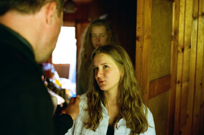
Picture1. Pentax MZ-3, SMC Pentax-FA 43mm F1.9 Limited, Kodak Portra 400
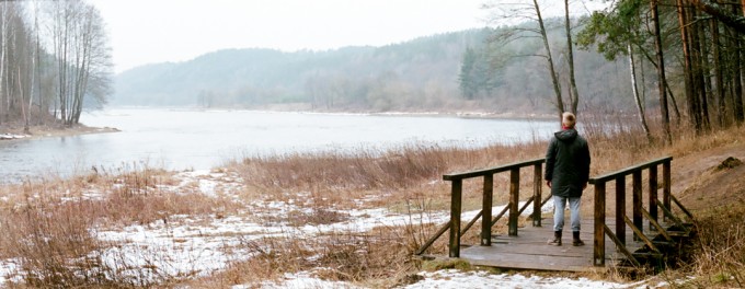
Picture2. Pentax MZ-3 (panorama mode), SMC Pentax-F 50mm F1.7, Kodak Portra 400
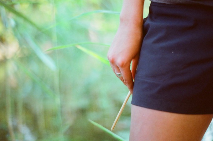
Picture3. Pentax MZ-3, SMC Pentax-F 50mm F1.7, CineStill 800 Xpro Tungsten
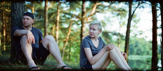
Picture4. Pentax MZ-3 (panorama mode), SMC Pentax-F 50mm F1.7, CineStill 800 Xpro Tungsten
Picture5. Pentax MZ-3, SMC Pentax-FA 43mm F1.9 Limited, Kodak Portra 400
Anyway, here is a list:
-Aspect ratio. Wider is better, but I dare to say that it is not dead necessary. 3×2 aspect looks OK to me.
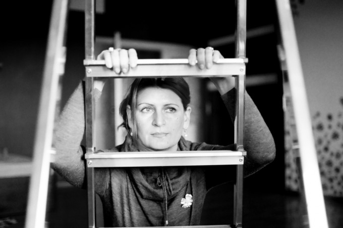
-Its better when subject doesn’t have direct eye contact with camera. Not sure why, maybe we are used that there is no operator in movies, he has to be invisible
-There should be tension in the frame. I try to create it by looks, movement, composition, and emotional aspects.
-Depth of field. Limited depth of field works better for me, but it shouldn’t be just pone detail and a splash of bokeh in the rest of the frame. There should be context in the picture.
-Light. Proper directional good quality light is very important. But here I don’t see that much difference from usual still photography style. So looks like that there is no need to go into specific details.
-Lens flare. I didn’t tried to use it. I know that I have to learn how to crate it in controllable and suitable way. Like long lens flare that goes trough all frame.
So this is what I know. Now it’s your turn, readers; what would be your opinion, observations for creation of cinematic look?
O! Almost forgot, that this is gear site. Yes. I just have to get my hands on Hasselblad X-pan II with 45mm F4 lens and center ND filter. Yes, again. That should answer all my questions. He he he. J
Regards,
Aivaras


Tom, Karim thank you for efforts and good remarks.
Even relatively low budget films have dedicated teams of experts in cinematography, lighting, hair, make-up, styling, postproduction, etc. who make sure each frame is perfectly lit, framed, composed and processed, the base line standard is very high. Photography is increasingly done on the cheap, lighting budgets are a fraction of a film shoot budget on even the highest end photo shoots. A lot of high end magazines are printing more photo spreads shot(often poorly) with only available light. When someone says a photo looks cinematic what they are probably really saying that it is very well lit, framed, processed, etc. The fundamentals are almost the same in cinematography as they are in photography. But films tend to have more money, better equipment, and top of their field experts in every department. The other thing films tend to have at their disposal is space. Sound stages are huge, and a lot of photographers are crammed into small garage studios. A large amount of distance between camera, subject, and background means each element can be lit individually, which allows a lot more control over the look of the entire frame. A lot of high end commercial photographers shoot this way as they have the budget available to hire large studios and enough lights for the ‘cinematic’ look. Higher budgets can also buy access to better locations, costume/clothing, and talent. Photography often becomes about compromises, getting the best we can with what is available, film is about doing what it takes to get exactly what you want. Photographers can get the same look that cinema can but more is left to chance, often we just don’t have access to the same tools, expertise or time.
I have mulling this over. This evening I was talking to one of the directors of the Keswick Film Festival up ‘ere in Cumbria, NW England and was asking her about the whole concept of cinematic imagery when it comes to photo stills.
If you look at my previous posts, particularly for the pictures around Kiev, one thing is abundantly clear, and I think this helps separate out your run-of-the-mill stills photography and something that starts to look cinematic, and that is the lighting.
Look at many of those photographs taken during EuroMedan, one of the reasons why they are so interesting is that you have, in many photographs, burning tyres, or something ablaze, but you also have snow and ice, and a low winter sun. This is unusual and combined together, produce a lighting scenario different to everyday.
Now, I appreciate that the most recent “cinematic” two films from Hollywood are Inception and The Hateful Eight. Inception only used extra lighting in one scene but uses very wide lenses and had snow and ice in spades. H8 went the other way and went v e r y w i d e in its format.
I don’t have a definitive answer but I do think that the extraneous light, or light coming in from various angles, in our case as photographers, off camera flash and / or continues lighting – this makes for what we would term, a cinematic effect, and having worked on many TV productions, adverts and a few films in my past (20+yrs ago), I can testify to the power and expertise of the lighting crew and the camera men / women, which in most scenarios, is rather extensive and hugely important.
I also think some films simply look more cinematic because they are shot of film, which rather suggests MF or LF today. Have you ever shot something like a Mamiya 7 with a standard 80mm f4 lens, wide open, close up-ish, it knocks any Leica lens on say an M240 digital body into the long grass, I know, I own both.
Ergo: it has nothing to do with lenses or the camera, format, or digital / film per se, it’s a combination of all elements, but for me, the deal breaker is the lighting which makes the real difference.
What a good idea to get ones head around the 16:9 aspect ratio of video . . . shoot stills the same way. I’m leaving my X100s and XT-1 on 16:9 aspect ratio to get a better compositional sense for video and film.
It’s a cropped sensor / image, something you could do in post production, so do not limit yourself.
http://proof.nationalgeographic.com/2016/02/19/behind-glass-a-poignant-look-at-primates-in-captivity/
How do these look to you?
They look square to me.
Very nice square images.
But square images.
Which is excellent for the artist.
Who clearly did not have a cinematic style in mind.
Because cinematic images.
Are not square.
And if I were to shoot square images, I’d change the viewfinder to a 1:1 aspect ratio. Since I’d be discarding the pixels anyway, it makes no difference before or after. Except before provides an accurate view of the indented aspect ratio and after has a habit of cutting something out that you thought was in.
Maria Švarbová’s work? http://www.mariasvarbova.com/index.php?article=gallery&id=6
Review here: http://www.featureshoot.com/2016/02/minimalist-scenes-from-pastel-hued-swimming-pools/
The format is simply not relevant for an image to look cinematic. Do not limit yourself.
A most interesting and worthy discussion. I think some of the photos here are certainly cinematic. But some are not (e.g. Picture3.jpeg – that is *very* photographic!).
For me, cinematic style involves a lot of deliberation. Not every single shot in every movie will be ‘cinematic’, of course, but wherever possible, the director of photography will take care with every frame. This means that there are no unnecessary elements in the frame, that exposure is exact, that shots within a scene match each other seamlessly, etc.
Let’s also acknowledge that all shots in a film have a context – they work with the shots before and the shots after. I try to not make the mistake that photography and cinema are closely related, but that does not make this discussion meaningless. 😉
I do not believe that Picture1 is cinematic. I like the way it looks, and that is partly because it’s shot on film. 😉 But it’s not refined enough IMO to be called cinematic. Just for example: too much headroom above the subject; the person behind her is awkwardly placed; the subject should be more toward the right of frame. In this case, having the subject in the centre of frame results in an imbalance. Note that Kubrick often has centred compositions, and it’s easy to see why it works when he does it – it’s not magic, just common sense and balance.
Aspect ratio isn’t really a factor, but I admit that wide aspects are exciting. Photography has much more flexibility, as photos can be square or even vertically composed. Films with lots of camera movement and/or close-ups do better with a narrower aspect. Peter Weir never liked anything wider than 1:85, and I agree with his reasoning. And in the past, all movies were 4:3.
The quantity of DOF has nothing to do with anything. It can be shallow or deep, but it’s not relevant. It has to be nicely done, but that’s a given.
And please, for the love of God, please do not use orange and teal! It is disgusting – and it’s overused. It’s a fad, just like shallow DOF. Let the light, film and lens do the talking, IMHO. Just because you can doesn’t mean you should. I don’t think an audience will ask for refunds because the film has natural colour.
If we are going to talk about cinema, let us have a sense of history first. Anyone who thinks that shallow DOF is cinematic clearly has no interest in the history of movies – this includes not just classics like Citizen Kane, but more modern films like 2001, Star Wars, or Inception. And plenty of others. You can pretend that lenses only have one aperture, or you can get a deeper sense of aesthetics, so you know what is good (for you) and what is not.
I love Kubrick’s movies for several reasons, but one reason is that they are all so carefully shot. Have a look – especially 2001:
http://film-grab.com/category/stanley-kubrick/
Or look for your favourite films in this list, and examine the shots:
http://film-grab.com/movies-a-z/
http://www.bjp-online.com/2016/01/culture-of-the-confrontation-live-from-the-ukrainian-revolution/
and
https://www.lensculture.com/articles/maxim-dondyuk-ukraine-culture-of-the-confrontation
These are the sort of looks you should be aiming for. Described as Cinematic too, “Euromaidan became one of the most visually beautiful revolutions, like scenes from a Hollywood film”.
And Brendan Hoffman’s work too:
http://www.bjp-online.com/2014/01/behind-kievs-barricades-against-the-odds/
These three I have plucked out to better illustrate what you are trying to describe as “Cinematic”, just putting the camera in panoramic doesn’t mean it’s cinematic in any way, you’re just losing the top of the sensor / frame; it takes something else to elevate a set of images to the level of Cinematic.
Better still, check out the documentary about Dennis Hopper, who as you’ll know, was a very keen photographer and who had a major retrospective in London recently.
http://www.bjp-online.com/2016/02/american-dreamer-dennis-hoppers-wildest-days-in-photographs/
Again, as above, check out the World Press awards, this will gain you a very good insight into what cameras, what lenses, what apertures, what shutter speeds and ISO those images you most like are achieved with, each image has, give or take, all this info attached in the blurb, per picture.
As such, this http://www.worldpressphoto.org link could be your finest resource yet on the subject of achieving a cinematic look.
Abe. Actually there is only one image here which is staged – Picture5. All the others were taken from raw life. 🙂
Great Article. The 1st Image looks like it’s an actual screenshot from a movie. The 4th picture looks a little too staged, and while it’s totally accepted in photography, in a cinematic style I would try to make it look as natural as possible, as that’s the definition of good cinemography.
Chris, thanks for instruction regarding “orange and teal”, think will try in the future. James, Ponamarev is a good example ho to create loo from what is in the place. Mahesh – yes, I read Ming’s excellent writings with the half of internet. 🙂
Thank you for bringing up this interesting topic.
I think the ratio aspect is very important. Regarding the examples above the panorama ratio (e.g. 16:9) gives a much better “cinema feeling” than the 3:2 ratio. Picture 4 illustrates the role of ratio very well but also the role of how to position the subjects. Nearly one third of the frame for the guy, nearly one third for the lady, one third for the space on the right which is opposite the line of sight of the two persons. I like that shot. Well done.
I would also like to mention the role of the color contrast. “Orange and teal” is one of the mostly mentioned keywords when discussing the cinematic look. This means to get the highest color contrast by stressing orange tones for the actors skin and blue for the background/foreground.
Maybe you like to do the following experiment with picture number 4: more orange to the skin tones, less overall green and more blue and/or teal for the background. Don’t know if it works, just an idea.
Kind regards from Germany
Chris
I’d like to comment on cinematic look with respect to aspect ratio. In the earlier days of film and television it was 4:3, not “cinematic” by today’s standard. HD television in the U.S. changed the aspect to 16:9, more cinematic and closer to more modern film ratios. A more common aspect in film would be 2.35 to 1 which is CinemaScope and Panavision. Using this criteria alone, your image of the gentleman on the wooden bridge is most cinematic, to me.
The lead photo from Sergey Ponomarev in the 2016 World Photo winners is a good example of how the technique can be pulled off during run and gun situaitons. (link) http://www.worldpressphoto.org/collection/photo/2016/general-news/sergey-ponomarev
See also Kevin Frayer’s 1st place singles shot about coal in China, or see also Rohan Kelley or Abd Dumany or just about half the winners in the 2016 photo competition.
That’s cinematic in my book, and it’s very popular these days.
Good attempt, the last one is definitely cinematic to me. The factors you mentioned make sense. There is an article or two on Ming Thein’s website which is very good.