The new one of a kind Leica M, yep, only 1 made. Want it?
If you have FAT wallets and a desire to own a one of a kind Leica M designed by Jony Ive and Marc Newson then you will have a chance to nab it at a special Auction on November 23rd at Sothebys NY. This was designed for Bono’s (Product) RED charity and proceeds will go to a global fight against AIDS to help reduce the number of Children born with this dreaded disease.
This camera took 85 days to create and the team went through 561 models and over 1000 prototype parts.
I do not think this will go cheap 🙂 The Auction is just 3 days after my birthday, maybe I will stop in and place a bid 🙂 (kidding).
Enjoy the images below. What do you think of this one of a kind design and what do you think it will sell for at auction?

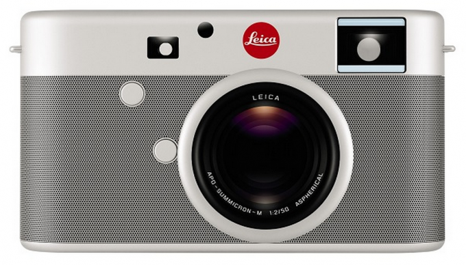
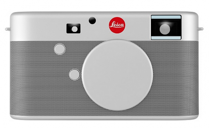

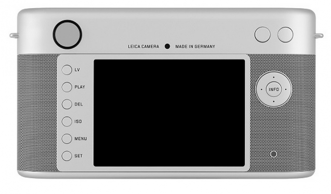
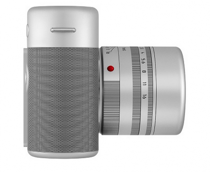
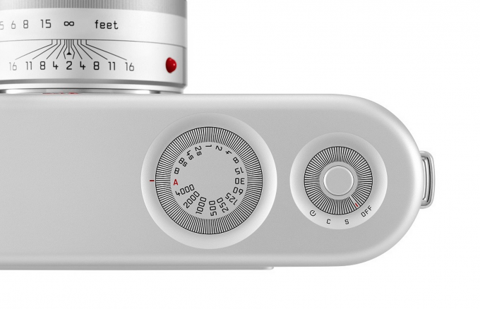
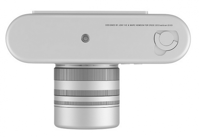
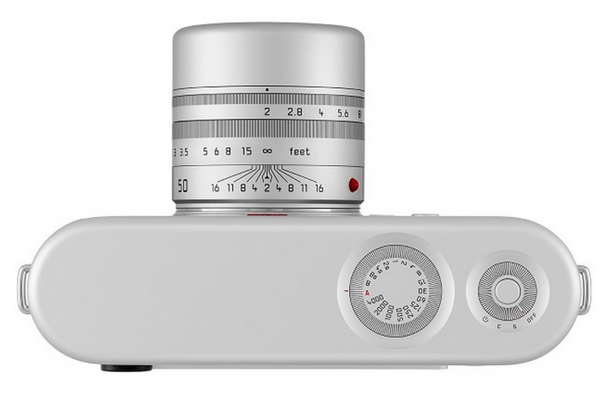


For those of you who missed the Charlie Rose interview, here it is. The Leica is discussed thoroughly in the interview. Both Jonathan Ive and Marc Newson have been heroes of mine for 20 years but I was very disappointed with their Leica collaboration.
In the interview Jony and Marc talk quite a bit about the beauty of function but where they went wrong with the Leica is that they chose beauty “over” function. A part of me can’t blame them too much as they are not photographers but the other part of me holds them fully responsible for their laziness. Together they have designed some of the greatest objects known to man. We all know of Jony’s contributions to design but how many of you know Marc’s grand master stroke; the Ford O21C?
So why couldn’t these designers get the Leica camera right? Marc had already designed the Pentax K-01. He should’ve used this experience as a stepping stone for this Leica. Instead, Marc and Jony decided to get rid of the hotshoe on this Leica just because it was a visual intrusion while forgetting that it served a function. The primary function of a camera is to control light. The hotshoe’s primary function is to control light either with a flash or flash trigger. Fine, redesign the hotshoe but to get rid of it entirely makes this camera a $1.8 million failure (though the proceeds went to a great cause).
There have been many other comments about the other shortcomings of this Leica camera. Sometimes I think that Jony and Marc are such superstars that they surrounded themselves with fellow designers who stroked their egos instead of being open to critique. After 550 prototypes, they should’ve gotten this Leica correct. In this interview, Jony’s and Marc’s passion about design shines through. Their failure to think clearly about this Leica also shines through.
http://www.bloomberg.com/video/apple-s-design-chief-jony-ive-charlie-rose-11-22-3AdUnh8ORLidaNw7OzoA8Q.html
UPDATE: 1.8 Million USD.
Newsome MkII. Ugly
Looks nice, but reminds me of a shaver from Braun.
Big design deal. Just have a look at first Carl Zeiss Verra camera to understand latin words- nihil novi sub sole or otherwise – en kol chadásh táchat hashámesh
funky looking camera – somehow i like it and don’t like it at the same time 🙂 black version could look really good or whatever apple calls that dark colour
When you have a high level team working during 4 months with one of the most famous designer of the world, it’s not to sell a unique piece for a charity purpose at 1M $. That’s under the cost price in fact.
I will say 10M $.
It’s as much Newson as Ive, if not more, and I love it, as I did Newson’s 1999 Ford 021C Concept Car – I wish they’d produce both. Those aren’t holes, they’re hemispheres, says Leica. But yes, I too am waiting more for a FF Sony body with EVF, able to take M mount glass…
Not very useful but if the auction supports Project Red, then why not. I say $750,000. It will sit on someone’s shelf or in a bank vault for a long, long time.
It looks like the instagram logo. No thanks.
Somehow this design reminds me of my Contax T2….only worse.
I prefer my MP or Monochrom over this. This design says nothing about Leica. Take out the Leica Logo and you cannot tell what camera this is. Leica Monochrom, no logo whatsoever, will be recognised instantly as a Leica
Some serious moire in those pics. Shot with an M?
I think it looks pretty boring but I’m sure someone will spend a good chunk of change on it though.
Nope, can’t take it anyway… imagine trying to get the dirt of those little holes… looks good and that’s about it…
It is similar to Yashica Rapid 17.
I saw a Monochrom in the flesh today at ProGear in Newmarket (Auckland) they also had a leicaflex, M2 and M3…. the Monochrom is lovely, and in kiwi dollars 11995. I think I will be using my M6 a while longer — that is a kids college fees for the year down here.
Thanks but no thanks. What I want is:
Sony A7R (36MP FF & NO AA) + Novaflex Leica M to E-Mount Adapter + Leica 50mm Summilux
Wow!
The design is beautiful, maybe not as a working camera. I hope it sells for a fortune, those kids need it.
The ruggedness and usability of the “regular” Leica M design is way much better than this. But let’s face it, it is just going to be an expensive toy anyway, so why not make it look like one? But I sincerely do not hope that Leica picks up anything from this design.
Yep, it’s a classic Ive piece fit for a museum. That said, I’ll be so glad when Jony’s eyesight goes south of 50! Everything he designs is truly beautiful and artful but seldom utilitarian. I hope one day he ends up in a universe of gray, with everything in 7 point typeface.
I hope it earns a ton of money for the cause. Anyone willing to bet what will be the winning bid?
My bet is that it fetches more than $1 million.
As to the design: of course it’s meant purely as a collectible piece of art, not as any practical camera, and so should be judged as such.
If I were super wealthy, I surely would try to be the winner of this auction.
FAKE you all have been trolled.
Lots of small holes for my son to mould chocolate into!! Yummy.
No thanks.
Bring Chinese guy, ask em to make clone copy of it & buy from them
You know, I need something to have kicking around in the back of my pimped hum-v so I can take pictures of all the squirrels, bunnies, cats, dogs, etc. I run over while driving to the country club for my afternoon 18. This looks like just the thing. I’ll have to send my manservant to acquire it. When’s that bloody auction?
It looks like a Nikon 1 … except $499,700.00 more.
Yo, fat stacks b—ch.
Funny, it reminds me a lot of my fathers Voigtlander Vitessa
I think we are getting a look of the Leica of the future.
“THE NEW M 1000”
Dang the normal version of that camera with the 50mm APO Summicron is already the price of a cheap car. This thing will probably go for close to $1,000,000 depending on the type of attendance at the auction. A follow up article would be awesome 🙂
Our local Primary School kids could have done a better job………shocking design!.
over a million bucks….not my cup of tea though
I’ll only take it if I can shave with it
The dials are touch sensitive like the ipod’s click wheel.
I like the strap lugs.
No particularly excited about this one. I much prefered the Hermes or even the M9 Titanium designs.
Thank god that there is only one made…… uglier than the Hasselblad Lunar!!!
Mmmmh unattractive, too bland. It’s missing the mechanical/function side to it. Too numb down…
Been waiting to see it. Looks like the IOS 7 circle theme is making it in there. Definitely looks like the fruit of those 2 designers. Even the lugs are changed. Awesome.
Send me your Leica and I will convert it into a one of a kind, no problem, have lots of tools and heavy machinery. Cost will be considerably less than the auction price…
Like they say, “a fool and his money are soon parted!”
Well, it looks like a retro-futuristic design, something from the 2001 space odyssey movie, but I don’t understand how to rotate the dials 🙁
I don’t think I would buy a leica camera (except the dlux line) but certainly if I would buy this camera I’d prefer that the logo were the same color of the camera and not in that red that makes the camera seem a furious cyclops lol.
Dials look cool and I think it’ll be a pain to use (with text rubbing off too) but this is not a camera for actually taking pictures. Probably a good art piece.
Usability seems to be beside the point – I suspect that this camera may never be used to shoot even one photo. Well, maybe one …. just to prove it is in fact a working camera. Of course, it will go for a great deal of money, and eventually be resold for even more.
Awful!
It will go for at least a million dollars!
I love the look, aside from those Norelco razor looking dials. I think it’s a nice clean minimalistic look – exactly what you’d expect from an Apple designer.
@Evil Ted: Why does it need hot shoe? Will you take picture with it?
Hell yes I would 🙂
(If I was swanky rich and had it round my neck)
I take pictures with all my cameras…
“If Fisher Price did Leica…….”
My sentiments exactly! Or if Lego did a Leica!
No matter, Steve, when Seal picks it up can you ask him to do a review for us?
😉
i need an electric shaver! but seriously, great cause and that’s what really matters!!
The first impression was Apple Leica .. ! and then i saw the back .. “Designed by Jonny Ive”
From a designer’s perspective, this is a very futuristic design of an icon.
I’m tapping here on an Ive designed iPhone 5S and know him to be Steve Jobs’ design secret weapon for good reason. Biggest selling single model “camera” ever made was the iPhone 5. Ever.
That said “stay the hell aware from tools”! The M Leica is the culmination of 60 years of industrial tool design.
The Bono-Leica will sell. But it ain’t a progression in camera design. It’s a design for a different purpose.
Just my Apple induced response.
Carry on. And all.
If Fisher Price did Leica…….
Give me the 50mm F2.0, without APO and the basics for 4k, now Leica would sell carload-with realworld dials also.
Affordability is not there Leica! Make something everyone can afford!
this is a Leica Apple design.. M s model..
should be made of aluminium
$1million+ dollars and no hot shoe?
Like Doug said this is going to rake in big bucks but this design is horrible in my opinion. I understand that this Leica would probably be never EVER used but the speaker like grill seems like a horrible idea. Awesome spot to get dust and grime in and hard to clean too. Like others have said the dials are horrible too. They are recessed in (design over function) and so cheesy looking.
The entire phone is too bubbly in my opinion, but glad its going to a good cause
They look like they would be impossible to turn, but I hope they thought of that, and engineered them to work with the touch of a finger.
I wonder if it’s a joy to use…but it looks really nice. Have to let it sink.
My bet would be $500.000.
wow it took only 561 models to get rid of the flash and and make the buttons and dials difficult to access…and put a metal grid on it….i will enjoy the fun of cleaning the sweat out of it….a true Jon Ivy design
Flash?
Flash?
Flash ?
Flash?
Flash? No.
Weather sealed? No.
Dials flushed on top of the body? Basically worthless.
Cleaning out hand gunk inside grills? Terrible nightmare.
What are the two buttons on the top right? Amateur mode & Noob mode.
You’re paying for a Red dot and bragging rights (if this is worth bragging for — I doubt it).
Don’t blame Ive for trying to make it as unpractical as possible, with unaccessible dials, etc…
The man probably shoots with his iPhone 5s++, which apparently sell very well.
Designer, yes.
Stylish, certainly not.
That said, it is as ugly as it gets. What, Leica iM ?!
Flash?
Looks like a portable speaker.
Any one-off by Jony Ive is going to rake in big bucks at a charity. I think this thing could easy top $100k, maybe as much as $250k.
It will go over 500.000.-
Actually it should be between $500,000 to $750,000 based on this site.
http://theultralinx.com/2013/10/500000-leica-designed-jony-ive.html
You can tell there is Mr Ive influence in that design ..would be great to see the next M model have a similar look…love the dials and the back screen buttons..
superawesomedesign!
I think it’s a good sculpture to put in a display. I would be afraid to leave some dirt in the grip area (are these holes?!). It looks like something from a ’70s sci-fi movie, a concept design that lost some functionality (aperture wheel, for example). Is there a place where we can look at the discarded designs? I appreciate the fact that it’s for a good cause, but no,I don’t like it that much.
Worst.dials.ever.
Can’t disagree with you there. I have a feeling this one won’t be a shooter anyway. I think they could sell a bunch though if they had better dials went into production.
you won’t need dials. it’s designed by apple. the camera will think for you…
The dials must be Newson’s influence, the shape of the lens to reflect the shape of the body, looks like something Ive would do. The body covering looks like the old Mac Pro face.
So cool! Wish I could afford it!
Me too ! Not because I want it. Just because I’d like to be able to 😉
You just got the point