Steve,
I have been following your website for more than 5 years now. I first stumbled upon it when I was beginning my interest of photography during college. Through the years the daily inspirations and gear reviews have kept me coming back every week.
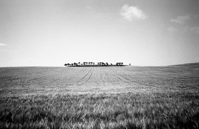
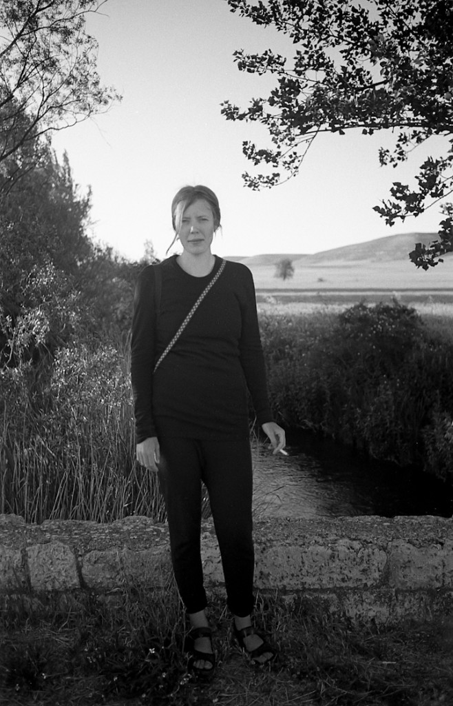
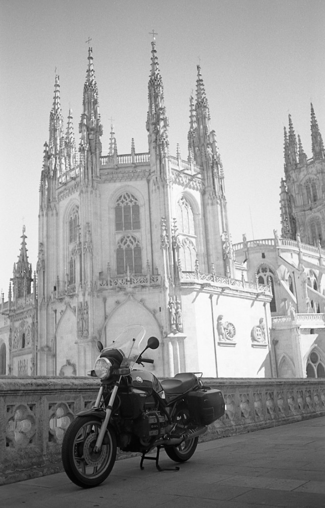
I just returned from a two-month trip across Spain. I had the amazing opportunity to hike the Camino de Santiago, walking more than 500 miles from the border of France to the western coast of Spain. Traveling across a country on foot is a unique way to ensure that you experience everything a country has to offer, from the food, the language, and of course the scenery. While walking the Camino you also have the opportunity to meet and talk to people from across the world who all the share the same goal. On the trip I carried a Leica m4 and an Olympus xa. The xa was in the waist belt of my hiking pack and I used it primarily for snapshots along the trail. I pulled the Leica out for any notable shots and for all the portraits I shot on the trip.
The lens I had on my Leica was the tiny Voightlander 35mm f/2.5 color skopar. I shot nine rolls of Arista Premium 400asa (poor man’s tri-x), developed in D-76 and scanned with an Epson V600.
The three shots were all from the m4.
More work can be found at my website: ronnelsondp.com
Thank you for all the hard work on creating such a great site Steve, keep up the great work.
Ron Nelson


Comments invited? OK.
#1: Nice composition, though there is not much more you can do with that scene, except play a little with the horizon (more up or down, either of which is what I would have done to add interest to the composition).
#2: ???
#3: Horizon, contrast and exposure totally out of whack? Composition, subject? Very poorly executed.
Keep trying… 😉
That picture of the island oasis in the field is well done . Arista Premium and D76 is more-or-less my formula too. It works well for natural lighting and is simple to use.
Steve, I still enjoy reading your blog, but the Daily Inspiration column lately it’s almost completely full of reports from Leica users, and in many cases they show shots that they think are interesting mainly because are made with their beloved Voigtlander and Leica lens… it is fine that everyone shots what they enjoy better, but c’mon…here we are confusing the indian with the arrow…
Thank you for all the comments and critiques. This community is what makes Steve’s site so valuable, and I welcome all the new eyes and solid feedback.
well at the end of the day… he walked right across Spain
so it really doesn’t matter what the photos look like because he lived that experience to the full
good for him
So the inspiration is not photographic after all but one of trekking? The “Daily Inspiration” no longer belongs solely to photography – has Steve been told..?
I like your style. Its hard to explain but i find it kind of casual and honest. Reminds me a bit of the danish photographer “Krass Clement”.
Is this for real? Or is it a spoof? Who has been actually inspired today by these three shots?
Snap no. 2 is …well, below ordinary. And that’s praising it.
And yet we read, ” I like how in picture 2 there is tone and texture in her outfit as opposed to the blacks getting crushed.” Tone? It’s mud. Ever heard of the Zone System and placing blacks while still retaining texture? Instead of elevating blacks to mid-grey mud?
Same in no.3. More mud. And the church wall ain’t got too much texture on the sunny side!
No, I take it back, this is inspirational. I’m sure nearly every reader here is saying, ” even my duds are better than these..”. And that’s positive.
Yep!
Critique is fine, but why is it that so many commenters on the internet think they need to be rude (or would you say “even my duds are better than this” to somenone face to face? – I wouldn’t).
That said, I like #1 because of the sense of big sky and horizon it conveys. #2 may not seem spectacular at first, but taken in context of pictures of other pilgrims (c.f. Ron’s website) the entire series has a very interesting documentary character. #3 does not do so much for me.
Jerry, I did not set out to be rude and I’m sorry it came over that way. I would say it in a non-serious sort of way to Brenton’s face but immediately buy him a drink or two! I’ve received worse for some of my disasters and the messages have not been forgotten.
And I’m pretty certain Brenton has plenty of stunners, but I can’t fathom why he put no.2 and no. 3 forward as exemplars.
The portrait location was great, but the face and clothes were ..mid-grey.
One further thought; this part of Steve’s site is called “Daily Inspiration”.
I assume contributors submit works which they judge will be inspirational to the likes of many readers. Therefore, they put themselves on a pedestal of sorts which proclaims they think they are good enough to inspire others. They’re making quite a claim. Nothing wrong with that, but it’s hardly the position for the timid or easily hurt.
The blog is not called, “I’m Trying Hard, What Do You Think?”. Then the comments would be more about helpful tips, a sort of clinic.
If you are Mr or Ms Inspiration (self-proclaimed and promoted as such), then no one is going to be expecting a shrinking violet who’ll burst into tears because their work was a little less than claimed.
Great pix. I like how in picture 2 there is tone and texture in her outfit as opposed to the blacks getting crushed.
I enjoyed looking at your pictures,very interesting shots.
Probably not going down well (as usual), but in my book not good photography, pictures, etc… Seems to be, either old school/film or hocus pocus with all kind of software, ooc always a reason to apologise…. To bad an sad!
Agree
Wow! Nice, rendering that only film can do to date. I also use my digital, an rx100ii, for social media and cheapshots as well.
Real photographs ! And do you know there is even more detail in them you can bring out without losing the “film look” – particularly in number 1.
Very good photography on your web site!
Film lives!!!