B&W Color Processing. How to get Richer Black & White images.
by Dirk De Paepe
It’s been a while since my last post, but today I’d like to share how I get richer black & white images, by applying a customized color conversion process for the various subjects within a picture. The level of execution can vary from really basic to as detailed as you find it necessary. A more detailed procedure involves the demarcation of multiple sections, to each of which will be applied its own conversion process. I see this procedure as an endeavor to do maximal justice to all subjects in the picture and as such to enrich the whole image. It’s a pursuit to getting precise control over ultimately all grey shades, by converting them from the full color file in a “manually controlled” way.
It has always been Photoshop to me.
Let’s say it straight forward. This article is meant for those who like the post-production process or are at least interested in it.
But first a bit of history. (If you want to go straight to the processing, you can skip this chapter. 😊)
I’m a Photoshop guy. Shortly after this software appeared on the market – in 1988, if I remember well – we got to know it in our publishing company and I was immediately impressed by its concept and possibilities for prepress purposes. It can sound odd nowadays, but we were into digital post-production, long before we applied digital photography.
From the start of our publications, I was convinced that DTP (desktop publishing) would be the future in printed publishing. I decided to go for the Mac platform, a choice that in the subsequent decades has proved to be the right one. QuarkXPress, Photoshop and Illustrator constituted the core of our system for many years. Later, Indesign replaced XPress. From that moment on, the Adobe Creative Suite package contained about everything we needed for our prepress work.
Often we received ready images from our clients, that we needed to scan to create their advertisements or to use in editorials. And of course we also scanned our own pictures. As we published for a niche in the smaller Benelux countries (Belgium, The Netherlands, Luxembourg), we always worked on a tight budget, which meant that the received pictures were often “not of optimal quality”. Still, clients always expect an “optimal final product”. So, to get the desired result, and eventually get payed anyway, we needed to process their pictures – sometimes very heavily.
In those early days, it was mainly a matter of self-education, and exchanging experiences with fellow dtp-ers. In addition to what we nowadays consider as typical post-production, there was also a big matter of creating files that were as light as possible, yet not too light. In fact, they had to be right on the spot. “Image size” was a very important parameter, since every picture needed to be calculated and exactly resized in regard to it’s final print size. Magazines were typically printed with a 150 lpi (lines per inch) raster, so to get the colors right, 300 dpi were needed in the resized (!) picture. And when pictures were layered in XPress (the DTP program that brought text, pictures and other illustrations, like logo’s, together), overlapped sections needed to be cut away, to simplify the processors’ calculation task. Anything too heavy would overload the system, resulting in a blocking Ripping process (RIP stands for Raster Image Processor. The RIP-machine turned the images into the 4 rasterized films – cyan, magenta, yellow and black – that we needed to make the plates for the presses.) In our early years, we used a Linotronic Ripper. This machine could easily take up to two hours to produce the four films for one full color A4 page. And this was without any indication of the progression of the job! With processors that were tremendously less powerful than today’s, if you overloaded the file and their was no film after say two and a half hours, you had to cancel the process, find out where you could have left too many pixels or too many required calculations and revise the files. On the other hand, anything too light would result in a typical low-res image and would be disapproved by our clients – and our readers, of course. So we were pretty much dancing on a limp cord. Learn or quit your job, that was the matter. You simply couldn’t afford too many blockages of the RIP-machine, or you wouldn’t meet the deadline.
It was a constant quest for new procedures, to get rid of all the imperfections of the pictures, and to apply special effects for specific goals. What we did for our publications, was not so much creating spectacular visual effects, rather than making the pictures look more natural and clear or more expressive, or to put more emphasis on certain parts or subjects and less on others, in regard to the desired message. As mentioned, we always looked for new ways of execution and often needed to “think creatively” to solve acute problems. When your remuneration depends on it, you learn fast or get out of business, especially when you enter on new paths, like dtp definitely was in those days.
Photoshop was the most powerful picture processing tool on the market for us – and IMO by far the most professional one for publishers. As far as I’m concerned, it retained the leadership of the image processing software up till today, and I don’t expect this to change any time soon. The fact that it’s perfectly integrated in the other Adobe software, required for pre-press, made it during all these decades my way to go, the evident choice. This integration comes with an easy of work that IMO has unpriced value. Adobe has for many years now been thé steady rock for publishers, reliable as a true friend. So for picture processing, indeed, it has always been Photoshop to me.
Black and White color processing
I gave this post this somewhat intriguing short title, for the sake of conciseness, but also to draw a bit more attention. 😊 The “full size title” would have been: “Getting more control over the conversion of full color files into black & white pictures, by applying sectional color processing”. Not really appealing as a title, don’t you think?
OK, let’s get to business now.
At the Speedshop Springmeeting…
I got the idea of writing this article, after visiting an American car show, last spring, at the Speedshop event in Stekene, Belgium. Speedshop Belgium is famous for its swift import to Europe of parts for all American cars. The show featured a very colorful car collection, as well as a very colorful collection of people. 😊 So if I wanted to show both at their best, I reckoned they required different processing: the cars shiny and bright (metal), the people more soft and friendly (skin). And then there was also the environment – sometimes trees, grass and bushes, sometimes streets and buildings and sometimes both. A very favorable setting to demonstrate this procedure.
Because it was mainly an old-timer show, I decided to make it a B&W report, since most of the pictures, that I can remember from the era of those cars, were monochromatic. Yet, I still wanted to suggest a colorful event, and thus I found a thorough, customized conversion to be mandatory.
All shots were taken in a time span of about one and a half hours – a typical situation when making an event report, which I’m used to from my publishing work. I find this kind of fast shooting really fun to perform. It’s what I love. It has a lot in common with wedding photography, I guess – having to deliver the best possible performance, no matter the circumstances. (BTW, I have the utmost respect for a good wedding photographer.)
It can seem strange for this kind of shooting, but I never use autofocus. This series was shot with the Carl Zeiss ZM 2/50 Planar. I didn’t use the Loxia Planar, since on that particular day, I just felt that my smaller and more vintage looking silver ZM would appear less obtrusive and draw less attention. I thought that the more “amateurish” look would give me more discretion and allow for even more spontaneous acting people in the picture. Like always, I’m particularly interested in the people – how they act and experience the event – more than in how the cars look, although for sure I love those as well. The people are the main subject, the cars are the essential “conditioning” environment.
Basic process
Colors that manifestly distinguish in a full color picture, often result in very close shades of grey in the B&W image. The customized conversion process in Photoshop indeed allows you to distinguish grey shades in a B&W picture in an equally clear way as their corresponding colors in the original full color picture do. What I particularly like about this customized conversion method, is that it gives ME the control over the process. I like control. I require it. In some cases, I can even get greater distinction in B&W then what was there in real life. I’ll sometimes perform this for the purpose of expression. You can find a good example hereof in the picture “Beyond Thunderdome”, the third last picture.
Customizing the grey shades is basically really simple: manipulate the color sliders (red, yellow, green, cyan, blue, magenta), which Photoshop provides in the conversion process, to darken or enlighten specific colors, without effecting others, and as such create the pursued distinction between the subjects or the grey shades within subjects.
(Picture 01.) (Please always place the picture before the text, Steve – thanks!)
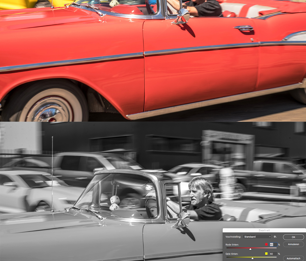
Separate sliders for red, yellow, green, cyan, blue and magenta, when converting to B&W after clicking on Image/Adjustment/Black&White in Photoshop. (Sorry for having a Dutch version of Photoshop. In English it says “Default” instead of “Standaard”).
A very simple procedure indeed and for some pictures, it’s all that’s needed.
“Enjoy your flight” (12:36h)
(Don’t forget to click on the pictures, to get the right IQ.)
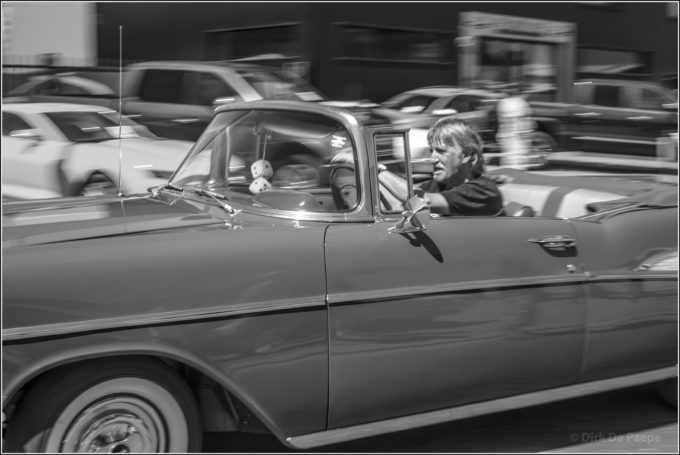
Concerning the color treatment: this picture clearly took benefit from its processing, as basic as it was, because originally the pretty light red of the moving car in the forefront and the deep yellow of the one, positioned at the left behind it, resulted in a too close grey shade, partly nullifying the flair of this “flying beauty”.
—
“Basic conversion process”
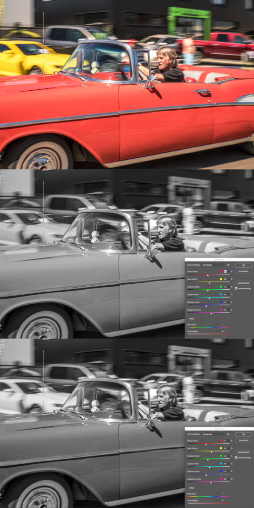
First you see the full color picture. Secondly a default conversion. You notice the two cars having close grey tints. Thirdly the customized conversion with the Red slider lowered from 40 to 17 and the Yellow raised from 60 to 83. IMO, it does a lot more justice to the main car, although the difference with the original conversion is still subtle. (It would be very easy to make the difference a lot bigger, should you wish to do that.)
The processing for this picture was the simplest of all 20 shots in this article. Not spectacular at all and executed in less than a minute. Still, I believe it was required.
Sectional processing
The conversion process itself may be pretty simple, yet there’s really a bit more to it, since various objects in the same picture often require different processing. The pictures that go with this article involve people’s skin and clothing, cars, nature (trees, grass, skies), streets and buildings. All very common subjects, yet very different in character, color and texture. That’s why they may all benefit from a specific, customized treatment. Of course it’s not always necessary to process everything individually in one and the same picture, but it might be very beneficial as well.
Luckily, Photoshop offers all the necessary tools to precisely demarcate different sections of the picture, tools like “quick selection”, “magnetic lasso” and “invert selection” (amongst others, but I personally use these a lot). If you’re familiar with them, you know what I mean. If not, you can look up some tutorials about those tools on YouTube. There’s plenty.
Still, here’s some extra advice. Since those tutorials usually demonstrate these tools with an even, uniform background (eg a plane white background) and since non-studio pictures normally have a pretty “busy” background, you can take great advantage from working with finer settings. I use the magnetic lasso a lot for demarcation, and normally apply a width of 1 point and a contrast of 1%. Also, to allow for greater precision when demarcating a section, I’ll usually magnify the picture to somewhere between 200 and 700% view, depending on the image character and the display (standard or retina). BTW, I find that a picture should not be judged by pixel peeping, but for processing purposes, a larger view is very helpful indeed. During the demarcation process, I’ll also ad marking points by clicking on crucial places and I’ll go back a bit (erase points) with the delete key, when necessary to correct the demarcation line. This is also how to scroll the picture: draw a falls line, just to provoke the scrolling, erase the falls part and draw the right line.
With those tools and some practice, it’s possible to define an unlimited number of sections – precisely yet swiftly. By exploring the possibilities of adding and subtracting sections, you’ll understand that you can execute the FC to B&W converting process in as many steps as you want, each time with the possibility to tune the colors differently. Of course it makes a lot of sense to customize other parameters as well, having these sections at your disposal anyway. For instance, when there’s no possibility for controlled lighting, like when you need to shoot fast in real world circumstances, it gives you much greater control about lighting and colors (grey shades) for the various components within the frame. Changing the exposure of specific colors within various sections makes for a much more powerful and more clean control, as you will experience with some practice. Photoshop has an enormous amount of available settings. The control possibilities are virtually endless, as is the potential for experimenting.
(Of course, section demarcation is also valuable when processing full color pictures, but this article is about B&W. I’m sure though, that you can easily imagine the FC possibilities as well.)
So the processing is done in sections. As said, this doesn’t have to be limited to just the conversion from FC to B&W. You can as well treat levels, curves, local contrast, sharpening, etc. You name it. It’s even a good idea to first determine a section if you want to use the dodge, burn and sponge tools, to avoid that the effect spreads out into unwanted areas.
For effective processing, working in sections is of great benefit.
I’ d like to demonstrate in detail now, why and how I perform sectional color processing for B&W pictures.
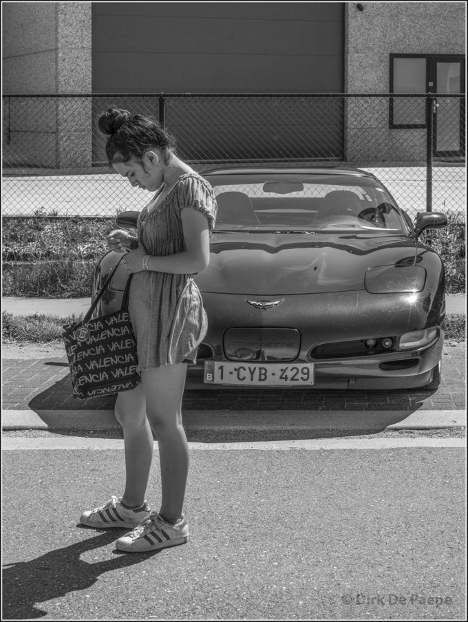
“Don’t we match perfectly?” (12:15h)
With this picture, here shown in final result (do not fail to click to get the right IQ), I show the process in 10 steps.
—
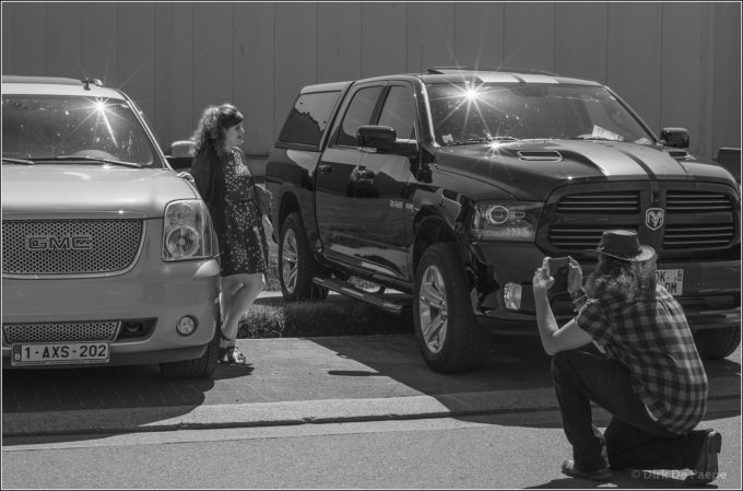
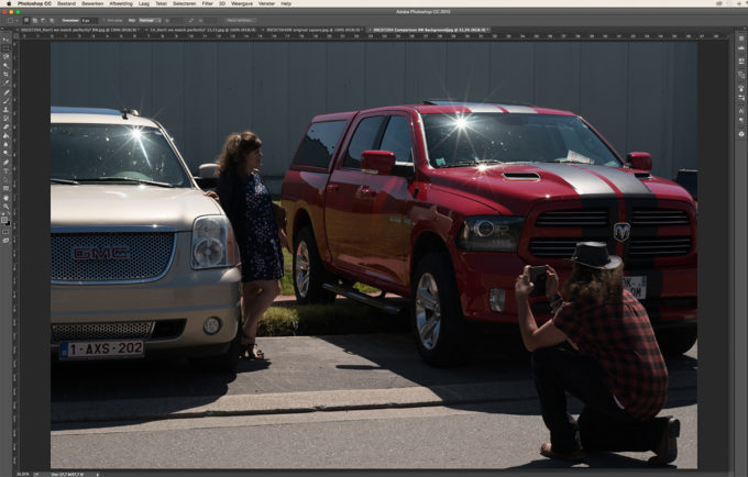
Step 1
Original unprocessed picture. I applied zebra’s in the EVF, to avoid blown up zones. This engendered a somewhat underexposed picture. Yet, the sensor of the Sony easily allows for full recovery of the dark areas later on.
—
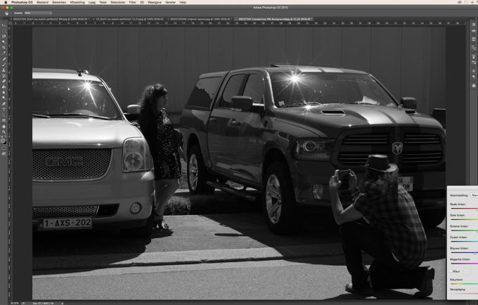
Step 2
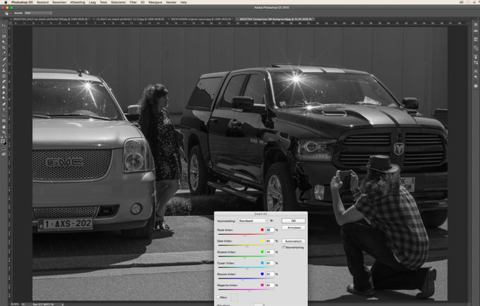
A conversion to B&W with the standard “preset” option (default). Thereafter I tried to do a good job with the Brightness/Contrast sliders (a typical method for many photographers who want to work fast). The result is poor. I don’t wanna work like this and consider this a dead end. So let’s forget about this step. I just added this one to compare.
—
Step 3
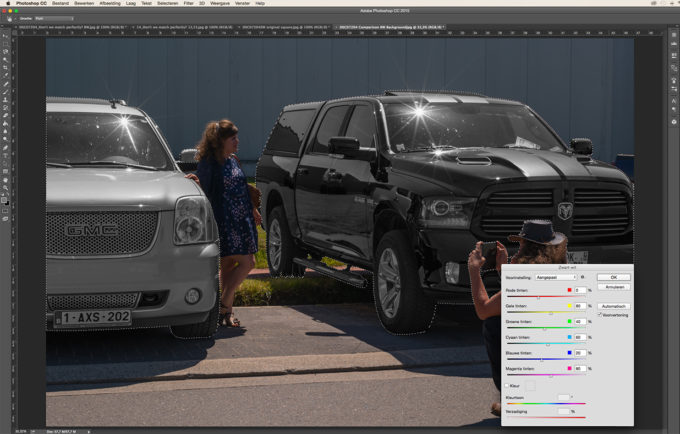
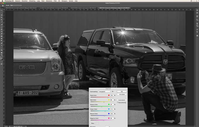
Going back to the original picture, defining the two cars in a separate section with the Magnetic Lasso Tool, and clicking on the “Image/Adjustments/Black&White” button, yet with no changes made.
—
Step 4
To get more deeper and powerful tints in the Dodge RAM (right car), the red and yellow sliders were adjusted. Also the local contrast is adjusted in this stage, to give the cars more shine, without effecting the rest of the picture.
—
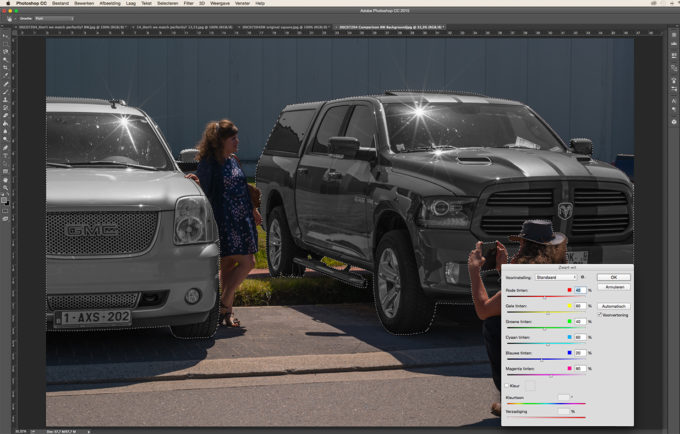
Step 5
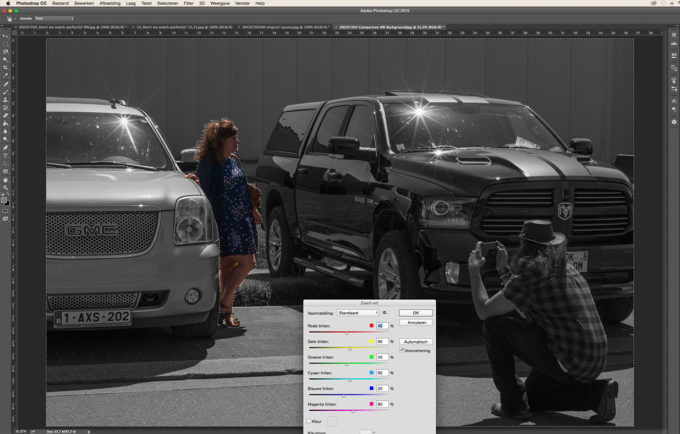
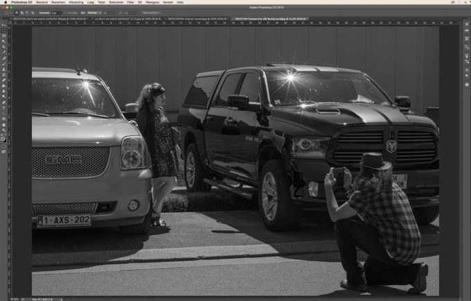
First, by clicking “Select/Inverse”, the rest of the image was selected and then the young lady was subtracted from the section for later separate processing. The standard conversion to B&W was activated. You can wonder why I include the cars in the section. In fact, it doesn’t matter for as far as the color processing goes, since they were already converted to B&W and thus they are no longer receptive to any color processing. As long as no other processing is required, this is perfectly OK. Still, it’s best to make use of the “Inverse” function anyway, since it’s a fast and sure way not to miss any dots for conversion on the demarcation lines between the girl and the cars.
—
Step 6
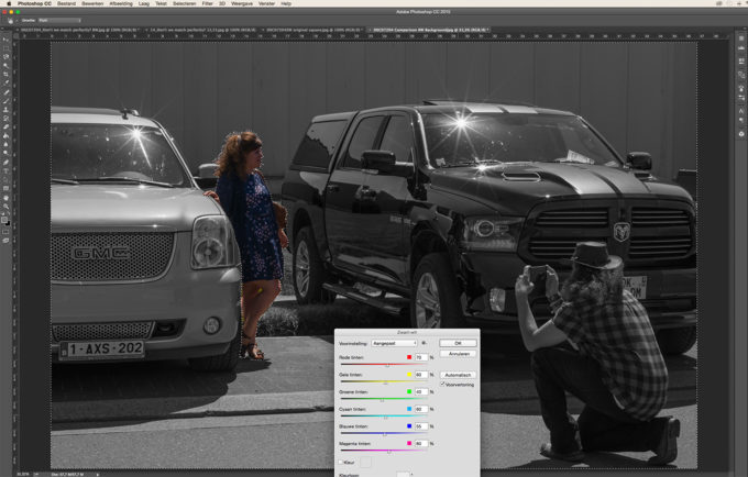
By raising the blue slider from 20 to 55, the tint of the wall in the background is positioned between of the tints of the two cars, doing them both more justice. And by raising the red from 40 to 70, the guy in the right down corner is becoming a lot more prominent.
—
Step 7
After yet another “Select/Inverse”, the girl is demarcated for individual treatment, here with unaltered B&W conversion.
—
Step 8
Except for the green and the magenta, all sliders were moved to make her a lot more bright, in a much more controlled way than when just altering the exposure or the brightness. By lowering the local contrast, not only the face became a bit more “human”, but also the dress got a much more “fabric feel” to it – very important to contrast with the metallic shine of the cars. If face and dress would require individual treatment, of course separate sections aught to be made for them.
—
Step 9
Some accents in the girl’s face were attended, mainly her lips were darkened. It was not necessary to do this with color processing, since it was a simple job. Still the lips were treated in a demarcated section.
—
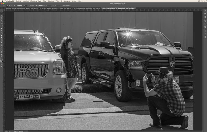
Step 10
When all items in the picture are in balance (achieved with step 09), some final general processing can be done to finish off the picture. Still, a few more details were adjusted in separate sections, like the girl’s legs and the mirror reflection on the RAM’s door. This picture shows the final result of the image. (See “Don’t we match perfectly?” , here above for better IQ)
This picture also illustrates how, at the moment of the shooting, my goal is nòt at all to get a picture as close as possible to a good final result, but to get a RAW-file that has all the necessary potential to create the desired final result with. Big difference. Because attempting the first may well impede the last.
Some more examples
Since all pictures in this post were taken in a very short time frame, I thought it would be a funny idea to add the time of shooting and to put them in the order that they were shot.
It’s of course impossible to show all the individual steps for all shots, but, as usual, I add some comments to tell you what I did, as well as why I took the picture.
Please look at the picture first, before reading about the processing.
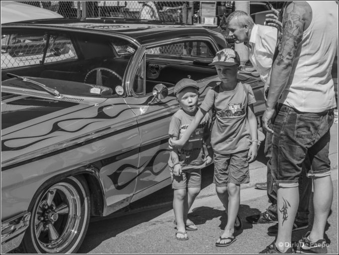
“Hands off!” (11:21h)
Two different jobs: one for the car (shiny and bright – the color processing enabled the shades to be as distinctive as the colors were in real life) and one for the people (soft and friendly – a totally different color processing was needed than for the car).
I found this a very nice and human scene: the older boy taking responsibility for his younger brother, avoiding that he would deface the customized paint job of this vintage car.
—
“Playground” (11:25h)
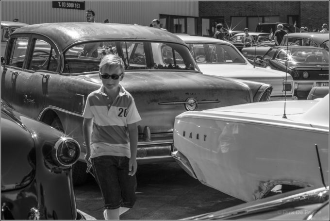
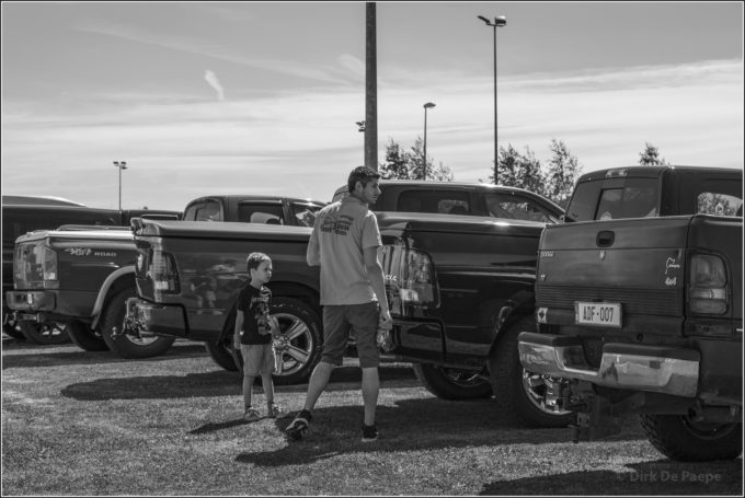
It’s particularly the different layers of rust in the Oldsmobile (or is it a Buick?) that I found interesting in regard to color processing. And evidently, all cars needed to have their distinctive tint. The color processing allowed me to give them the exact grey shades that I wanted. This obtained accuracy in grey tints is what I particularly like in this procedure. I found this a very interesting color play here, especially because of the rusty car. You can guess, the boy’s colors were treated separately.
The timing for this picture was of course determined by the boy, walking through the “car garden”. His grin/smile can only suggest the fantasy world, that he is creating in his mind.
—
“Stylish” (11:30)
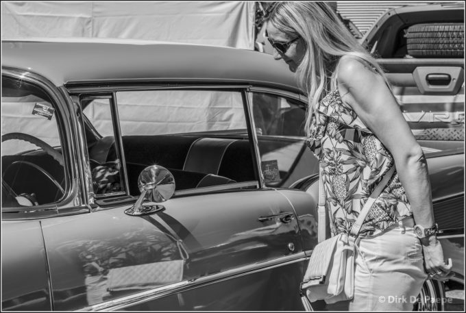
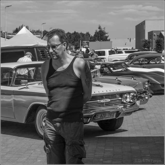
It’s clearly not only men that like vintage American cars. This one, a ’58 Chevy, has always been one of my favorites. It’s a rich azure blue one, and needed a very different processing from the lady’s blouse and then again from her face, that needed to reveal her expression from the dark, without avoiding the shadow all together. I didn’t want to resolve the shadow on her face (although quite possible), because it underlines the “real life” situation (opposed to a staged one). I felt that just revealing her expression in the shadow was perfect.
—
“Skeptic” (11:32h)
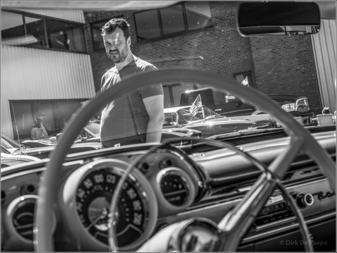
Like usual, it’s the man’s facial expression that intrigued me the most. That’s why I focused on him, and the car’s interior is slightly blurred (still giving enough information for the story, without attracting all the attention – a dosed aperture was required instead of a wide open lens). His face, taken through the windshield, with quite some ghost lights in the way, demanded very elaborate processing, to reveal it’s full expression. Especially his left eye, under the reflection lights, needed additional burning at point level. It was a matter of making the eye to appear, without eliminating the reflection light. Again, the car interior’s processing was quite different. It not only required particular color treatment but also exposure compensation.
—
“Estimating” (11:45h)
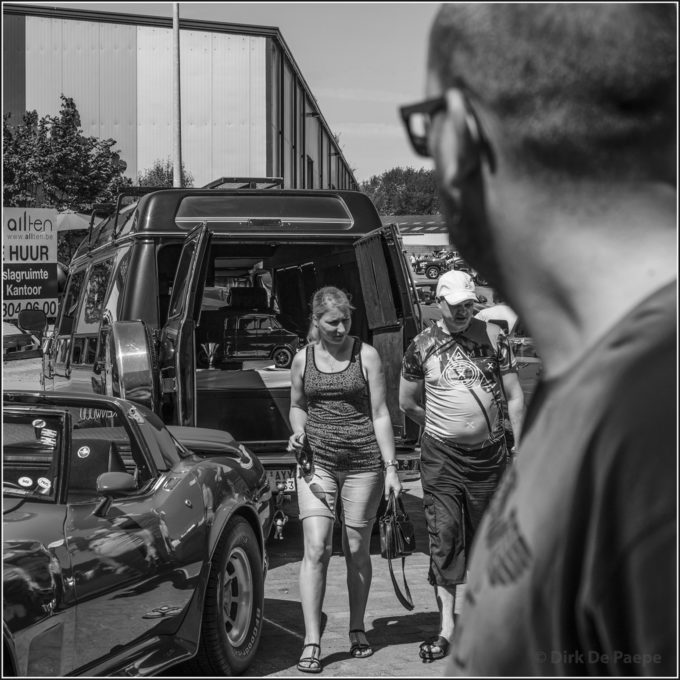
The people are in the lead role, of course, especially the lady in the center of the picture. Both she and her husband are apparently having doubts about the looks of the car there’re watching, which is hidden from you by the guy in the foreground (and doesn’t matter at all for the story – on the contrary). This guy on the right is the only object that is blurred, because picturing in full detail would make him much too prominent. He’s there, just to express the bustle of the event and shows all the detail that is required. For the rest, the DOF reaches up to the people in the very background, adding to the feel that there were cars to see on all places, wherever direction you were looking in.
Concerning the processing, besides the separate treatment of the lead role players and the typical “metallic” color processing for the cars, it was the interior of the van that demanded specific care. Both the colors and the exposure (mainly the exposure in this case though) were handled to reveal just enough information, just avoiding that it became merely a black hole, but still not to draw too much attention. This interior also received a modest luminance treatment in a separate section, to diminish the noise. This was no problem, since the decrease of detail, as a result of the luminance, was no matter at all in this case. Overall, the sectional treatment proved very much to be worth while here.
—
“Dream away” (11:46h)
The somewhat introvert posture of the man makes me believe that he’s fantasizing about owning a car like the one he’s looking at. His face needed special treatment (comparable with the ladies in “Stylish” and “Feel good time”, 3 shots hereafter), since his skin had not the best tan and exposure in the RAW file. Each of the cars needed its own distinctive tint, certainly the first five in the row. I took special care of the difference between the light pink one in the front and the white one a bit further. Especially by deepening the tint of the flank of the pink Chevy, I wanted to make clear that this is not a white car.
—
“What the ….” (11:57h)
In this picture, besides separate treatment of the people, faces and cars, I gave special sectional attention to the color processing of the sky. Without it, it would just have been plain even tinted.
—
“Bridal Paradise” (11:58h)
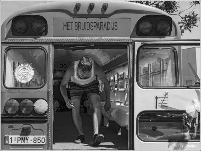
When deciding about the grey shades for the deep yellow bus and the blue sky, I wanted them to be not far from one another, still clearly distinctive. But as you probably can guess, it was the bus interior and the guy that needed the most attention – the first mainly to get everything visible but still keeping it in a more dusky environment, the guy regarding his facial expression and skin tone. I’m sure you can imagine the different sections that were needed.
—
“Feel good time” (11:58h)
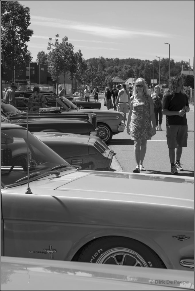
This couple is clearly enjoying the sight of so many different exotic cars. The cars occupy about half of the picture surface and make for the first processing section, again with slightly increased local contrast for their metal shine and specifically dosed colors to give them distinctive grey shades. Their original colors are going from (bottom to top) light red, over metal grey (Mustang), deep lipgloss red, dark blue, black, light blue, etc. None of the cars is fully in the picture, so that the couple really gets the attention. Still the beauty of their design, colors and metal shine largely determines the atmosphere of the picture. But it’s the couple, and mainly the lady, that is the real subject. I find them to nicely illustrate the typical feel good ambiance at the event. With the exposure and color treatment of her dress, as well as with her hair, I wanted to show the bright sunny weather. Her face needed separate processing to lift her expression out of the shadow, without making it too harsh. It was a matter of playing with red and yellow and very slightly lowering the local contrast, but still working with the curves. Also worth mentioning is the color treatment of the tree leafs. By slightly lighting up the yellow, again some brightness was added, without decreasing the amount of different gray shades. Yet, not everything needs to show detail. The husband plays a secondary role. Therefore I wanted to only show detail at the side of his T-shirt. The rest of the shirt was of no importance. Recovering nuances in the front of it (which is easy enough to perform) would IMO cross the line. Here and there an “imperfection” in the picture enhances the non-posed “real life” feeling.
—
“A matter of priority” (12:02h)
Pretty simple sectional processing here. First the general picture, then the car and finally the girl. (There’s no importance regarding the consecution.) Besides handling the colors, the car needed increased local contrast, whereas the girl just the opposite.
—
“Scratch” (12:04h)
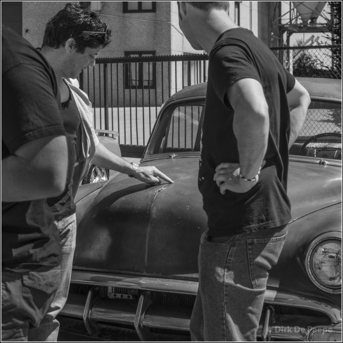
Yet another rusty Chevy from the 50’s in this picture. I guess you can notice that the car got different processing from the rest of the picture, mainly for the local contrast. Of course, when one subject is divided into two parts (like the car in this picture – here it’s divided by the person at the right), one needs to create two sections at the same time, because the processing needs to be exactly equal for both the left and right sections of the car. I guess this is obvious, but for the sake of completeness, I mentioned it anyway. Also special care needed to be taken to slightly increase the distinction of the left person’s head from the background.
–
“Impressed” (12:13h)
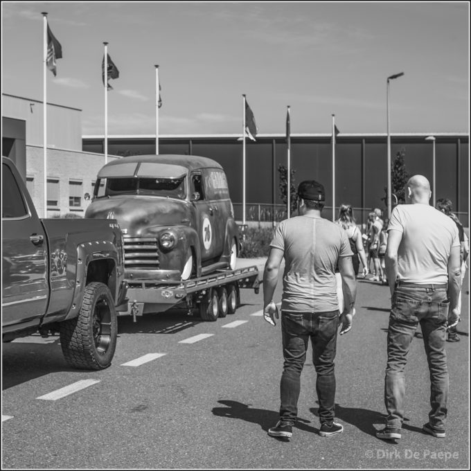
Another rusty one in “Impressed”. This time it’s a Chevy panel truck from the 50’s. A standard color to B&W conversion gave very little distinction between the different tints of the car. The original blue color and the large rusty surfaces appeared to end up at quasi the same grey tint. And also the darker transition between those two colors needed extra accentuation. So a specific color processing was mandatory. A totally different story for the two leading role players in the right half of the frame.
This picture is about how the arrival of a simple old-timer can totally impress two hefty guys – which their body language gives away all too clear. Therefore all the color nuances in their body needed to be present and well balanced. Their colors also needed to be sufficiently distinct from the surroundings, especially the building in the background. Only then, the guys would really pop up and be able to play their leading role, like they were meant to, since I only took the picture because of them. BTW, the ZM Planar makes them clearly pop in 3D, although the focusing was done in a pretty large zone – that is, with a pretty stopped down aperture. (BTW, you can tell that I’m not a photographer who believes a lens should always be wide open anyway. Instead, I rather consider which aperture tells the best story. But that aside.)
—
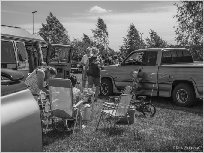
“Family picnic” (12:20h)
A romantic scene out of daily life. It makes me think a bit of certain 19th century paintings. I guess the sections are obvious: sky, trees, cars, people, rest – each with different processing of colors and whatever other relevant parameters. A special treatment for the car panel in the left down corner, since its original very light color was much too bright, drawing much too much attention and creating great unbalance. By darkening it, I wanted it to blend in.
—
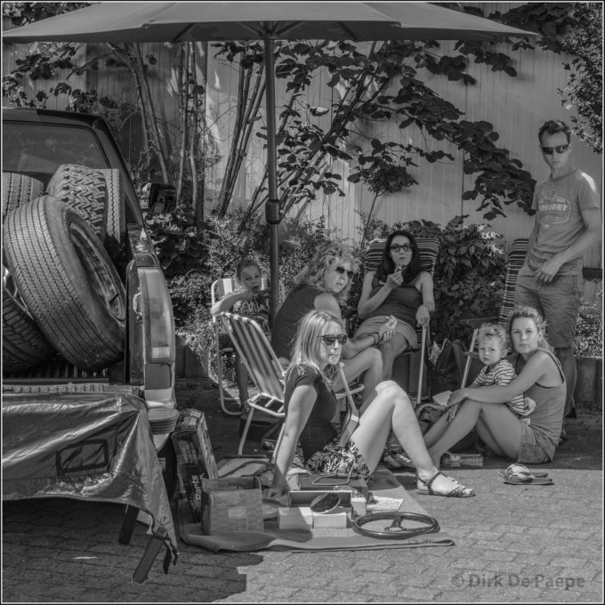
“Cosy family shop” (12:23h)
Same style as the previous picture. Here I wanted to control the tints in regard of the content contrast between the rough truck load and the romantic gathering. Most of the processing went to getting every person’s expression very clear (mainly by enlightening the people’s faces in the background, who were pretty dark), without destroying the effect of sunshine versus shadow. Also the tint of the parasol was treated to clearly stand out in grey tint and texture from the background.
—
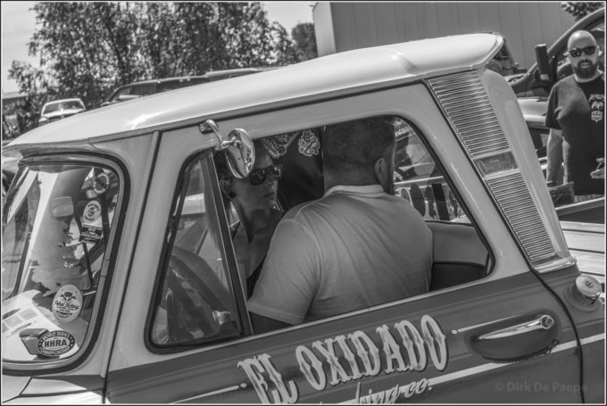
“Reverse” (12:25h)
Rust seems to have become kind of a religion for many participants. This Ford pickup truck even carries the “El Oxidado” signature (“The Rusty One”) on its doors. The rusty colors are carefully dosed and cultivated. In the processing department, of course separate treatments for car exterior, interior and surroundings are mandatory. The interior was the most demanding, since the young woman plays the leading role, showing her concentration when backing up into their parking spot on the show ground. She totally needed to be recovered from underexposure, her colors needing to show her tanned skin, with enough detail and contrast to reveal her expression, yet showing her in a still pretty dark environment. The challenge here was not to overdo the recovering, but still keep her “in the dark”, giving just enough nuance to reveal her expression. Finally her sunglasses got special treatment to reveal the utmost detail. Pretty amazing what modern sensors make possible these days!
—
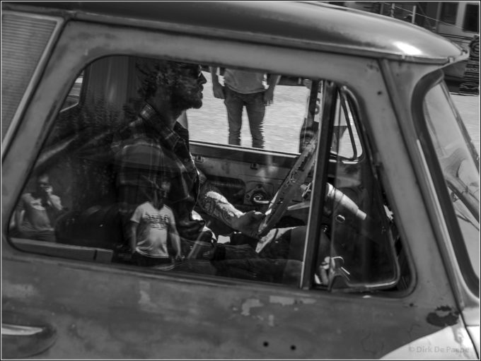
“Beyond Thunderdome” (12:28h)
The same truck model as in the former picture here. But this time the vehicle is even more rusty (this is even real rust, I guess) and quite a bit stripped. It somewhat reminded me of that one Mad Max movie. The processing was very interesting here, since the side window was closed. In this exceptional case, I was more going for extremes, to amplify the expression. Of course this demanded for a specific side window section, with a largely increased local contrast in general, to clear up the content: the car interior on the one hand and the window reflections on the other. Together, interior and reflections created a bit of a surreal image. It was the dosing between reflections and interior that was the most interesting and which I performed with great care. I created quite some differently treated sub-sections within the window to that purpose. For instance the head of the driver needed special yellow treatment to clearly reveal the flame-like reflections. Also the interior back panel demanded a specific treatment, of the green in this case, to enucleate the reflected bushes. Yet another specific section for the tattooed arm. And a next one to reveal the details of the drivers door and steering wheel… Of course the car’s exterior required its own processing, to clearly distinct the red roof from the side panels that have lost their color all together, but exposed different amounts of tarnish and rust, resulting in an interesting play of stains. Pictures like this are a lot of fun to perform, as long as one loves the post-production process. Here I gave reality a clear twist, for reasons of expression.
—
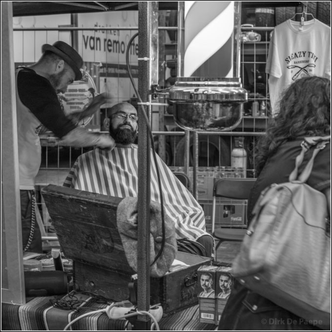
“Pop-up barber shop” (12:45h)
A completely different, but still very typical scene from the Speedshop Springmeeting. Lots of small shops are popping up. Amongst them this barber shop. The picture required very specific treatment, though, mainly due to the very poor light conditions. First of all, the face of the guy in the lead role needed lots of recovering work, to make his expression stand out. But instead of just working with exposure, I preferred to lift up the colors separately, which gave me a much better controllable result. For the rest some specific and distinctive sectional color processing was necessary for different parts. In the turning cylinder (a typical barber sign), the blue and red surfaces needed to stand out as clearly in grey shade as they did in color. The lady, passing by in the right section, needed to be darkened a lot, to draw a lot less attention. Same procedure for the back of the mirror frame at the far left side. And then there is the section between the client and the lady. There were two kinds of crates, with slightly different color, and a clearly differently colored chair. Only sectional color processing could provide the nuances that I wanted here.
—
“Friendly swarm” (12:49h)
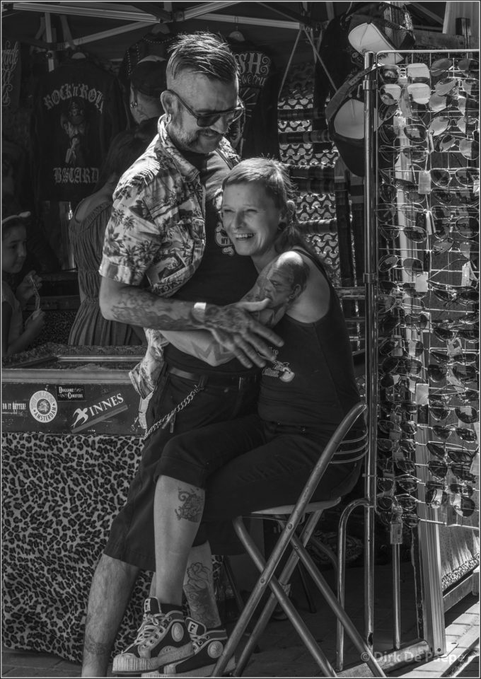
Another pop-up shop in this picture. Again specific processing, of course first o fall for the faces, then for the tattoo’s, and again for the clothing (mainly the guy’s shirt). At the left, the people in the shadow were originally as bright as the leading role players and drew much to much attention. So the exposure was locally adapted, partly with color processing, partly just exposure and finishing it off with a slight application of the burn tool (careful with that, because it will easily smudge the picture). The last section concerns the rack with the sunglasses. With specific color processing, I wanted to show an as rich play of tints in the glasses as possible. I find this kind of pictures very rewarding to work on, since one can make a substantial difference, without making it look too artificial.
So far for the pictures. Although it’s not always obvious, I guess, to notice at first sight what kind of processing was performed, I can’t emphasize enough how important the color processing has been for the final result. Remember that my goal was not to get “spectacular” effects. I carefully tried to avoid “overdoing” it, which IMO is always a great danger with any kind of processing. Instead I wanted the pictures to still have a natural feel. I wanted them to tell a story and I tried to use the processing to increase the expression of the story telling.
On the other hand, one can of course also experiment with customized color conversion, to purposefully obtain special effects – by enlarging the processing maneuvers or even endeavoring the extremes. That would result in a totally different style. Could be interesting as well… Anyway, I hope you enjoyed this one.
I’d like to finish with a big thanks to Steve, for publishing and maintaining this wonderful site and for creating this fine community. Thumbs up!



Dirk
I love how you took a boring car show in a ugly place and turned it into pictures with emotion giving a real human quality of interest to the images. It’s harder than most people think to go into this venue and pull out such great images! I would love to see you take some of them and put some heavy gradients to darken the edges and print them and hang some on your wall so you can enjoy for a while the great shoot you had.
Hello Cash. It really pleases me that somebody expresses in his comment exactly what my goal was with these pictures. What interests me (and what I personally find the most compelling and vast subject in photography) is human emotions. That’s why it’s important IMO to shoot without being intrusive, so to register natural acting people. At the same time one needs to shoot with great alertness for the right moment. Indeed, you get it right, it’s a pretty tough task to shoot these pictures in a good hours time. But it’s also great great fun! I just love shooting at events. Thanks, man!
Thanks for a very well researched and thorough article.
Rgds Fergus
Thanks, for your appreciation, Fergus!
Someone here remarked “tough crowd” regarding the not-so-favourable commentators. But you should reflect why this is so. They look at your pictures and think “something’s wrong”.
A really good photo speaks for itself. You need many words to justify your editing and complain about people not really having read your article. (I did btw)
“Methinks, the Lady doth protest too much” (Hamlet).
Likewise did someone suggest to use a Monochrom and you scorned it because this robs you of your color-channels in post-processing. Of course, because you need to work with an actual Color-Filter in front of the lens. As in working with “real” film.
There is no question that your editing-skills are admirable. If your intention was to show how this editing works, fine, mission accomplished, but the outcome is clearly not worth the effort. The technique is valuable, only you simply overdid it.
When was the last time you took a hard look at a real photo made from film, say, Kodak TMax or Tri-X? Do they look so very artificial with “digital” written right across?
You don’t have to look far. The article following yours by Peter Prosophos shows the real thing. And strangely enough, no one complained about it.
Thanks for your comment, Claus. Really.
I always find it difficult to communicate in writing, since it’s hard to imagine how your words and intensions will be understood. In business, I have always insisted that people who worked with and for me, first negotiated by talking, only afterwords in confirming in writing. That’s impossible here. But the comments give at least some possibility to clarify and nuance our thoughts.
First, I’d like to thank you for your “mission accomplished” comment – it was indeed and my intention to demonstrate this editing technique. I’d like to clarify this. The sectional processing is a technique that I use since many years and that, to me, has proven it’s value so many times. So I have been thinking for a long time to share my experience here. But the problem was that I normally use it to correct (smaller or larger) imperfections. The result is as such never obvious, let alone spectacular to the viewer. The picture gets even a more normal look. So the result is not obvious or spectacular, in the way some other editing techniques do, like infrared processing, to name one. (We have seen some great work here from Dierk Topp with this technique, if I’m not mistaken.) The benefits are very obvious in that case. But not so with sectional color processing. So I thought: if I’m ever to write something about sectional processing, it’s best to make it obvious what it can do. That’s why I thought of writing the article, after I shot those car show pictures.
In the sectional processing, there are two parts: the color processing and all other processing (like curves, local contrast, sharpening, etc.). In these pictures I did quite some heavy processing of the second, to emphasize on the “sectional” processing. The color processing on itself wouldn’t be remarked, like I guess nobody would notice anything being done in the first picture (Enjoy your flight). Well, I admit, these series are more processed than what I have ever done, to better illustrate the process. Too much? Probably for some of you. It was kind of an experiment for me. Still I kind of like the tension between the absolute spontaneity of the scenes and the composition and processing that is very much edited. Not to everybody’s taste and clearly a path that’s not commonly taken. But I have never been afraid of experimenting. Yet, I probably wouldn’t have edited these pics to this level, shouldn’t I’ve had the intention of using them in this article to demonstrate this technique. Or maybe I would – I can’t possibly tell anymore, in hindsight.
Concerning film, I have shot film for about for decades, before switching to digital. I can assure you that I haven’t forgotten about its charms. 🙂
Concerning the Monochrom, it IS a great camera. But it doesn’t allow color processing, of course. Yet, one could still apply sectional processing and then work with eg the curves, or other parameters, if wanted. But fact is (IMO) that many photographers nowadays want immediate results. They have no idea of the work that was to be done in the wet darkroom, in the film era. It seems to me (and many people of my generation), that they have become lazy, or afraid of the pp work, even notwithstanding pp has become a lot more effective and efficient in the “digital darkroom”. If somebody dares to put forward that a photo is not finished after clicking the release button, the reactions are severe. And of course, after explaining all the processing work on these pictures (which horrifies or even frightens many), I was almost certain that these reactions were to be expected. But counting them, there are (at this moment) 7 negatives and 6 positive. A better score that I expected! (BTW, where I put sometimes a few hours work in a picture, taking great care of details, some photographers that I respect a lot, like Dirk Dom, put a multitude of work in it – starting from film, BTW.)
To finish, I just like to say that your Shakespeare quote is not really correct (just check the original text) and that the queen, who spoke these words to her son, Hamlet, also wanted to (indirectly) justify HER OWN remarriage herewith! Something to think about, Claus… 🙂
Hi!
When I still did wet darkroom, I spent on the average six weeks of about six hours a night (until 4AM) on one print, burning and dodging etc etc until it was, to me, perfect. My result would be a 24 inch print. I worked from 35mm 100 ASA black and white film. I was out all the time shooting to get good negatives.
Now, with Photoshop, I do between one hour and twenty hours, often divided amongst about four weeks, on a black and white print. I now shoot 6×7 and 6×9, on 400 ASA black and white film.
I think that with black and white, postprocessing is essential, period! Creative possibilities with black and white are much greater than with color.
Saint Ansel said: ” The negative is the score, the print is the performance”.
Look at the black and white work of famous photographers and figure out how they postprocessed them to make them beautiful.
Dirk, I need to ask you something. Do you have a relative, called Boudewijn Dom? He was a Latin teacher, and very passionate about photography. At the age of 12, I made my very first steps in the darkroom with him. Very shortly, but still…
Maybe you know from former articles of mine that I had a professional education in classical music. Many musicians wonder if Bach would have written his Preludes and Fugues for piano instead of the clavecin, should he have lived in an era that the piano was there. A pretty irrelevant question, of course, but still amusing to wonder about. I believe the most plausible answer is: of course he would have composed for the piano, but he probably wouldn’t have composed preludes and fugues – yet his works would have been evenly great masterpieces for sure.
It’s interesting to make an analogy with Saint Ansel. Would he have shot in color or in B&W, should he have lived now? Film or digital? I’m more reluctant to answer these ones. But I see it as plausible that he would make a totally different kind of work. Maybe even a faster shooting process, with completely different subjects. (A vérrry wild guess!) But it could still be very possible that he would finalize his work in B&W, IMO, due to (exactly what you say) the greater creative possibilities. I add greater expressive possibilities to that – an extra nuance (what is exactly the reason why I show these colorful scenes in B&W, because it’s about the people’s emotions here, not about the cars). I also wonder if he would be interested in processing the colors to get control over the B&W tints… Who knows, maybe he just might… But again, those are all some totally irrelevant wonderings, but still amusing. 🙂
Coming back to the hours of work. Because of my decades of work for publishing and the constant time pressure, I was always forced to find new faster ways to get the same results. I have never taken a result for granted and was only satisfied when the result was exactly as I wanted it to be (which on itself is of course no guarantee for great quality). I have always maintained this way of thinking and working, which is why color processing for B&W is for me the way to go. I find it more powerful and faster, but still offering the same amount of control. But to be clear: this is only MY opinion. No absolute guarantee. I began performing it, by thinking logically, within the possibilities of Photoshop, in my constant search for more effectiveness. Still, after a good three decades of producing pictures with a deadline, I think that maybe it could be worthwhile for others, to give it a try as well.
Hi, Dirk!
no Boudewijn Dom as a relative. “Dom” is a quite common name, it originated as a short for “Dominic” or Dominicus”
Your comment about music is interesting. I sometimes wonder what Mozart would have done with a synthesizer.
Ansel Adams predicted quite accurately the possibilities of digital processing. he started out with 8 by 10, but when he grew older, he switched to Hasselblad, with pretty normal lenses.
I think that if he lived now, he’d use digital medium format. Black and white or color? No idea. I myself use both, but I take black and white much more seriously, although I have beautiful color work I shot with my big Fuji panoramic camera. One has to make choices in life. Making really good prints in color in those days was extremely difficult, I did Cibachrome for awhile in my wet darkroom, with intermediate negatives to control contrast etc but I gave up on it, it also was unbelievably expensive. The few (about three) good Cibachromes I made were stunning, but the 12 color inkjet prints I get made now are much nicer.
About his printing skills, he had both the vision and the technical skills to make his prints. During the time he photographed, very few people had these skills; He also went to the limit of controllability.
Nowadays, because Photoshop is so much easier, it’s technically much simpler to make prints as beautiful as Ansel Adams made, if you have the vision. So, now, there are more people who print at his level; I think that nowadays, he’d not be “the” Ansel Adams, but one of the many top class black and white photographers and printers.
In -my- view simply too much post-processing. Aperture 2.o is tricky if you increase the exposure by software. It is not my intention to offend somebody. Please see interesting link below which describes what I mean. (My English is too bad for extensive comments. That’s the truth…)
http://www.messsucherwelt.com/?p=3522
http://macfilos.com/photo/2016/6/13/post-processing-where-theres-light-theres-also-shade
… in English
Dear Ralf, I fear that you, like many others, have commented on this article without really having read it, or at least without understanding where it’s exactly about. Let me explain.
You mention: “… simply too much post-processing. Aperture 2.o is tricky if you increase the exposure by software”. Sorry, but this is totally irrelevant. What makes you believe that I shot at f/2.0? Because I used the Carl Zeiss ZM 2.0 Planar? I can tell you, none of those pictures was shot at f/2.0. I mentioned that I always choose the aperture that IMO tells the best story, which is most of the time not wide open.
But even at f/2.0, this is still irrelevant. In fact, the essence of this article is the sectional color processing when converting to B&W. Sectional means that the conversion is done in pieces, in sections. How many sections is for you to decide, or for whoever performs the conversion. But the color processing itself is pretty simple and involves no more processing than when you would choose one of the preset conversions, available in Photoshop. Extra processing, of other parameters, is possible, but there doesn’t need to be any if you don’t want, other than the colors. This means that you can process exactly what and how you want – not more than you think is OK. So in fact there is no more processing than when choosing one of the presets – in other words, no more processing than with any other conversion. The only and important difference is: by positioning the sliders manually, you stay in total control. This manual process is the only way to get exactly the grey tints that you want, the more when you customize it for each of the subjects within your picture, by demarcating a specific section for each of them.
Is this bringing any light on the matter?
BTW, with my pictures I only want to demonstrate the possibilities of sectional color processing for B&W. If you don’t like them and you’d prefer them processed differently, that’s a matter of personal taste and I can appreciate that. But it doesn’t affect the possibilities of the conversion procedure.
Very nice and exhaustive exarticle.
I am familiar with using the method mentioned in the first picture, the simplest one. Because I do not use Photoshop, “only” Capture One (which covers 99 % of my needs), I cannot try advanced techniques. The version of Capture One I am using does not allow me to control colours separately for each mask. I believe that new version solves this, so it is time to learn these techniques.
Thank you for inspiration.
Jan
Not exarticle, sorry for typo…
Thank you so much, Jan, for your appreciation.
I can’t tell you anything about Capture One. But it would be very good news when multiple masks would allow multiple color processing. I hope the section demarcation can be done very precisely. If so, this technique would be applicable, indeed.
I’d like to reply to all of you.
1) IMO there’s no single right workflow. There are many. What I described here is yet another technique, with some specific possibilities for specific purposes. Especially when one wants to exactly dose grey scales for different subjects within the same frame, this is useful. I wrote that I found the pictures, taken at this event last spring, to be very useful for demonstrating this technique. This means that I even don’t use this technique myself all the time. But I do it on a regular basis, since I like to be in control. Frequently, I require this level of control, because I like to create images “that are my own”. In this, I’m totally agreeing with BEATS’ comment (thanks).
2) Because I like to be in control, I shoot with manual focus lenses and often apply manual aperture. It’s also why I’m not afraid of a “manual” pp process. Silver Efex is pretty advanced (CLINT and RETOW), but is more preset based, and (correct me if I’m wrong) doesn’t offer the possibilities to perform different processings for different demarcated subjects within one picture. The here described technique is intended for the cases that you want to do just that. I see more and more photographers that hand over the control to the machine, and go for instant results. That’s OK when there’s very little time to finish an image, but I find it a lot more fulfilling to keep control in my own hands. I regret that so many see it as an artistic merit to buy the fastest lens and to shoot it wide open with the best autofocus and the highest frame rate per second, whereafter they brag about their (own) bokeh quality, focusing and timing skills…
3) Also ED’s comment illustrates this. The Leica for sure is a great camera, but I doubt if it’s possible to make your own decision as to how the same color will convert differently for different subjects within the same picture, without effecting the other color convertions. This is what I show in this article and I believe the Leica doesn’t offer this possibility. BTW, I regret that you mention Sturm und Drang here, Ed, which I rather see as rabble-rousing than as a positive comment. Sturm und Drang is a movement in literature (2nd half to the 18th century) which puts freedom of feeling and emotion before reason and ideas. As such, it is totally irrelevant to mention this in the context of this article, which is merely about a processing technique. So I guess you really didn’t know what Sturm (written without diaeresis, BTW) und Drang really is. That’s why I suspect you to have used it just for rabble-rousing – which I regret. I’m open for all counter arguments and welcome them very much, but they must be valid. Sorry for that, Ed.
4) This technique is useful in specific cases. It’s not mainstream, I totally admit that. It’s not for every shot, not by far. But in my articles I often try to take a standpoint that is not common. I believe this is more interesting, because the mainstream techniques are already all over the internet. There’s no need for me (or anyone else, IMO) to again repeat what has been said already so many times. I tried to add something to all of that.
That’s also why I took those pictures in black and white, DAVID BABSKY. There are plenty of images of those car colors available. I don’t feel any need to add to that, by just showing more beautiful cars. BTW, these shots are not about the cars, they are about the people and how those cars influence their behavior. Having the pictures in color would weaken their story. I’m sorry that you didn’t get that, David. But thanks for your reply.
5) Wanting to be in control and preferring a manual workflow apparently puts me in a minority position. As does my preference for a softer contrast here, PVILLUMSEN. I chose for B&W because I was thinking of pictures from the era of those cars and because the people are the main subject. Those old pictures, as I remember them, didn’t have the strong contrast that is kind of a tendency for some years now (and is pretty easily provoked). It’s indeed a personal, subjective choice. But I’m really glad that you did the effort to get into the thinking behind the process. Apparently, you’re one of the few. I hope it can serve you well for some of your future pictures. 🙂
6) I just don’t get RALF’s comment about the 3D-Pop. I would have liked you to have been more precise, Ralf. Is it a default of the Zeiss lens? Do you think it’s a result of the color processing? Is it in all pictures? With all subjects? Or just in a few cases? I find it to be just a bit too easy to launch this thought, without doing the effort to be more precise. Just following the mainstream of criticism?
I actually wasn’t referring to rousing rabble but to the tumult of extra activity to achieve the desired result. Nor was I belittling your thoughtful process. Your effort is informatively fascinating and clearly shows a mastery of PP technique beyond that of most users (myself included).
I was simply suggesting a way to avoid the conversion altogether (Leica MM) or pointing out superb native B&W output (Ricoh GR).
Dear Ed, written words often come out more severe than they were meant. Really, I have great admiration for the MM concept and the Ricoh BTW. But they are not for me.
I don’t know if I clearly understand what you mean with “the tumult of extra activity”.
Is it that there’s too much pp work being performed on my pictures? If so, I can only say that I’m absolutely convinced that it’s essential to take care of every picture in pp and that my amount of work is not that much, compared to what many others perform. I believe the the color processing helps me to more quickly get exactly the tints that I want. And to me, that’s one of the reasons why I prefer to work in this way. Whenever I would have to work with an equipment (how good it might be), that had it all finished for me, it would leave me with a feeling of incompleteness, being unfulfilled. Of course, one can always edit MM files as well to get them absolutely as wanted, but I believe the sectional color processing is a faster and more powerful procedure. But I never used the MM, so I can’t proclaim this as an absolute truth.
Is it that I did too much work for the article? In that case, I would absolutely regret that. Yes, I worked hard on this article (like I try to get everything right that I do), the only reason was that I wanted to make it clear for everybody of you what the great possibilities are of the sectional color processing technique for B&W. … As long as one doesn’t scare away from some work, and only finds something good, when it’s offered to him without any effort. I know that I’m not the only one that finds “preset results” to be not his own work, but the work of the machine. And I know that I’m not the only one that isn’t easily satisfied.
Hello!
This is an interesting way of working.
I only rarely convert from color to black and white as I shoot black and white film.
When I do convert from color, i aim for a maximum in grey tones and then I make every grey tone exactly as I want it using burning and dodging.
I also work with Photoshop. Sometimes I work at an image for twenty hours. I go into great detail. I use the full palette from black to white.
I learnt it forty years ago in the wet darkroom.
Thanks for posting this, it’s a new way of processing to me.
Bye,
Dirk.
Hello, Dirk. How remarkable it is, that the most positive reaction so far comes from someone who is extremely serious with his photography! Feels really good. Thanks for that!
I understand how you try to recreate in Photoshop what you do in the darkroom.
Due to the fact that I necessarily had to process digitally for our publications, since 1988, I develloped a different way of thinking through the years. I think this workflow is more geared to digital files and equipment. I guess the here described procedure offers the same detailed way of working (because you can demarcate as many and as fine sections as you wish) but is more powerful, since the sectional color processing gives you direct access to all gray shades, while maintaining the natural transitions within each color (without effecting the others) and thus maintaining the corresponding gray values. And whenever you want to deviate from this, you still can burn or dodge – which BTW I think is more secure, when performed within a demarcated section.
It’s my personal believe that, whenever you want a final B&W picture and you require the ultimate control, it’s the best way to start with an original in color, because of the tremendous control of graytints the sectional color convertion process offers. Even when you shoot on film, I guess this is the case. But of course, develloping the film is a lot less easy to perform yourself in color than it is in B&W.
Still, I can totally get that someone wants to stick to the traditional way of manipulating grey tints, analog to the wet darkroom procedure, for reasons of how it probably results in an even more “handmade” look. But as I said, you can still add some dodgin/burning to the color processing. So this procedure may well be the best of both worlds. For sure it is to me. 🙂
Hey DdP,
My compliments on your command of written English. That is a lot of text to prepare in a language that is not your native tongue….well done.
Although I do not use Photoshop, I’ll see if some of your techniques can apply to Lightroom.
Cheers
Thanks for your appreciation, Richard! I’m sure you can use some of these techniques in Lightroom. But I doubt if it’s possible to demarcate sections within a picture with Lightroom. And the most powerful application is when applying the color conversion in different sections. I believe all Lightroom possibilities are available in Photoshop, within comparable control windows. So whenever wanted, I believe that one can perform the same workflow in Photoshop as one does in Lightroom. But then, there are all the extra’s in Photoshop, the IMO are really worthwhile. Maybe it’s a good idea to think about upgrading to Photoshop?
Tough crowd!
🙂
I have the impression that, like it is often the case, some people give comments before having read where it’s really about. Thanks for your sympathy, Rodney.
Best monochrome images without the above Stürm und Drang?
Get a Leica Monochrom, v.1.
Best OOC B&W without the heady investment of a Leica? Ricoh GR
the 3D-Pop is a little odd artificial
i really like the process and the thinking behind it. Some really great images here. Overall (and i know that is very subjective) I would have processed the images further – to get more contrast and punch back. Thanks a lot for sharing!
B-b-b-but why? Why turn the gorgeous-colour cars to black and white?
Surely part of the fun of these cars is their bright colours? To me, it’s like using Photoshop to remove the people from the photos, or to blur out all of the cars, or to replace the cars with fish, or cups of cocoa.
..I mean ..why do it? What’s the point?
All I can say: Silver Efex avoids 90% of all your hassles.
1++
In my opinion a much faster and better method is to use Silver Efex…adjust a few sliders and bam. I realize the finished product is a subjective thing but most of these conversions look too flat for my taste.
Silver Efex is a great starting point, but I like to move the sliders a bit to “make it my own”. And turn off all that godawful grain of course…