Summer vacation with the Phase One IQ250
By Andrew Paquette – www.paqphoto.com
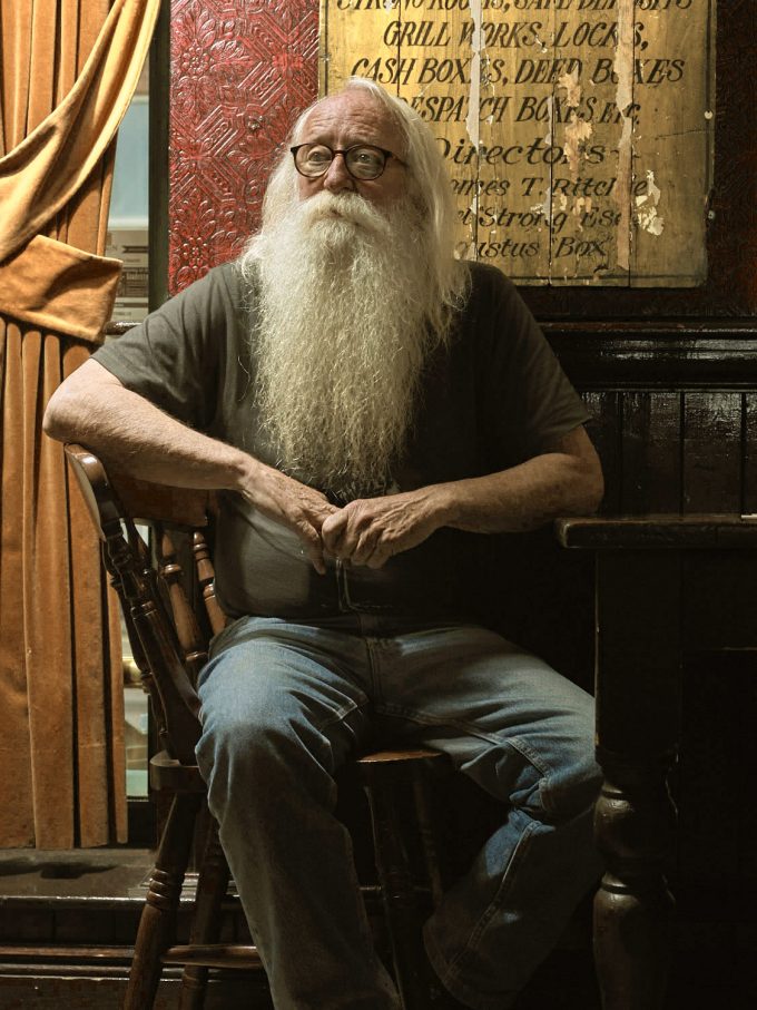
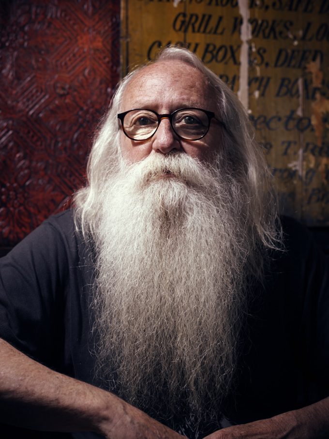
I’ve had a few portrait shoots recently, and a couple of others that gave me a chance to grab a couple of portraits while shooting something else. The first shoot, Ted, is a friend of mine who was giving a talk in Utrecht. We met up at a pub where he generously gave me about two hours to get the shot. The pub was tiny and full of people, making it feel a bit like a Chinese puzzle trying to get the shots. Just moving one leg of the tripod, any of the lights, or any other piece of equipment took quite a bit of negotiating the positions of everything else. After about an hour of working in this cramped space, everyone cleared out and we had all the room in the world. We didn’t use the first group of shots and instead went for a couple of images that remind me a bit of an old N.C. Wyeth painting from Mysterious Island (Figures 1 and 2). You can see the illustration here. The first of these portraits used one ProFoto B1 light, the second used two of them—the second at a low setting for side fill.
Figure 1 Ted 001, f/8, 1/200s, ISO 200 SK LS 80mm
Figure 2 Ted 002, f/4.5, 1/160s, ISO 200 SK LS 80mm
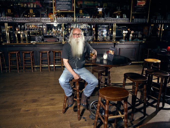
The last shot of Ted was made in the empty bar with a 28mm lens. We had one light to light the bar behind Ted, and another in front for Ted. The final image is a composite of two frames, to remove a bartender in the background.
Figure 3 Ted 003, f/4.5, 1/100s, ISO 200 SK LS 28mm
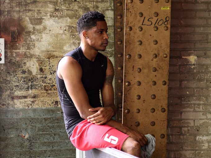
This next shot (figure 4), is a player at the Tilburg Streetball Masters tour during a time out. This one was shot in natural light for a change, against some really interesting textures on a wall. I wouldn’t want a wall like that in my house, but they can look nice in photos.
Figure 4 Time out, f/6.3, 1/125s, ISO 200 SK LS 150mm
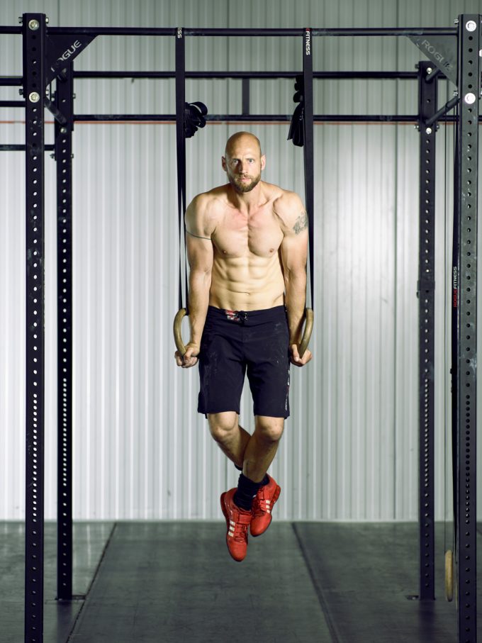
A few weeks ago, I did a fitness shoot in Nijmegen at an amazing factory complex. While there, the model suggested we talk to the owner of a crossfit gym there, to borrow some props. Not only was the owner very generous about letting us use some of his equipment, but he also posed for a shot. This is him, Arjen, working out in the background. We have a light in the background to light the wall and eliminate shadows from the foreground light aimed at Arjen. I adjusted the photo a little to make the background a little green, to emphasize his skin tones and red shoes (figure 5).
Figure 5 Arjen, f/4.5, 1/200s, ISO 800 SK LS 150mm
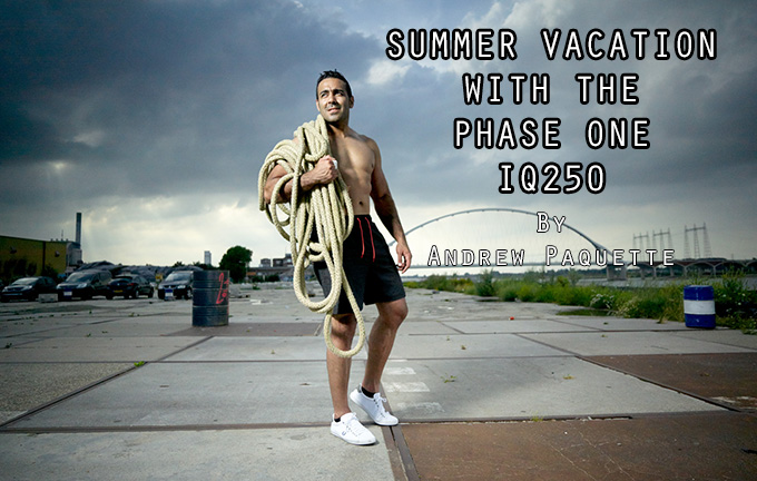
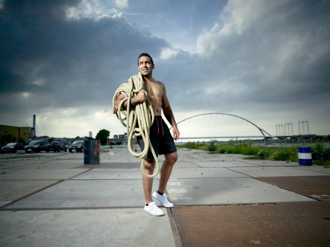
Ali was there for the fitness shoot in Nijmegen, but in between shooting him climbing ropes, pulling tractor tires, and other exercises, I snapped a couple of shots with the lighting setup that we had. Although I like the first shot (figure 6), it has a flaw that bugs me also. It was very bright that day, but I wanted the sky dark with a spot on Ali. Setting the ISO low and increasing the shutter speed didn’t make it dark enough, so I went the other direction by putting a Lee “little stopper” filter over the lens in addition to the .6 ND gradient filter that was already there. With those filters, I got the light I wanted, but it also made it impossible to see anything through the viewfinder. This meant that focusing was done through my tethered setup, which took a lot of tries to get it right because Ali was moving so much in the shots. This shot was done quickly, before I’d worked out the focus, so it is softer than I would have liked.
Figure 6 Ali 001, f/4.5, 1/250s, ISO 3200 SK LS 28mm
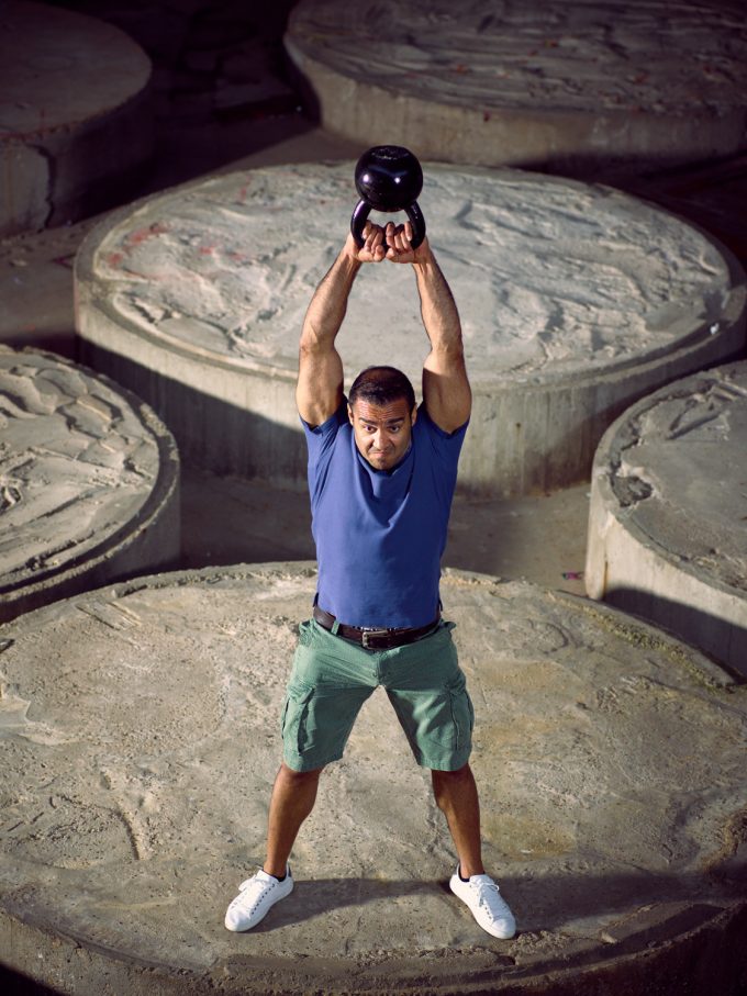
This location in Nijmegen had several awesome spots to shoot from, and each looked different from the others. In Figure 7, Ali is holding a 28kg kettlebell over his head while standing on a huge circular concrete platform inside an abandoned warehouse. To get the shot, I am standing on a rickety metal stair that led to a catwalk that ringed the area just below the roof. We had a B1 unit without a light modifier set to full intensity six meters to his right, and another about five feet from where I was standing with the camera. The second B1 had an octobox on it to soften the light and to provide some side fill.
Figure 7 Ali 002, f/4.5, 1/200s, ISO 800 SK LS 150mm
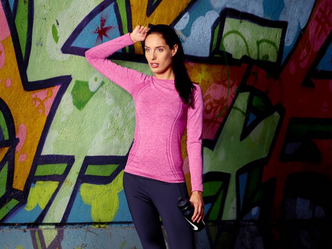
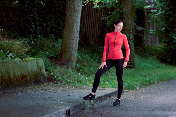
This next two shots are of Mandy. The first is a lighting test done for a fitness shoot and then “the real thing”. In the end, the lighting test was one of my favourite images from the day. It was raining for this part of the shoot, so we set the camera and light in a bike tunnel facing out. Although I used the 150mm on other shots presented here, this is the first time it was used in the field. I like the lens, but was surprised by what a difference it makes when communicating with the model. For all the shots I used it on, I couldn’t talk to the models directly because they were too far away. Instead, I yelled out instructions to the lighting assistant and then he relayed instructions to the model.
Figure 8 Mandy f/3.5, 1/200s, ISO 200 SK LS 150mm
Figure 9 Mandy 02, f/6.3, 1/100s, ISO 200 SK LS 150mm
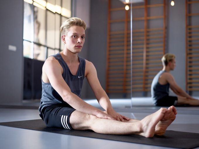
After the Mandy shoot, I did a yoga shoot in Rotterdam. Most of the photos are too fitness-oriented to work as portraits, but one shot of Martijn while we was warming up was shot as a potential portrait (figure 10). Unlike other dark gyms I’d shot in the past, this time it wasn’t so difficult to get what I wanted—probably because I’m starting to get a lot of experience shooting in dimly-lit interiors. For this shoot, the biggest challenge was the wall of mirrors behind Martijn. Positioning the lights so that they were out of the way, and the same for me and all the camera gear, took some ingenuity.
Figure 10 Martijn, f/2.8, 1/125s, ISO 400, SK 80mm LS
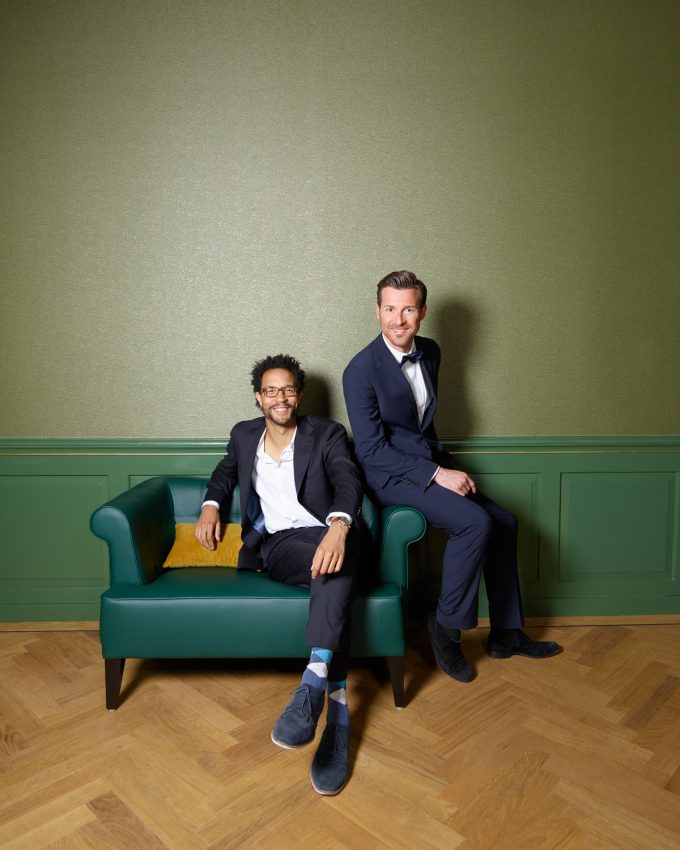
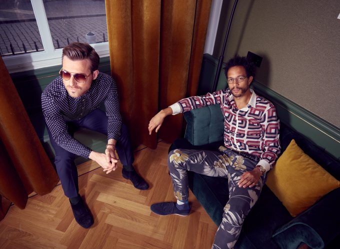
Just before the summer holiday, I’d been contacted by a former student about doing a double portrait of him and a friend of his. I liked the idea, but had a hard time finding a location. My first idea was to find a nicely furnished elegant home and do the shoot in the living room. However, I didn’t know anyone who had the kind of living room I had in mind and neither did Johnny. A friend pointed me in the direction of a new hotel, the Nassau, that had just opened. According to my friend, it might have a room that would work. It did, but they wanted 250 euros to use it for four hours, and another 129 euros if I wanted a changing room. I didn’t want to do it because of the cost, but as the summer wore on and we still hadn’t found a location, I decided to bite the bullet and get it done. This decision was aided by the fact that another shoot I had planned for my last week of vacation had to be cancelled. If I wanted to do the portrait, I had to do it quickly.
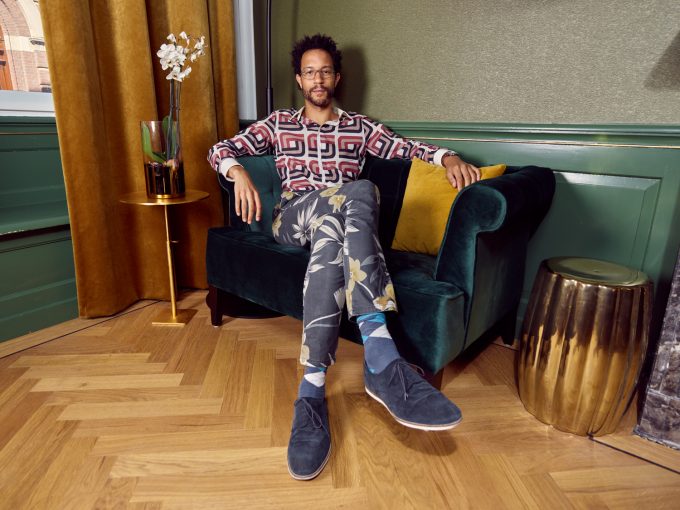
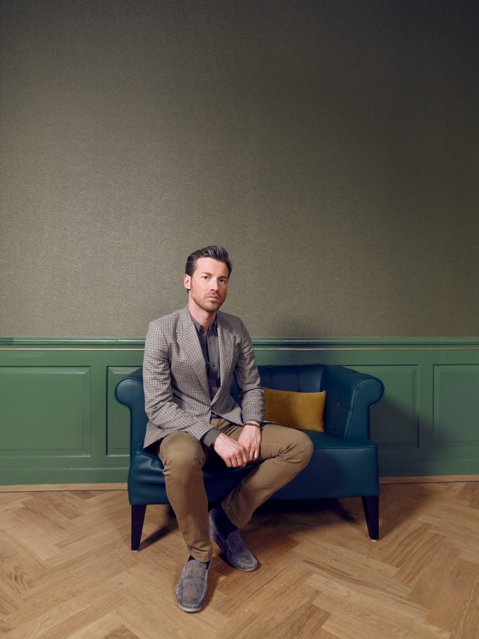
The hotel was great, and Johnny and Pascal were very patient while I tweaked the lighting over and over again in a process that feels very much like painting. The biggest challenge was that the room we did the shoot in was fairly small and it was crammed with furniture. To set up the equipment, I had to move almost everything to one side of the room, and then every time I wanted to change the lighting or the camera position, I had to move the furniture again. In the end, we got about six shots in the four hours, but not the head shots I wanted so we will do those later.
Figure 11 Johnny and Pascal, f/7.1, 1/200s, ISO 400, SK 28mm LS
Figure 12 Johnny and Pascal 02, f/5.6, 1/200s, ISO 100, SK 28mm LS
Figure 13 Johnny, f/5.6, 1/200s, ISO 4100, SK 28mm LS
Figure 14 Pascal, f/7.1, 1/200s, ISO 400, SK 28mm LS
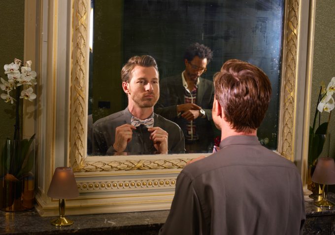
Figure 15 Mirror, f/10, 1/200s, ISO 400, SK 80mm LS
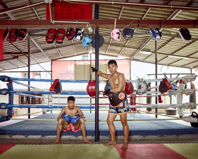
I am cheating a bit to include the last shot in this article. The Thai boxers were shot last summer in Thailand. I’d forgotten about the shot until cleaning my hard drive this year. It took about four days to go through the thousands of photos I had cluttering my hard drives, but in the end I managed to delete about 1.5 terabytes of rejected images. Among them, I rescued a handful, this one included, that I had never processed. I don’t know the model of the rented light I used for this shot, just that it was a Broncolor unit.
Figure 16 Boxers, f/5.6, 1/40s, ISO 200, SK 28mm LS
And that is what I did for my summer vacation!
AP



Unfortunately I tend to agree with the first comment here. In many of the compositions the subject is very close to the centre of the frame, which I don’t think improves the picture is most cases. In order:
3 – the framing and composition just don’t really work – subject in the centre, camera above his eye level, line running out of the frame on one side, and dead space on the other
4- subject is facing away from the light on the left of the frame, though this doesn’t create nice lighting, and is boxed in by a beam to the right, and too centred
5- I shoot male physique and the lighting is not particularly flattering
6 – agree that the ugly background doesn’t seem to add to this, or if it was intended to, it lacks drama or mood
8&9 – look like they are supposed to be “natural” but just come across as rather posed and static
10 – I keep looking at the out of focus light switch on the wall on the left, and I want to see his full reflection in the mirror. Moving the camera to frame the LHS on the windows, and moving the angle of the camera to get more of the OOF mirror would have been a better composition in my opinion
13 – not sure what’s going on with the wide angle lens and enormous legs and feet
14 – much too much dead space at the top of the frame, and a little lost in the centre of the frame
The others I like for various reasons, 16 seems out of keeping with the others, and the background does nothing for the photograph (bright outside light draws the eye).
Sorry if this seems rather damning, but these were taken with a very high end medium format camera, and I am left wondering why, sorry
Some suggestions mostly about composition. The one with the guy in the middle of the bar has all of those bar stools in a line pointing up and out of the photo on the right. On the left is dead space. I really don’t like the hand on his crotch for a pose. I prefer the close up shot of him, but I think it’s slightly out of focus. The one of the guy in time out has that vertical beam that blocks him in. If he had been facing the other way, it might have given him some more openness. The one with the guy holding all the ropes would do better with a different background than a trash can, a parking lot, and a bridge line running right into him. A few of them suffer from distortion like the apparently enormous feet and legs on Johnny sitting in the corner. I like the one of Pascal (I think the top could be cropped a lot) and the mirror shot. My favorite is the one of Johnny and Pascal. It looks very natural.
I also like the photos – Ted is a particularly good subject! Otherwise I think you do better in the off-centre shots. Too many centre or near-centre give a certain eye fatigue.
Like the shots great but the poses could be more natural the ones that are more natural or casual are better
Hi Andrew,
Lots of interesting shots here (I love Ted on a barstool; must be an interesting guy, if only for his ZZ Top beard!), and challenging approach as always. I also like the portraits that end this series.
Thanks for sharing!
nice portraits – good compo!