Fine Art Portraiture with the Leica Monochrom
by Jan Hartmann
What is FineArt Photography for me?
Beside my work on commercial projects I am still someone who needs a kind of artistic photography. In Short, Fine Art is only another word for artistic photography. Doing Fine Art Photography allows me to express myself and to get into a creative process. Within in this process i can realize my visions and ideas. What I like most about it that I can slow down and have more time to put the focus on composition, expression of the model and the overall impact of the emerging image. And one important element for this kind of work is the Leica Monochrom. The concept of the camera does not have big menus as other digital cameras and reduces everything to the basic parameters of photography – shutter speed, Aperture and ISO. That’s all you need. So you can concentrate on the main part of your work. The Model, The Moment and the Composition. That is where you have to be and not lost in menus.
Working with Models
I am not that type of photographer that is frequently looking for new models to work with. A decisive aspect is that I can establish an identical human level and good communication to the people I work with on a free basis. Consequently I prefer working in longterm corporations with a fine selection of models that share my philosophy of teamwork.
One of them is Amelie Lezcano Mendoza“ with who I have just worked 2 times before this project. We both love the timeless character of black and white photography and prefer a natural and authentic look.
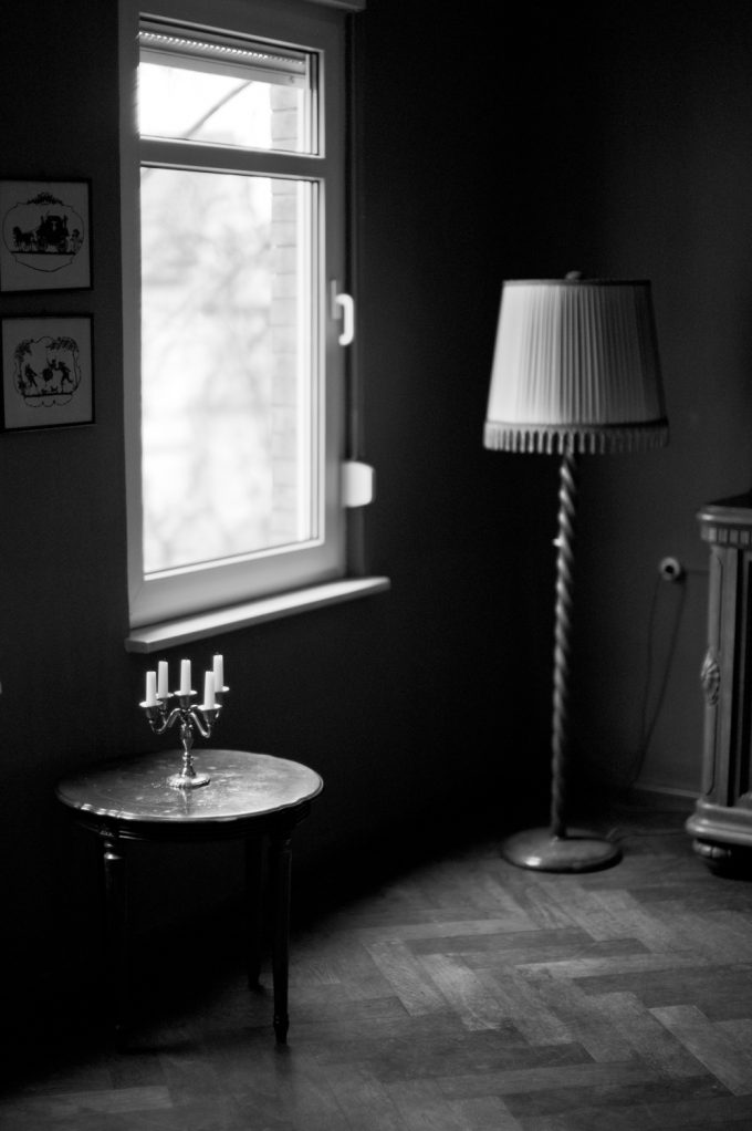
The Location In the tradition of working in a Team Amelie was responsible for scouting locations and selecting one. She had chosen a very nice mansion in the architectural style of 19th century. The rooms had a really esthetic interior and big windows that are perfect for the work with natural light.
The Monochrom in Action
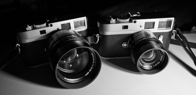
So the Day came and we were drove to the mansion and went into it. While Amelie started to dress herself and have a final look on her makeup, I checked my to M Monochrom Cameras. Both of them are in silver-chrome.
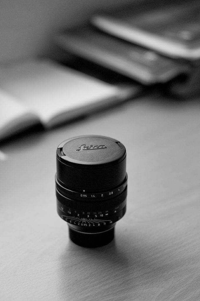
On the first Monochrom a 50mm Noctilux ASPH f/0.95 is mounted and on the other I use the 50mm APO-Summicron ASPH f/2. You will wonder why the hell I use two 50mm lenses and indeed the most expensive in the whole leica lineup. I am 50mm junkie. The first I owned was the Noctilux, a dream of a lens, of which I had a lot of sleepless nights until I got it. The APO is truly another beast and renders totally different. I use them for different shots and situations.
But there is not THE SITUATION for each of these lenses.
My favorite lens is still the Noctilux. No other lens I used has this special rendering. It turns every scenery into a dreamy and aesthetic look. It is amazing to see these soft and natural skins of the models when using the Noctilux. The 50mm APO Summicron ASPH f/2 is more for the “real world“ shots. It renders like there is no lens. And in combination with the Monochrom the results have a look that tends to medium-format-quality. This is visible in the high amount of details and the areas from sharp and unsharp in the final image.
When Amelie finished her preparations we just started on one of the windows. The first thing I always check is the right exposure. In this case the histogram is very helpful, because if you overexpose than the whites are blown out with no information. That is the Achilles heel of the Monochrom Camera. You just have always to expose and take care for the highlights. If you do so, the rest is just easy.
To work with Amelie is a joy. She doesn’t need detailed instructions, only smart corrections. Her posing and facial expression happens very intuitive and natural. What always impresses me is here authentic expression.
This is something not many models have. That is a big advantage and influences the final results in a positive way. The big and bright optical viewfinder is something I like the most about the Leica Monochrom. I just see the whole scenery and so it is a lot easier to frame and make the composition.
The 1.4 viewfinder magnification enlarges everything and this help a lot to set the focus plane where you want it – especially with the extremely thin DOF of the Noctilux 0.95. That is much more precise than working with Manual Focus on DSLRs I used before I went to Leica. One general aspect that makes the Leica Monochrom outstanding is the richness of tones. Especially the middle grey tones are unbelievable. I am a fan of the CCD Generation. For my eye the rendering of the CCD is very much like film and does not look so digital.
The Relation between the Leica Brand and Passion for Photography
Now it is nearly a year that I started to work with Leica. My initial reason to change was the fascination for the Noctilux. What i noticed when i had been working with Canon DSLRs before that there was no real relation to the equipment. You just used it for its function.
But with Leica it is another game. I really love the work with rangefinders and manual focus lenses. With the Leica Monochrom you just get the essential feeling of photography with the basic elements. And what makes Leica unique in this times is the mix of technical perfection, lifetime-built-quality and the simplicity. I am getting nervous when I can not work with my Leica cameras for some days. This is truly very subjective. But for me it is important to have the equipment that makes you passioned and inspired and this is definitely the case with Leica.
Aspects in my Fine Art Portraiture Work
The most important thing in my work is the emotional aspect. That means the final images should transport a certain feeling. When I work with models I don’t want to see a program of studied poses performed like a machine. My pictures should get an authentic and natural character. In the interaction with the model I try to bring them to be as they are. So when I look at the image I want to get an idea of the person and the character.
Communication is the base of a successful portraiture project. If I have not the right communication, I don’t get the results I want. And these are important requirements that I can go into a creative process, looking for light, the right framing and composition.
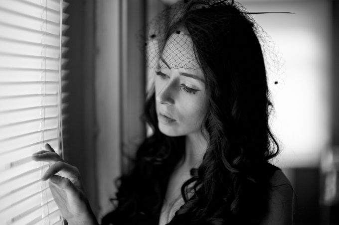
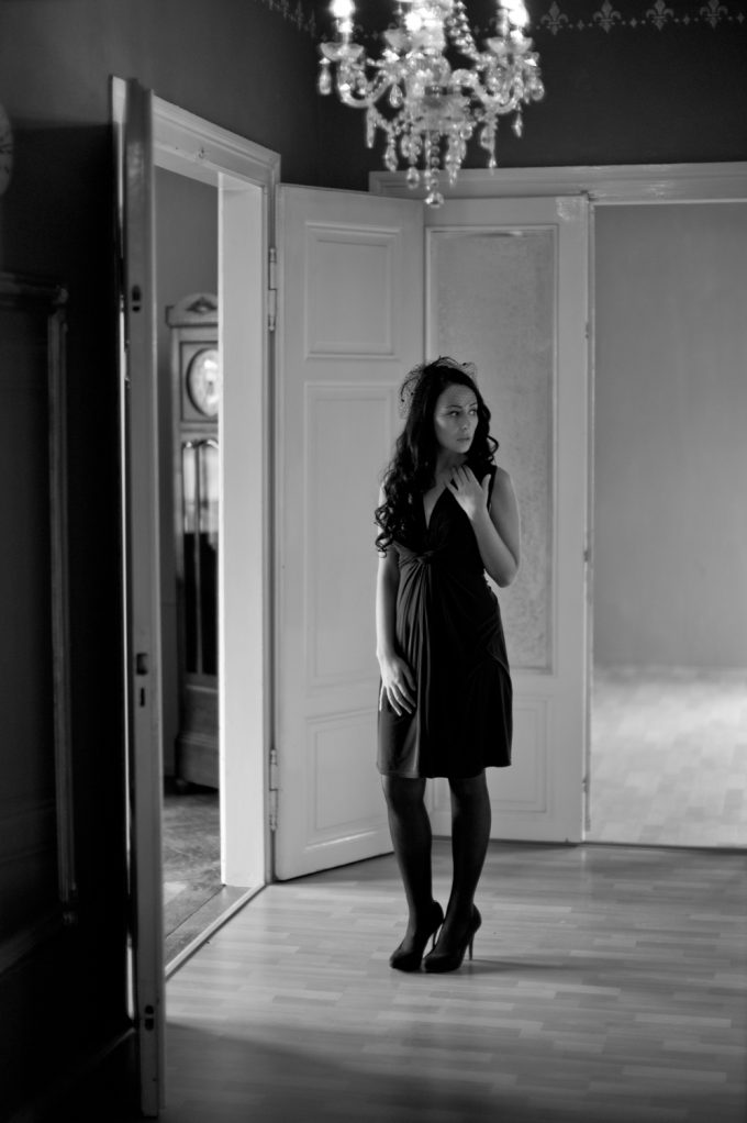
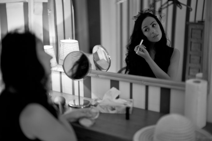
At the end I just want to show you some pictures from the Fine Art Portraiture Project with Amelie.
Web: www.janhartmann.photo
Facebook: www.facebook.com/janhartmann.fotografie
Email: contact@janhartmann.photo



Hey Jan good work on putting your work out there. I am not much of a critic or a great photographer in any sense of the word but your pictures are nice and have a certain rendering that I like. I think fine art is a suitable title. Fine art is basically visual art that was created primarily for aesthetic and intellectual purposes and judged for its beauty and meaningfulness. Based on the many comments preceding mine there seems to be some lively discussion as to what your pictures are and how others feel about them. Me if I look at it and it pleases my eye I like it. I don’t worry about the cup being too soft or the candles in the girls private parts. But that is me. Anyway I am a big basketball fan and with Kobe Bryant retiring many people either loved him or hated him and he was a great basketball player. So maybe the same can be said of your work based on the comments I am reading. Anyway good on you and these are just my humble two cents.
Is this a late April Fool’s day joke?
A bit late in the day, but here’s my take in these images.
Jan is obviously proud of the expensive stuff he’s been able to afford due to hard work, and why deny him that pleasure? But he does publish the images made with that equipment here, and by doing that offers them for close scrutiny, words dipped in honey or in vinegar. If I were Jan, I’d bypass the tone and look closely at the content of the comments. Life is too short to feel insulted (rightly or wrongly) by things said on the net about stuff you put there yourself.
So…
I understand the approach, some images work, a lot of them suffer from less than very careful composition (I won’t repeat other comments here), “Fine art”? Please explain; that phrase didn’t slip in by accident.
“Fine art” strongly reminds me of the ads of galleries in an American b&w photo magazine; that look, which appears to be replicated somewhat here.
Nothing essentially wrong there, and the old rules of careful composition still apply. Sloppy composition (I’m guilty of that many times) can’t be overcome by choice of equipment.
The equipment used here doesn’t really interest me; Instart by looking carefully at the images, and go from there.
I use a 50 or a slightly longer than 50 often for portraits, but prefer to come in closer, and that’s where ultra sharpness becomes an obstacle rather than a benefit. Shooting wide open at 80 cms defeats the purpose as well.
I’m actually planning a submission on portraits with the slightly longer than 50.
Thanks for sharing Jan.
I do not normally comment but it is obvious Tom is trying to over compensate for his poor performance and tries to elevate himself by running others down. Feel sorry for his wife if he has one.
Brian: “over compensate… poor performance ” – care to enlighten us on either?
Elevate myself?
Why bring a.n.other into your post, my wife even?
Seems Brian, I have jangled a nerve and you don’t like it – you have hit rock bottom with your comments, no way back sunshine.
Best revert back to the default Brian mode: not to comment in the future. Hang your head in shame.
Hi Jan,
I’ve found the comments in this forum very interesting. If these photos were taken by cheaper cameras, people would praise. If it’s opposite, you will be beaten up. This is a lot different from the comments in this forum few years ago when there less non-Leica users. I don’t think it’s right. People have rights to use equipments they love, cheap or expensive. In your case, it’s a hard-earn money.
Your photos are amazing and I really like them. Please keep posting.
Best
Thanks for sharing this portfolio. Some shots I liked, some I didn’t. (I think when you wrote ‘longterm corporations’ you meant ‘long term cooperations’). 😉
There are a few ways to make MM shots look really good. Here, the tonality is what I would call neutral – neither flat nor snappy. I don’t have an MM but you are absolutely right that the highlights can be easily blown. You can underexpose a lot, though, so that makes up for it. Some people do not understand why a monochrome sensor makes sense, but that is their problem, not mine!
You are also right that there are only three controls that a camera should have: shutter, aperture, focus. Even when focus is done by pushing a button, it’s still just focusing. I am open to supplementary controls like exposure compensation. And if the camera has a stabilized sensor, you should have the option to turn it off. But the fewer options the camera has, the better.
I love the location and some of the photos worked out great. But for some reason I expect a bit more… what’s the word… ah – drama.
I think you know what I mean, right? We’re not talking about simplistic crap like hyper-grain, high contrast, blur, computer effects, stupid poses, saturation or explosions. 😉 We’re talking about composition, light and perspective. I’ll try and explain this in the best way that I can…
The easiest thing to suggest is to look at some of your favourite movies and note when you really like a shot. There is too much to examine from this angle, and you would have to be discussing these things in person with someone to really figure out why certain shots have more drama than others. But movies are a good resource because actors are never sitting for portraits – they’re doing something, although in a stylised way.
But it exists in photography, too. Drama is just another way of saying that you are drawn into an image because something interests you, it captures your attention, even a little bit. In these photos, there is not much drama.
Here’s a simple example where I don’t need to show you an image: imagine a blue sky, photographed with a yellow, orange or red filter. Perhaps the moon is in the shot. And there is an airliner – not too big in the frame, all the way up in that dreamy stratosphere. Maybe there are contrails. Maybe not. Think about that – it’s simple, but regardless of how simple it is, or how often it has been done, this kind of shot will always be dramatic, because our emotions are primal.
Or how about this shot from ‘The Shining’:
https://film-grab.com/2010/07/09/the-shining/#jp-carousel-1669
Or this from ‘Eyes Wide Shut’:
https://film-grab.com/2010/07/11/eyes-wide-shut/#jp-carousel-1952
Or this from ‘2001’:
https://film-grab.com/2010/07/06/2001-a-space-odyssey/#jp-carousel-1871
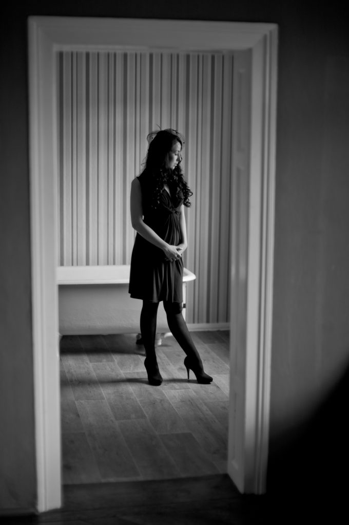
That last shot wasn’t quite right, as you can tell (even the best people can make mistakes). But compare it to the shot of Amelie in front of the Venetian blinds. I think you overlooked an opportunity to use perspective (i.e. where the camera is placed) to create drama with the blinds. You don’t even need a wide-angle lens – you just have to put the camera in the right place.
Even a headshot can have drama. Why? For a simple reason: the simplest way to create drama is to have the subject face in a different direction to where their body is pointing. You don’t have much freedom with headshots, and they do all look the same, even if they are done well. But well done headshots are still attractive.
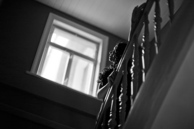
Perspective is an important element. Put the camera higher than eye level and we have a sense of drama as the camera looks down. Put the camera lower and the sense of drama increases as the camera looks up. Most of these shots look as though they have been taken at eye-level – there seems to be no consideration for perspective.
Perspective sometimes is just a technical thing, too. The shot of Amelie in the bathroom is not bad, actually, because there are no distracting elements. But because the camera was not at the optimal perspective, the door frame in the foreground is not level. I think that composition is too wide, though, and I don’t really like the way Amelie is posed.
Drama can also be created by using opposites or symmetry:
https://film-grab.com/2010/07/08/barry-lyndon/#jp-carousel-1617
Candles are peaceful but still dramatic – if you have them, use them:
https://film-grab.com/2010/07/08/barry-lyndon/#jp-carousel-1622
And on and on.
I also believe that ‘fashion’ or ‘portraiture’ are better descriptions than ‘fine art’. It is true that there are at least two kinds of photos: artistic and functional. But portraiture is by definition artistic photography.
Your choices of lenses are certainly good ones, but I don’t think the 50 APO is the best lens for portraiture. It’s too sharp. For commercial and landscape and macro work, yes, absolutely. But the Noctilux is a better choice, even though I would never use it. Another great choice would be the Summilux or the classic Summicron.
Some further thoughts: a lot of great imagery makes you ask certain questions, like “what is the subject thinking,” or “what is he doing,” or “what does he do for a living.” I don’t get this feeling from this portfolio.
Great comment!
Yes, great comment Karim!
Thank you for your extended and high quality critics. That is a substantial comment of which I can learn something and not blind hateration.
For me most intesting is the aspect perspective. The more I think about your description, the more I am aware of what you mean when looking the examples. Sorry my English ist not perfect, I am from Germany.
But I think I get it. So in summary some of your thoughts are something I can extract something for my work.
But as always photography is very subjective. With this article i only want to give a impression in my view of this. this article was only leaded by my passion and I am not a pro. And so it is a base for discussion and learning for me. It would be great to see some work of others to share.
Thanks for your time.
Well, I was just going to say “too much of a camera for too few of a photographer”, but you put it way better than me.
Hi Jan- Thanks for sharing these photos- they are well composed, and many of them contain classic elements of art, composition, working with models, etc. The lighting and composition on them are great, and are very deserving of second looks. Thank you for sharing them, and you should seriously dismiss some of the criticism from other comments- they are trying to pick you apart because you have the guts to post your work and call it what you see it (which I quite agree with on a couple of them).
I absolutely love the look the monochrom gives- it is definitely a classic. I could just never justify the price! Keep up the great work
I have noticed a recent mean spiritedness that has accompanied some of the comments on this site. And it seems to be reserved for those who use high end gear.
A shame really, I hope this isn’t a trend.
I only can repeat. I worked hard for my equipment. I am just a normal social care worker that works with kids and my income is not very high. I shot weddings for 4 years beside my main job. And so it is hard earned money for this equipment. it was my dream. so provoking comments like them of Bill Holden are not very reflected and blind jealousy in my eyes.
Some of the kids who came from bad social environments behave more adult and facile then people like Bill do… So i can only laugh when he makes relations between equipment, the person that is working with it and the results….
Would be interested in why you call it “fine art”?
At fist glance at your images they seem flat and exposed correctly for only the window light the more I studied the more aware I became of your intent. Love your work! I would for my taste experiment with a little more aggressive development process, bringing just a bit more punch to the overall image and a slightly wider step from the middle tones.
Great work!
There is only one picture that I find good; the one below the bathtub.
Here are some reasons why I disliked other pictures:
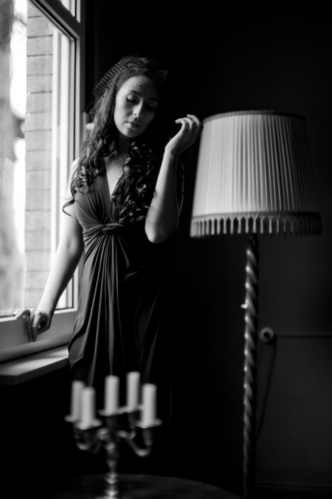
#1 that big lamp stand (left over from flea market?) and the candles do distract,
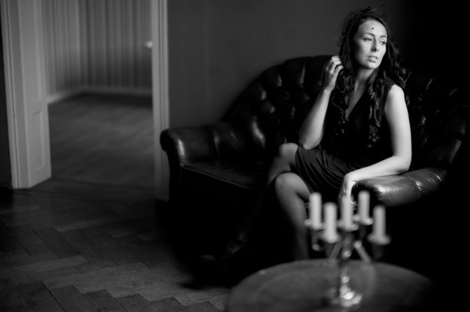
#2 converging linses (door frame) and candles are no go,
#3 that dress over the knee, not attractive,
#4 is ok,
#5 tummy ache?,
#6 like!,
#7 bottom left hand corner is really not a thing of beauty,
#8 hands are not adding anything positive, on the contrary,,
#9 too high contrast
#10 what’s that to the right of the top of her head
#11 too much emphasize on her right arm and too little on her face,
#12 too much emphasize on the lamp shade and too little on her face.
In short, too much fine art and expensive equipment.
Thank you for your oppinion Bill. I will analyze that and think what i can do better next time. Perhaps i should sell the expensive stuff and start with a Canon 500D. then maybe results become better 😉
Hi,
Some of your comments might be relevant (especially regarding the candles positioning) but I feel some hostility in the way you express it.
It seems that the more expensive the gear is, the more others feel the need to express harsh comments and judgments.
I guess Jan did not pay his gear with your pocket money so what he spent on it is not a relevant matter.
I don’t expect Ferrari owners to be all driving like F1 champions but simply to enjoy their cars, and same goes for Leica / expensive camera gear owners…
Best regards
Sebastien
Hi Sebastien,
this is a real aspect. No one asks how i have paid that. That are 4 years of hard wedding work. Weekends where you are out the whole day with the camera, editing 1000s of pictures. So it is hard earned money. I am not rich. Only after these long time of hard work i have now the possibility to use this equipment.
but i have had such forces on other platforms in relation to the equipment. I just love to work with this lenses and cameras. i just started with a canon 500D. and only the passion lead me to write this article. that are only my personal feelings. i dont want to make general suggestions or anythin like that.
The gear is irrelevant, work on the technique however, as mentioned by several here, is what’s required.
Gear never is irrelevant. I am really bored to hear the same stupid comment “the photographer takes the Image – not the camera”. that is trivial and true, but that does not mean that the output would be exactly the same regardless what equipment is used. A hughe difference ? That really much depends on who you are and how you look at it.
Elderin, you are right. Different cameras will sometimes influence how your take the photo. A Hasselblad will encourage you to shoot at waist level, whereas an iPhone or a Pentax 645 will encourage you to shoot at eye level. In most cases, there is more than one way to get the shots you want, and that’s a good thing.
Anyone who pretends that equipment is irrelevant is just virtue signalling.
Lovely and would consider this my must have soon-I believe that the monochrome folks are in a class by themselves-Leica BW look clear and the tones are surpurb very fine and always preferred high contrast varied tones remind me of classic film. ASA 400 T max type look. As for CCD sensor for the moment using old ltm and Nikon Pentax and my secret hybrid-Rebranded leica copy lens in various Minolta rocker lens 1.7-1.4-1.2 Thanks to a GMBH music fans retired optics who made a Budget leica fan Very happy.
Good news Steve and all the Leica Film fans-have secured my first gallery show with agent here in Toronto. Will post a selection of some of my Stand outs.
Thanks for your great pictures and love the natural light. Steve-May the Force of Others be with you and all of us…Happy shooting and here’s to sunshine and Camera Karma…
Click Advance
Paul
Circle
it’s kinda grating when people call their own work “fine art”.
Now i see that this title isnt right, maybe. When i wrote i never thought that someone see the intention that i put my own work on a higher level. I am not someone who is arrogant or loves his self so much that i just dont see the reality. But i can understand why some are a bit annoyed when they read “fine art”…
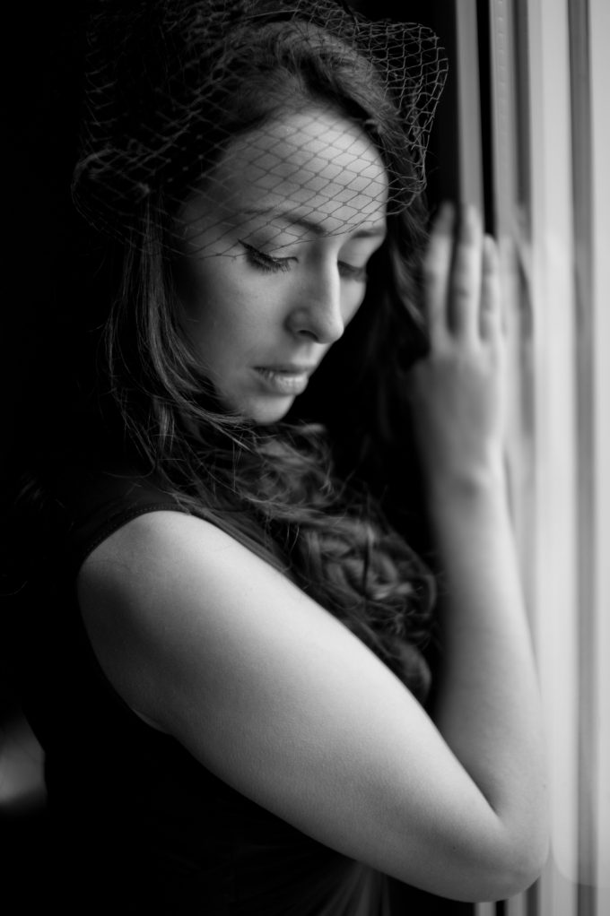
Very nice work Jan. Interestingly the ones I like the most are the ones with a little more DOF than the ones shot wide open. That extra few inches of focus depth adds a richness to the scene, especially apparent with the head shots.
When the monochrom first came out there were an awful lot of flat grey images posted. And hang ringing to go along with it. It’s as is people were treating the raw files as final jpegs. Your processing shows how it should be done.
Best regards
Huss
Love some of these images and all the images on your site.
I’ve just realised that some of my snaps are “fine art” photographs. Not really sure how it happened because I didn’t declare my intention beforehand and that seems to be an important preliminary. Guess I got incredibly lucky because the rest are really ordinary.
But a lesson learned: classify your images first in case anyone’s in doubt.
Sorry, my comment above was intended as a stand-alone, not in FF’s box.
Incidentally, pre-classification really helps craft responses to images..
Agreed. LOL.
+1
not bad but once you go B&W medium format film, you don’t go back…
Thank you very much… Sure. I will try one day.
Nice work Jan. Love the monochrome approach.
My dream camera and glass (one day). Great pictures Jan.
Thank you. Yes they are both stunning glasses and cameras.
Ok I find the poses of the model contrived and don’t really tell a story the shots light etc is fine I just don’t see the point of taking pictures like this unless it was a fashion shoot or nude shoot sorry I just don’t get it just some nice headshots would be great of interesting people?
Oops!
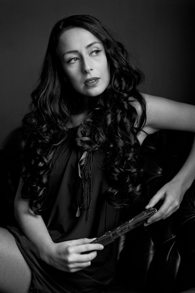
Did you mean to include the candles creeping up towards her private parts in the first shot plus her face is out of focus and then, well in the second shot, these candles interfere with her fingers? Neither shots works.
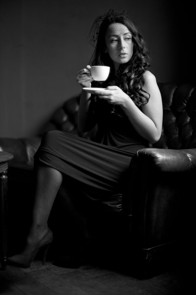
Raised tea cup looks very soft.
The bathroom shot, the pose – is she modelling maternity wear?
There has been no change of the model’s outfit(s).
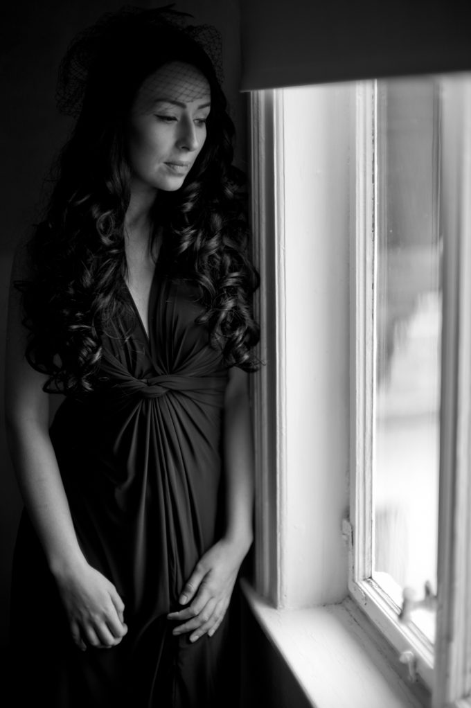
In the mirror shot – something’s seemingly sticking into her hairnet and the whole images looks flat.
All you have done is re enforce the dislike I have for the Noc lens.
Used well, maybe it works, but the f2 knocks all the f0.95 images into the proverbial cocked hat.
Without a comparison to the M240 and subsequent images rendered out as b&w, it’s difficult to comment of the Leica’s skin tones, but they look creamy and smooth, something the soft Noc lens should major in, but for me, I am left unconvinced by this lens.
Thank you for sharing.
Thank you for your oppinion. I always like to read critics whether they are good or bad. but they must be constructive and factual.
when i read some of your sentences i can only find destructive words and attacks. “The bathroom shot, the pose – is she modelling maternity wear?” this is only abusive for the model. that is nothing factual. you only want to find some words that hurt others personally. and this has nothing to do with critics.
And even the noctilux is also very subjective. if you do not like it you always have another view than someone who likes it. so i could even do the best nocti shots you would never like that.
so in summary your comment is not very worthy for me. with a good critics that has a certain level and was written from a person with decency i could work with and make something better in future. the only substantial fact in your comment is that i could change the outfit in the next shootings… that is something i can work with.
Hey Tom, don’t be a jerk! I am all for critiques, but they should be constructive. I am sure your work is 10 times better than anyone’s here and if you posted some images, we would all worship you in humble amazement. I wonder then,….why do you so maliciously attack another photographer? So you don’t like the Noctilux, fine, you don’t have to be a rude, jerk about it!
Dont get me wrong, I love critiques, and tough, honest critique. But there is a difference from a good, tough, honest constructive critique and just being an A——–!
If you read my comments Ralf, you will note that I have been gentle.
Others have expressed and elucidated with more depth and have been far more critical, and of the few posts here, it has elicited the most number of negative comments I have witnessed on this site, and a minority, such as yourself, have been the most offensive in your own responses, though bad language, which in turn does somewhat render that post and user immediately inert since this is a by product of such words and insinuations.
One should be able to rebuff or construct an argument here in an adult fashion, without A’ words of calling in question someones’ parentage or ability to attract a mate.
This rather brings to mind Godwin’s Law – but without Hitler. Once a thread has run to the point where some people start slinging personal insults, it immediately renders them out of the debate and their comments become irrelevant.
This is now the state you find yourself in Ralf. Well-done-you.
Oh Pleeeese!! Your post was hardly rendered “Inert.” Your works were perceived as “attacking/destructive” by Jan. I agree though that one should be able to “rebuff or construct an argument in an adult manner.” What is so adult then about “…is she wearing maternity wear.” I’m sorry you took my post as a personal insult, I don’t know you, your history, personality etc. But you posted in a rude, completely unnecessary, insulting manner, yes, that of a Jerk! Herein I will refrain though from using such language, I have found though that some folk only respond when you call it like you see it. It is also very disappointing many recent post are unconstructive and condescending, I hope this trend does not continue and we can all learn from each other.
Hmm, I tend to agree with Tom here – his comments were simply critical of the photos here offered. I found none of it offensive.
Jan responded by claiming: ” “The bathroom shot, the pose – is she modelling maternity wear?” this is only abusive for the model,” which I would strongly disagree with. It is not only abusive for the model. It is a reflection of a very poorly considered pose, which is in the photographer’s control, both at the time of taking and in the editing and in deciding to show it. The culpability is all Jan’s. Someone else even referred to Stomach ache. It is a very poorly posed and selected image. The model is obviously a very attractive woman; it is up to Jan to learn how best to reveal that.
I don’t think much of any of the images, but enough has been said on that already to perhaps make Jan edit his work more carefully in future; I don’t need to add more.
However, calling someone a ‘jerk’ adds nothing to the thread, and just seems childish.