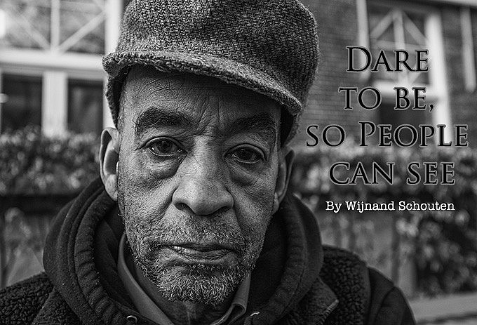
Dare to be, so People can see
by Wijnand Schouten
Hello Brandon and Steve.
Since 2 years I am working on a project called ‘Dare to be, so people can see’. Portraits are my favourite thing to do.
When I started I noticed the attitudes and patterns people have. In general life and for sure when a camera is involved.
That’s how ‘Dare to be, so people can see’ was born.
When you show how you feel in the now, without smiling, and looking straight in to the camera, you give a moment.In this context I get a picture instead of taking one.
For me the idea behind it is that the world is filled with plastic glamour. By showing how people can look without the glamour it might help an other person to feel more in the now too.And accept their selves.
All this without being pretentious.
For me its an attempt to contribute tot the awareness that every moment in life is worth to exist and be seen. Not only the smiles. I am always happy when I go home with a portrait on my memory card and edit it the way I feel.
Not all the people are happy with the results. Sometimes I find a picture beautiful and I don’t get the permission to put it on the internet because they don’t like the result. Then I don’t do that. Although I still see the beauty of it.
greetings from the Netherland and keep up the good job you are doing.
If you want you can follow me on instagram:
Very interesting approach to portraits and I like the intention to “be in contact” with the subject of your picture. People today love to make picture but often hate to be “in” the picture of someone . Also very interesting your respect for whom dislike its own picture.
Thank you for you comment.No negative thing found on my side 🙂
# 5 was the stand-out for me also…
Must be challenge working with total strangers at such proximity in the street. Perhaps that’s why their expressions don’t convey a great deal of personality. Maybe that’s the aesthetic Wijnand was aiming for in his images?
Either way, keep up the good work 🙂
I like the approach and don’t mind the short focal length, but the oversharpening I don’t like. Too cartoonlike.
While I like your pictures very much (they are very dyncamic), for my taste, the short focal length distorts the faces. Also the background gets too sharp/dominant.
Looking at the Flickr-Account the pics seem to have been taken with the Fuji X100s.
But a Sigma Camera would have been possible.
Hi, i am using a fuji x100s. Edit in Lightroom and silverefex
These are fantastic!
Congratulations.
-M.
As is under a microscope. I never really see the moon face landscape as is in over resolved photos. Where is the art and action? Where is the personality? All missing or overwhelmed by overwhelming resolution. Photo #5 is the only compelling shot with personality. The rest is generic.
Hello Wijnand,
You have a great eye for subtle emotion, really beautiful portraits! I have once small suggestion that may be helpful in the grand scheme of your project. I’ve noticed that while you are sticking with black and white you have a wide tonal range and sharpening from shot to shot. Lighting will obviously change but you can still level out the desired tone in post. The last three all look like they are part of the same collection while the shots above them vary from one spectrum to the other in both tone and sharpening. Please feel free to ignore me, I’m not trying to be negative in any way, just wanted to give you an outside perspective you might find helpful.
“why black and white?”… I think your answer is in the narrative…
Good to see as-is portraits. Sometimes (too often?) smiles for the camera are a bit contrived or pretentious and don’t seem natural. These images show people as they are which is just fine with me ’cause it shows how people usually look, not how they are in “Say cheese …” situations.
The detail in the photos reminds me of a Sigma camera.
Like it a lot. What camera and Lens ??
like it…thanks for sharing.
HI…nice pics!
Can I ask you what camera did you used?
and why black and white?
I personally think black and white portraits are the best!
keep on the good work…
Beautiful work! Also found you on Flickr 🙂