The Shadows Are Your Friends. Micro 4/3 Creepiness.
By Vince de la Pena
Greetings from Down Under.
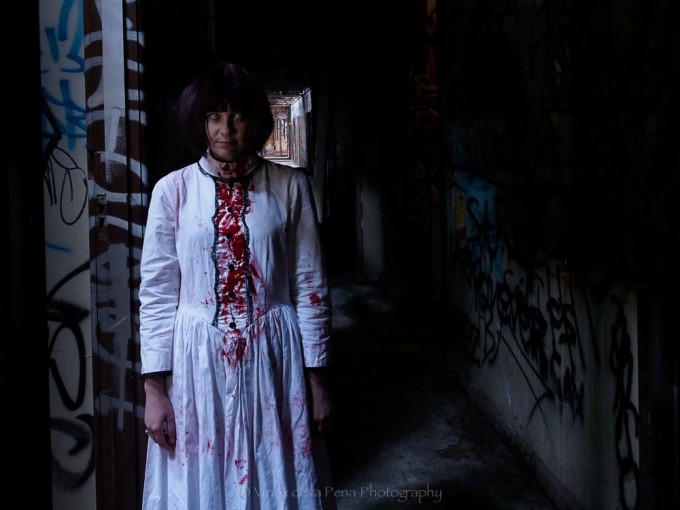
My name is Vince de la Pena and I’d like to share my very first personal photographic project. This was shot in the infamous (for photographers) old abandoned Larundel psychiatric hospital in Bundoora, Victoria, Australia.
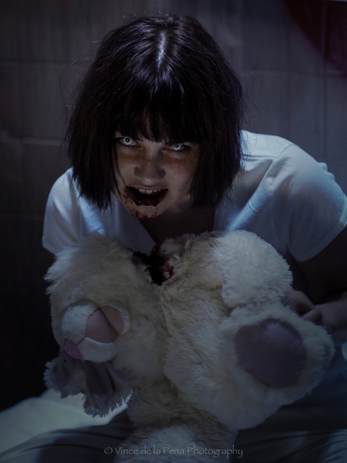
I purchased an Olympus OM-D E-M5 2 years ago after finding the my Canon 30D and lenses were too heavy and bulky for me. I have recently sold my Canon 6D and 2x L-series lenses to fund more micro 4/3 lenses and a Lumix GM1 body. I have also upgraded from the Panasonic 12-35mm f2.8 to the Olympus 12-40mm f2.8 which I find is quite a bit sharper. The majority of the shoot was done with the Olympus 12-40mm and the bunny-eating scene was shot with the Olympus 45mm f1.8.
The Shoot.
This personal project was months in the making. It required scouting out the old hospital and looking for some cool grafitti or murals to shoot against. This is a popular place for budding photographers. The upper level had lots of holes in the roof which would allow beautiful spots of harsh light from above. You can google the images of Larundel and see what I mean. Unfortunately, with the advancement of high ISO sensors and the overuse of HDR to see into the shadows, I felt that the creepiness of the shadows has not been taken to its full potential. I believe that the shadows create the unknown. And that unknown creates fear. Embrace the shadows. The shadows are your friends.
For this particular shoot, we had to bring a lot of props like a door; a mattress with pillows and sheets; lighting, stands, a purpose-built electric chair, ladders, tripods, black blankets, lots of flashlights, etc. I even had to buy some black cherry jam for the bunny rabbit eating scene. Have you ever had generic fake blood in your mouth? It’s freakin’ disgusting. I didn’t want to risk my model Emma pulling the lemon face during the gore scenes.
Finally, I want to thank my mum for her brutally honest feedback. Every time she looks at my photos and just says “Nice”, it makes me go “Whaddayamean NICE?!?!” It makes me try harder to get a shot that has more impact. It makes me see things beyond the pixel peeping, the retouching, the bokeh, the noise and grain, etc.
Happy Halloween, folks!!!
Vince de la Pena
PS: Special thanks to model Emma Jarrett (who flew down from Queensland for the shoot) and to Mikel Magdadaro and Edwin Retuta (assistant photographers). Also special thanks to Richard Denek (also a long time subscriber of yours) for getting me into photography, supplying my first serious camera and introducing me to this inspiring website



Yeah, these are real nice shots. There seem to be a lot of negative Nancies in this thread. If these had been shots of a mountain range, or trees, or someone’s foot… you’d probably be getting heaps of praise. But dare to something a bit out of the ordinary, and Halloween themed, how dare ye!
I much prefer these types of shots over the typical overdone nature images. But then again, i prefer the darker side of life. Would like to see more of these types of images, that’s for sure. I only wish there were buildings like this around here i could use to this effect.
Awesome photos! Fantastic imagination you have. I can’t wait to see what you would do when you decide to have this become more than just a “hobby”.
Thanks Kate. 🙂
I have a little surprise in store just for you…
Hi Kate.
Here is the link to the missing electric chair image.
*WARNING TO EVERYONE: HORROR, GORE AND SUPERNATURAL THEMES, IMPLIED VIOLENCE, AND GENERAL BAD TASTE* (I hope that covers me.)
This 30 second single capture long exposure was shot on a Canon 5D mkIII because the OM-D has a base ISO of 200 when shooting RAW. This means a loss of one stop requiring twice as much time (60 seconds) to expose the image PLUS adding the in camera processing and noise reduction which is double the exposure time (add another 120 seconds). That would mean 3 minutes per shot! As we were shooting in a restricted location, we had to execute this as quick as possible. The OM-D in this case was unacceptable. This is why this shot was not included in this Micro Four Thirds pictorial.
https://www.flickr.com/photos/vincedelapena/15007138343/
Also, if you want to see the scope of my other work, please check my Flickr profile here.
https://www.flickr.com/photos/vincedelapena/
Great stuff
Hey Ibraar.
I’m a big fan of your work, so that really means a lot to me.
Thanks. 🙂
Hi Vince…
Thank u for submitting these images …I find them very dramatic and attention grabbing ……
And going by all the comments that followed your image submission … well all I can say with certainity is that your images have touched every one of the commentators somewhere deep within …enough to come out and submit a individualised comment …rather than just ….NICE …
regards
Thanks drpankashukla. 🙂
I was starting to lose faith here for a while.
Good Stuff- thanks for submitting these!
Thanks Meatpants.
I’m glad you enjoyed them. 🙂
Hey, those are pretty cool!
I like the idea of the photos more than the photos themselves. So they are not my cup of tea but the genre itself I do like. At the end of the day I give you top marks for actually finding a cool location and, more importantly, actually making a plan and executing it. 🙂
I love permanent decay and I despise anything that has to do with ‘renewal’. Some things should be left alone, like this place.
One or two of the comments are unnecessarily critical. I’ve seen some beautiful photos of Auschwitz – is that wrong? Is it even wrong to point a camera in that direction? IIRC, Spielberg really wanted to film in Auschwitz but he had to build a replica nearby instead. The fact that he wanted to film on the site itself may be seen as wrong by some people, but not by most.
pretty harsh critique for real good Images. i think that would have been very different if they would come from am amateur. So this might be critique on a higher Level 😉 I think the Images would be much more striking if there were more things to see that one can relate to a clinic. the Spirit of this building did not catch me.
oh and that is probably why i like Image 1 the most. not real spooky ín that sense but it has lots of going on for me.
Elderin, I just want to clarify that I AM just an amateur. I have only been really shooting since early 2012. I actually prefer street photography. Wedding and portraits are not really my gig but I have the gear as I am still trying to find my style. This is purely for fun. The model and I participated in the Melbourne Zombie Shuffle the day before so we were still in “zombie mode”.
I think the “venue” is interesting and I would like to see some more moody type shots of the interior, but I think the usage of the model was very formular and also a bit gross. She was pretty much wasted.
damn i can see stupid comments. its like saying horror movies are horrible and should not be filmed. all i can see is bitterness lol
nice job mate!
Thanks blabber.
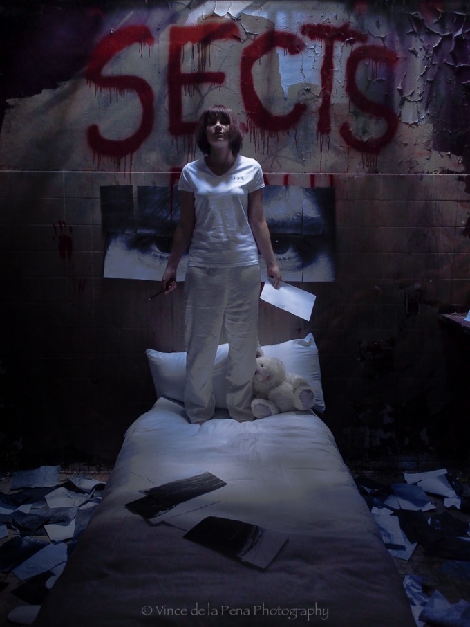
I was actually going for the horror movie poster look in the first pic. If the movie was to be called SECTS, I think I would have nailed it. Unfortunately, the grafitti in the room was there when we got there. The original mural we wanted to use there was painted over in brown paint. Then someone wrote SECTS and DEATH underneath. We covered the DEATH with the paper sheets.
My team doesn’t know what the SECTS reference means. But I like to refer the room as the “Sects room” cos it sounds way worse in a conversation. Hahahaha
Modern morbid fascination for things that are eyesores, essentially tragic and best forgotten? And then trying to squeeze some artistic essence /merit / meaning out of the fetid mixture? Inexplicable, when you have Trey Ratcliff’s exuberant and uplifting images …Guess it takes all types to make a world. What a waste of an OMD EM5.
To each his own. I’ve seen Trey Ratcliff’s work. He has his own style. That is one reason I prefer my images this way.
100% agree
Humbly, I completely disagree with your comment. Although the work is not everyone’s cup of tea (I personally didn’t really ‘like’ the subject), it is not a waste of the camera- there is a lot of technical merit to what’s going on, and his work showcases the subject of shadows.
I like Trey’s stuff too- but just because not everyone shoots what he does make them incompetent photographers.
But, then again, I think that’s kind of Steve’s hope with his site- that there would be discourse on photography- whether everyone agrees or not…
Meatpants (!), I agree with what you say — you do have something there. I wrote my comment when my revulsion with the subject matter was at its height. In retrospect, after reading more moderate comments such as yours, I agree that there is some merit in the shadows stuff, but insist that there’s nothing earth-shaking there…anyone can do it with a little practice or even without. The ‘levitating’ bit is old hat now and, for that reason, I feel it subtracts from the composition, adding a pseudo paranormal element that completely ruins the overall effect of the photograph. Still, the photog has worked hard and I must commend him for that.
I am sure lots of people will disagree with some of my comments again 😉
Subroto, I’m not sure what your reasoning is for stating that levitation photography is old hat. Is levitation trick photography now taboo because it’s “already been done”? Maybe the use of monochrome is old hat too. And, God forbid, the use of film and prime lenses. Where does this end?
Sure, my images are not to everyone’s taste and some of the comments here clearly show that. Just remember that Steve Huff’s Daily Inspirations page is to educate, inspire, explore, experiment and promote all types of photography. To call something old hat is to imply that something is irrelevant or obsolete. It is sad that you feel the need to deny others of the simple enjoyment of their chosen style of photography or art.
Finally someone who can still appreciate shadows! I hate HDR, in real life I’m also not able to see everything and that’s what makes it exiting. And about your mom…. I know the feeling. Since my youth my father has commented on every photo: yep, good photography is really hard.
Thanks Petra. 🙂
I think I hit a nerve with some people here. To me, great HDR work looks natural and NOT “overcooked”. The ones who overuse HDR seem to have sciophobia (fear of the shadows). I think HDR stands for Hates Dark Rooms. Hahaha
Not nice. Disgusting. Great job though. I think the equipment you chose added to the effect you wanted.
I guess I am blind…missing the electric chair….. I think the model and props were unneeded…just photos of the institution would have been interesting…just my 2 cents though…
I wanted to try something different than what I have seen. Something more like a contemporary horror movie shot.
If you search “Larundel” (the Asylum) on Flickr, this is what you get.
https://www.flickr.com/search/?q=larundel
Note the bathroom shots. That is the room where we put the bed. It was placed over the remains of the concrete base of the bathtub.
Dwight, a lot of the photos you can find of Larundel were shot quite a while ago. It has since been gutted by a demolition crew. They have removed all the furniture, fittings, cabinets, doors, etc as there are plans to get the building refurbished. There is only rubble and graffiti left. Some of the best graffiti murals were removed to stop the invasion of weekend photographers. It is still an interesting place nonetheless.
Irrespective of the subject, the pictures undoubtedly show the potential of the Panasonic GM1. Although I am still very happy with my Panasonic GX1, I cannot wait to have the GM5 in my hands. Probably the real successor to the Minox 35/Rollei 35’s of the pre-digital era – but much better! I know what I am talking about: I had two Minox, one of them with slide, the other one with negative film. Framing and focusing were approximative. to say the least. An EVF, even if only average in quality, solves both problems.
Actually, I just recently purchased the GM1. I was going to use it for the behind-the-scenes shots. Unfortunately, the lenses I have do not have image stabilising, making it hard to shoot in the very low light we were in.
The E-M5’s built-in image stabilizing made hand-held shooting with any lens a breeze.
Nice pictures. But I really don’t like when places that likely saw sorrow and painful lives are used as stages. Just my personal thought. I can’t find it cool. Here in Italy there are some abandoned asylums, one near Milan is often used in the same way.
Building an electic chair is something of bad taste.
I repeat, nothing against you, just my two cents about this kind of project.
(I find more interesting the reportage Gianni Berengo Gardin made at the end of ’60s, an album that eventually led to a new serie of laws)
Marco
I did check out Gianni Berengo Gardin’s work. Amazing stuff. Unfortunately, unlike Italy, Melbourne does not have the scope of awesome older buildings that I could have used as a backdrop. But then again, I don’t get out as much as I should. I really should look harder.
Thanks for the feedback.
I have to agree – I didn’t like the photos – they seem to be making some voyeuristic purpose out of mental health. But nevertheless I have to give credit for the work that has gone into the preparation and execution of these.
Photos are a matter of taste, you may like them or not, and that’s fine. What we usually forgot to do is to explain why we don’t like a photo, and the reason might be of some help to the photographer.
Having said so, I don’t find them so special: if Vince wanted to achieve that horror movie poster, well, he did a great job.
My “complain” was about the location chosen: for the same shots I would have chosen an abandoned building (old factory for example), and just for some kind of respect I would not have set the stage inside a sorrowful place.
Someone commented that it’s like complaining about a horror movie.
No it’s not: exagerating with an example: there are movies set on a stage rapresenting an extermination camp, but I can’t recall any photo shooting made “for fun” in Dachau, Mauthausen or Auschwitz.
It’s just my point of view: I had the chance to see what these (asylums) places were until not so many years ago, and though I was once asked to do a shooting inside one of them, I refused. It’s not about censorship: it’s about considering what we are doing, why, where, and considering the story of a place and the lives that crossed (and often were abandoned) that place.
To the author, perhaps he’s not so “tender heart”, or simply does not care or didn’t care, but he put his efforts, time and passion to do it, and we should recognize it.
Thanks for the honest feedback marcosatoriphoto.
During the whole shoot, the thought of disrespecting the location never did cross my mind. I will keep that in mind for future shoots.
If or when I ever travel overseas again, I will respect the locations and cultures.
In Japan and Korea, street photography (especially on women) is apparently taboo and could lead to arrest.
Nice images; but a philosophical vein for you… Given that you’ve invested lots of time & money, models, assistant photogs et.al., in your pre-production, would you feel confident in pulling out your M4/3 system out of the bag with a client standing with you on-set. I shoot with Canon, and now a greater percentage, with my M240. Many times, when I set the M on a stand, a client will say “so what are you shooting with now days?” Like I have to justify the smaller body because it’s not hanging a 5# lens on the front. Your level of pre-pro almost screams medium format in the eyes of most clients. Just curious in your response.
Thanks Chris D. This was just a personal project. I don’t shoot for clients as I’m not ready to translate ideas to create images for others yet. The cost of pre-production was actually very low as this is purely for hobby. I bought a lot of the props from thrift stores. I wouldn’t want to bring new items into such a dirty environment. The electric chair (not shown here) was made from recycled scrap wood.
Oh, how I would have loved to shoot medium format, but i can barely handle a 35mm film camera. And then I’d have to get scanner, Photoshop CC and a ton of lessons. I’m struggling with PS Elements at the moment.
Actually, during the shoot, I was so concerned about all the other details, like shadow play, the remote lights, and so many other little things, that I believe if your client was standing next to you, he would be more impressed about how you handled the shoot and created an image than pick on what type of camera you shoot. If he ever comments on the camera, maybe he’s a gearhead and he’s trying to connect with you.
Shoot with what makes you feel comfortable, otherwise it will be dragging you back and preventing you from enjoying what you do best.
Clients pre-shot comments are overrated. Let the quality of your work speak for itself. Show the images first, then say “I usually work with this” and show the camera. They usally say something along the lines “nice camera”…
I agree many of the client comments are overrated; that said in the past I shot for a studio that would not dare show their DSLR on-set even though it was more than adequate for a specific shoot. Had to pull out the Phase One with all of its big-bore 500 hp dual-carb indulgence. My Leica M system is in the MF price category, but I find for 99% of my work (more than run-and-gun), it is so much more versatile than any MF system in the same price category. Like you said “Let the quality of your work speak for itself. “
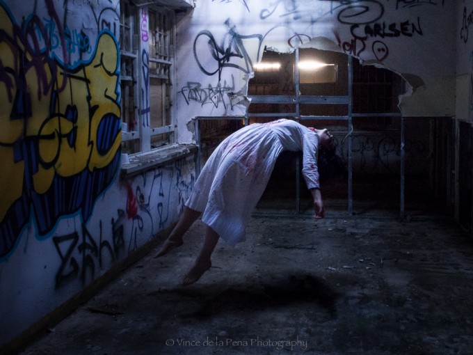
The last one is really great in that “How did he do that?” kind of way. Congrats
Camera on tripod, shoot lady on a chair or some object like that, then shoot a empty background and remove chair in photoshop… i guess!
Thanks Palombasso.
Jan’s is correct, but instead of a chair, Emma and I stood back-to-back and interlinked our arms. I leaned and arched forward, bringing her over me. I had to keep my feet together to create the smallest shadow footprint possible. When she was balanced, we unlocked our arms and took the shot.
In post-production, I stacked the model’s image with the empty room image and edited out my body.
It was actually a lot of fun to do.
Nice.
Thanks Mum.
LOL