SHOW UP AS YOURSELF
By Wendy Laurel
“Show up as yourself” is what I tell my clients when they ask me what to wear for a shoot.* The days of families wearing all white shirts paired with jeans smiling nicely for the camera are over. Or at least they should be.
Times have changed. People want to be seen for themselves. Modern Family aired an episode last year where Claire (the Mom) hired a professional photographer for an extended family portrait. She dressed everyone in white shirts (of course), but the “family picture” that Claire eventually chose was one where the kids were fighting, people were laughing, and life was documented much as it is lived. That is the family portrait I love to shoot and my clients love to buy.
Letting the kids dress themselves is the surest way to getting a fantastic childrenʼs portrait. That obsession with the Superman shirt will be gone before the parents know it. And who says that stripes and polka dots donʼt go together? It is the essence of their personalities that are important. Not their hair perfectly combed and dressed up looking like a child out of a catalog – a child the parents donʼt recognize. When it is all said and done, people want photographs of their children and family that bring them right back to that time.
Similarly, the focus should be on the people. People are the best detail in any shoot. The focus on details and props in people photography has spun out of control. Baby photography blogs are showcasing the best baby rooms and the cutest first birthday party decorations instead of the baby. Wedding blogs are guilty as well. I recently saw a wedding shoot where the photographer and/or the couple managed to work in almost every cliché prop there can be: balloons, scrabble board, chalk board, antique cameras, vintage soda bottles, analog records and a record player, just to name a few. The couple and/or photographer were so busy finding the hottest and newest props that they forgot about the couple. Who are they? Those details and the images told nothing about the couple, except that maybe they read wedding blogs. And it is a shame. Photographs of peopleʼs family and children or of their wedding day should show them as you really are. The love, the connection, the relationships, and the moments. That is what is important and what will be valued when they look back.
I love details as much as the next photographer. It is always fun to shoot people in cute clothes and with colorful props. I just love the people more. I think the focus should be the people and details that add to or help tell the peopleʼs story. If the girl loves her tutu and always wants to wear it? Well, thatʼs a relevant detail. If the couple plays Twister all the time together, then yes, it’s a relevant detail. The question is does the detail have emotional meaning for the client? Is it something that will trigger memories for them down the road? If itʼs yes, then yes itʼs important to shoot. In any case, the people are always more important. When is the last time you saw a photograph of table decorations up on the wall?
When my mom was first diagnosed with cancer, I hired a family photographer to come take photographs of her, her home, and my family. There were a ton of detail shots –shots of her straw beach bag hanging on the doorknob, shots of her holding some of her own pastel oil paintings, shots of her collection of miniature tea cups. But they were important details. Details that meant the world to her and tell her story. Details which combined with the wonderful family shots of us together gave us a full story. Details which showed my Mom and who she was. Those are the details that matter. Not details for the sake of details.
The trend is changing. People are showing up as themselves. The main focus is the people, the relationships, and the moments. As Babble.com recently said in talking about the top twenty baby photography blogs, “The emphasis on the people, unburdened by details or props, gives [Let the Kids] a touch of humanity that is infectious.”**
Showing up as yourself just means be YOU. If the family you are shooting doesnʼt walk around town in matching white shirts with collars, donʼt suggest to them to show up at your photography session in those outfits. Document their best selves if you like, but themselves. And the same applies to the photographer, show up as yourself, be real and be creative.
Written and submitted by Wendy Laurel (http://www.wendylaurel.com)
Wendy Laurel is a wedding and family photographer in Maui. She runs the Let the Kids people photography blog along with Tory OʼLeary, a newborn and family photographer in Southern California. Let the Kids.com is a blog that features people photography of any kind (family, kids, couples, even weddings and fashion) as long as it is exceptional photography. Let the Kids is always looking for very creative and unique images where the photographerʼs voice can be heard and the subjectʼs personalities shine. You can find Let the Kids at http://www.letthekids.com. We also have a Facebook page where we run contests and talk about photography. Submissions are encouraged. Just email a link to your photographs online or images sized at 600 pixels width to submit@letthekids.com.
* I have to admit I hijacked that saying from Jonathan Canlas, the premier wedding and family photographer.
** Babble.com (http://www.babble.com/baby/baby-care/best-photo-blog-mom-baby/? page=6)

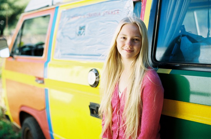
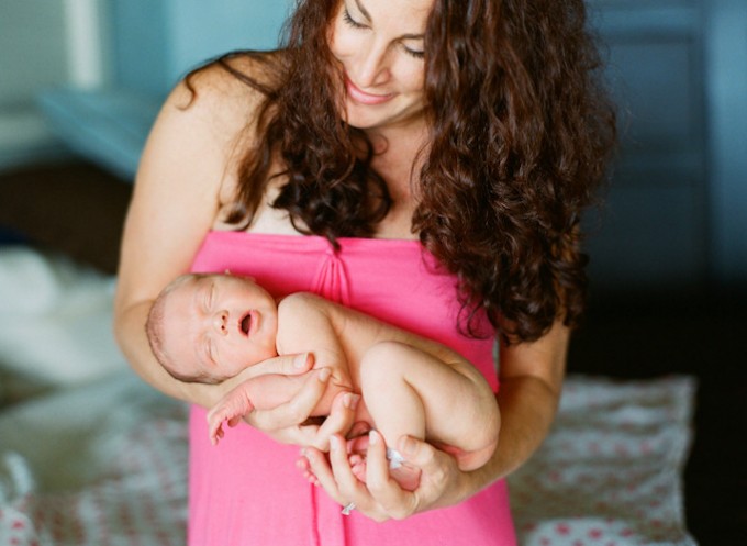
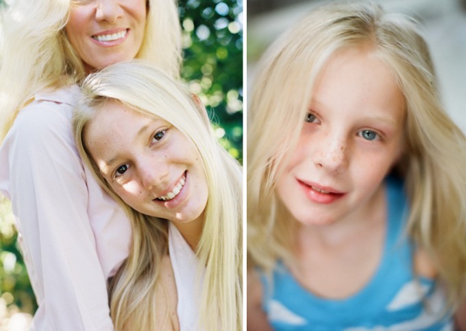
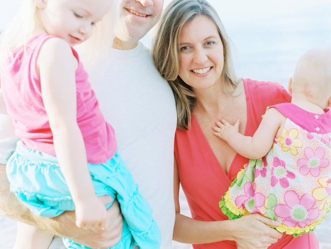


I understand and agree with the sentiment that traditional formal portraiture is not for everyone. I think that we’ve all seen portraits in the past that have been overly-stiff and unnatural, and which did a poor job of capturing the personalities of the people depicted.
However, a more informal, relaxed style of dress and posing is not a get-out-of-jail-free-card for poor photographic technique; the two are unrelated.
What I see in these sample photos are poorly-composed and very overexposed bad snapshots, not portraits. I’m always disappointed when I see crap technique (such as this) lauded as “artistic” — that label’s far too often used as an excuse for work that is simply poor in quality of execution, rather than work driven by a genuine artistic vision. “It ended up that way, so I’m calling it art” seems to be the modus operandi of far too many poor photographers.
Lovely article what the photographer chooses to put on their website is up to them as Wendy said she also took plenty of photos of the whole family with all the family’s heads
Such a great article and even better photos! Wendy is FANTASTIC!
Ever considered
1) there IS a pic with dad as the focal point, just not shown here? Or a photo where everyone is in focus and again, not shown here? Wendy gets to choose and show her faves, period.
2) if the majority of work out there is not to your liking, maybe ure becoming irrelevant.
just sayin’
Wendy’s photography is like a breath of fresh air. I like that it isn’t literal as we can all do that. She has carved a niche, on film no less. The colors are lovely and represent our Maui lifestyle.
I can understand “vision” and I can understand “creativity.” Every photographer out there searches and attempts to produce work that shows their vision and creativity. On another forum, Ms Laurel took somewhat of a beating on her style of photography. Ms Laurel came to that forum and explained herself and her photography. Most participants understood where she was coming from and what she was trying to accomplish. I, myself have gone to her website and perused a lot of her work. Some of it I liked and some I did not. Totally personal perception. From what I’ve seen here, there is the same difference of opinion on her “style.” Obviously, there are those that agree and love her work, or are blindly defending it just to be “different,” and those that trash it for whatever reason. I’m a proponent of “good” photography. It doesn’t have to be great or a masterpiece, but… Good!
I don’t walk the walk of total traditionalism in photography, but photos that are washed out due to lens flare, strange composition, and other elements that don’t seem to work usually end up in my recycle bin. I understand there is a market for Ms Laurel’s style of photography and for those that love it…. great. Yes, in a lot of cases rules are meant to be bent or broken in the realm of creativity, but when too many of them are broken at the same time, it tends to take what could have been a very nice photo and turns it into a throw away snapshot. Natural posing, creative lighting, whether ambient or flash, and “setting the scene” go a long way to taking what is a snapshot and making it a good photo.
Once again, whether you can agree or disagree with that premise it’s my opinion. Like I said, there is obviously a market for her work and for those that like it, fine. As always, just my 2 cents.
I’m a little curious, for those of you who seem critical of the chopped heads and other things… can you provide a link your own work to show us how your vision for a portrait should look like? It’s definitely easy to pick on another artist’s vision and creativity, but you should at least back it up with your own work to show people your interpretation, vision and creativity.
No, your comment is full of false logic. One can be critical of others work without having to show or produce their own. Do you ever have any critical thoughts of other’s cooking? Do you sometimes look at a building and comment on the architecture and disapprove? Does that mean you have to be a chef or an architect in order to say you don’t like something?
Oh and sorry, the days of White Shirts and everyone standing rigidly is over. It’s not for everyone.
Whoah! You guys not every photo has to have someone’s eyes in it. Photography is about your vision and your vision doesn’t always have to be what is suppose tot be the “norm”
Take James Nachtwey (who can be considered one of the greatest documentary photographers of all time). He shot this photo: http://tinyurl.com/7gsa8wl, did it lose all credibility as an artistic photo?
Come on people, all family photos don’t need ALL of the family in them. Obviously Wendy choose to feature certain people on her photos.
Wendy, great interview!
That obviously isn’t a family portrait either…I’ll tell you one thing, if I paid someone to take photos of me my wife and my son and my face is clipped out and that is what is being shown on the net for a body of work… I’d be insulted that I was made so insignificant in my family’s photo.
Josh, I think you are thinking to much into it. Just because I photographer chooses to cut off someone, doesn’t make them insignificant. Today’s family sessions are a lot different then having everyone sitting on the ground in a park wearing white shirts. Today’s sessions are about a lot more than that.
Nope, I’m not thinking too much into it. I don’t think I ever said that everyone should be sitting on the ground in a park wearing white shirts… they can be about a lot more than anything they’d like.. bottom line is, I fully expect to be in the picture when I pay for a family photo session, not from the lips down… I doubt that dad was thrilled when he saw his mouth only.
Why do you delete comments that are not complimentary?
I do not delete ANY comments unless it has a personal attack against someone. If your comment is awaiting moderation, it is most likely because it is the weekend. Doesn’t mean it was deleted. I never delete comments..again, unless it is a personal attack.
“A good picture suggests far more than it explains.” Using creative cropping and depth of field you can infer more than just “this is a family”. It says, “this is mom, an important part of this family. focus on mom.” “This is my daughter. She is more important than me.” I see these pictures on different walls, emphasizing on different members of the family.
Traditional portraits where everyone is within the same plane, in focus, smiling at the camera is safe but alas, uninteresting. What is the use of all that tech, creating bigger apertures, higher ISOs, less grain – if we don’t invent new ways of seeing. What is the use of learning all those rules if not to break them?
Wonder why your work is not being featured and you’re not being interviewed? Because you’re keeping it SAFE. Work like Wendy’s challenges the norms and moves our craft forward. Like it or not, that’s where we’re going.
Wendy~ I love your work. This article is awesome. Beautiful images, beautiful words! ~Kristen
Sorry, NOT a fan of this “Style.” If this is the newest “Trend,” I’m not in favor. Blown highlights, washed out colors, chopped heads…… I scratch my head on that. I’m all in favor of creativity….. in posing, cropping, etc. Love clothing that defines the person and their personality, but when you exhibit a photo of a family of 4 and the only one that is all there is mom….. that to me is not style, it’s a poor photo. Half of dads face, two thirds of the older daughter, the back of the baby’s head? Really???? Sorry just can’t buy into it. Just my 2 cents.
I am so sorry that photography has sunk to the level of cut off heads, eyes, etc is called creative. I am surprised that Wendy did not use instagram as another creative method. I would seriously have to consider someone selling this work to be a picture taker and not a photographer.
Or take the third picture from the top. That would be a lovely mother/daughter portrait, with an intimate gesture of the daughter affectionately leaning her head against her mother. But you can’t even see the mother’s eyes!! I honestly don’t think including her eyes in the picture would turn this into a “JC Penny” studio shot, as somebody above said. It would just turn this weirdly framed shot into a very nice and intimate mother/daughter portrait.
I couldn’t come up with a reason for the father’s chopped off face. And I just realised I have replied to your two comments in reverse. Haha, sorry.
Yeah I have to agree on the cut-off heads… is there a good reason for this? I am all for creativity but just take the very last image, for example. Seems like you would want the supposed husband/father’s eyes to be in the picture, no? If not, what good is this as a family picture? Also, why not wait until the child on the right side of the same image looks to the camera? Not sure I’d be much interested to see the back of my child’s head in a family portrait.
May be it’s to suggest that the missing mother’s eyes are in the daughter’s eyes.
I really agree with all the comments in the article, but I’m struggling to like the photos. I’ve read all the comments here several times, and have tried to see what others are raving about, but I keep getting stuck on the chopped-off heads and overexposed images. Maybe it’s my OCD kicking in. Maybe it’s all those accidentally-cut-off heads from my childhood photos when a viewfinder didn’t give an accurate representation of what was in frame.
I guess ultimately I could be ok with this style, if I knew I these were post-processed copies of an original, properly-exposed master with all heads included should I decide against this “trend” later on in life. These might be fine for now, but I don’t know if they’d hold up to the test of time. No, they don’t have to wear white shirts and jeans, but their faces should be in frame for capturing real memories, in my opinion.
For me, I’d rather just get creative in post process, but ensure that I have a properly exposed and framed original to work from. It’s easy to blow the highlights in Aperture or PhotoShop. Easy to cut off heads, too. I see no reason to ONLY give blown highlights and cut-off heads. Sorry.
in all of these shoots there were plenty of family photos with everyone’s heads. They just weren’t my favorite shots.
You learn the rules, then you break them.
And then you decide which rules worth to be broken
Blown highlights, poor lighting, bad cropping. Sorry, I’ll take the traditional photography any day.
I just took a look at your website and you surely have your own signature and style which is great.
I’m just not sure that tilted horizons, cut off heads and over exposed images are that great 🙂 .
Of course you have to stand out if you really want to go “high”, so maybe you are the new Picasso of photographers and maybe I just don’t understand anything about art or photography.
Hope you don’t get too offended by my comments 🙂
No worries. Im not offended in the least. Im happy shooting and learning all the time. I appreciate your comments.
wonderful article and, as usual, a clear and unique voice to your work. it takes a unique eye to consistently create work that sets you apart in a saturated market, and clearly your clients agree. for every person who doesn’t “get” your style, there are tons of people who love and appreciate it. keep it up!
Innovative cropping choices.
I’d be too embarrassed to show a client that I’ve cut their head off. I used to tease my mother in law about making that same mistake when she tried to take photographs at family events.
Thank goodness we’re not all obligated to compose every shot like it’s a JC Penny studio shot. It’s called creativity.
Go Holly. 🙂
+1. It’s called taste.
Holly – so to you, cutting of the father’s eyes (last picture) or the mother’s eyes (third picture) in a FAMILY portrait is called “creativity”??
Right….
I suppose the ‘cut-off’ head family portrait will be more relevant when the parents get divorced.
Other than that, I like the style and the over exposed look works well.
haha, you had me cracking up with that Des
Awesome post and great style too.
Love your work and especially your approach.
David Bailey was the pioneer of the missing head. He often framed the subject tight and lost the top of their head.
I think you have a fresh style and a smart outlook on what todays photographer can do to offer the customer future golden memories.
They will look back and be able to see “This is exactly how we were then”
10/10 with a big GOLD STAR.
Thank you Rich.
Thought provoking pictures. I really like them but feel that people say so much through their eyes so the cropping out of parents eyes is radical. Do these pictures work as family pictures for the children in the years ahead? For me, the most interesting and yes, well taken people pictures I have seen for some time.
Hi Wendy. I’m in full agreement with all the great comments. I’m a little curious about the last image. The husband is almost cropped out and one of the children is facing away. It gives the impression they are not important – or maybe that is intentional? Great article, thanks. Robert
Wendy is infectious! She is such an important voice of modernity in the industry. Fantastic article.
Well said. My favorite weddings and sessions are by far the ones that details take a backseat to the people. Thank you for writing this. Gorgeous photos, too!!
Am not a friend of Wendy’s… but, really, this is the best article that I’ve read on here! I love your style, Wendy! 😉
Great article!!!
Beautiful, edible images. Congrats from Spain, Wendy!
Awesome work/art! I dig all of those!
Wonderful insightful article, Wendy! I love your work and Let The Kids! Such an inspiration!!
Love the photos and your attitude… wonderful!
Even if I didn’t see who wrote this article I would know your work anywhere Wendy, your ‘overexposure’ plays a big part in this. No details for the sake of details AMEN!
Wendy, you make me jealous. You have got such amazing skills. I’m going to have to try this for family sessions!
love your work and style wendy!
The baby shot is amazing! Going to try to shoot my new born baby with his mom in this composition as well. Thank you for the inspiration!
Great pics and insight into your style Wendy!
Fantastic article! Nailed it on the head with “The main focus is the people, the relationships, and the moments”. I love that and that is exactly what moves me when I look at your photos and also the photos you feature on letthekids.com. Congrats, Wendy. This is so great!
Wonderful interview! I adore Wendy’s work, it speaks for itself. Her vision as an artist is so apparent in every shot.
LOVE Wendy and LOVE her work! The detail in the moments where it really matters.
What you see defines my style and how I see an image — p.s. I shoot film.
The photos look great, but I just don’t like the bleached out look of these. I have even noticed this similar effect on some TV shows and some commercials now. I find it hard to look at these very long.
great feature wendy, perfectly said 🙂 love you and tory and let the kids!!
LOVE this interview and LOVE your work. I love a high key look and admire the way you see the world with so much color!
Thanks so much for sharing Let the Kids & Wendy with your readers!!! Awesome article Wendy!!! 🙂
Soooo love this post, and a huge fan of Let The Kids as well. It’s a great reminder to all of what’s really important in your family (or wedding, etc.) and in the photos that capture these moments in time. Entertaining, laughable, embarrassing, and even teary moments. True life! Thanks Wendy!
Why so many cut off heads? Or is my phone showing a messed up image?
My first thought as well. Looks really bad too me. But maybe it is my phone?
Otherwise great article.
It’s not your phone. I’m on my computer and the heads are cut off. Maybe these are crops of a larger photo?
When I was a kid, shooting with a Kodak Instamatic camera, I used to cut the heads off of people all the time. Not intentionally, mind you… but hey, I guess I was 30 years ahead of the latest trend!
I looked at her Facebook page and many of her pictures are like that.. I don’t get it personally.. I feel like I’m missing something.
Nicely written! I agree 100% with you about capturing relevant details. These are gorgeous photos, Wendy.
great article wendy! love what you do! xoxoxox
Seems a current trend in commercial portrait work is overexposed images such as some of these….is this some sort of photography fad? Not criticizing these photos in any way they are fine images I’m just curious. I’ve noticed several of my friends with family photos where highlights are blown out, skin tones almost bleached out. I do mainly landscapes so again just asking…
Hey Jonny that last photo doesn’t actually look like that in real life.. it sort of tweaked lighter via internet, but I do overexpose my color film by a 1/4 to full stop depending on the film stock. I do not like my highlights to blow out though. That shouldn’t happen.
Thanks Wendy for the reply. I didn’t mean to say blown out actually more on the overexposed end. Basically wondering if it is more of an artistic adjustment that folks are doing for portraits.
Take for example your wedding page at:
http://www.wendylaurel.com/weddings/
Photo on the very left in yellow car looks overexposed. Same with picture on the very right of the woman with flowers. They look great and maybe I’m just imagining as I don’t have the original RAWs in front of me.
they are film so no raw files, but yes I do tend to overexpose… I think it helps with skin tones if its done correctly (which I may not always get right on the money). But I agree its very common in portrait and wedding photography right now.
I think from a customer’s point of view, they’d rather see a bright photo than a dimmed photo.
imo Jonny still has a point. There are ways to brighten a picture without blowing/clipping the highlights. Of course it might just be the jpeg version. I’d be afraid to see these pictures printed.
From a personal opinion point of view I wholeheartedly agree.
Love Wendy. Love her work. This article was a perfect reminder for me….
Great article! I love all of the points…especially about the favorite shirts, or tutu…or whatever it is that they love so much.
Woah, this is crazy timing as I was just talking to a client about this yesterday. She thought she was supposed to dress her family in all white shirts and jeans for her family pictures and was relieved when I told her I would prefer she didn’t do that. 😉 She wants pictures of her family being themselves.
Thanks for the great article Wendy!! What a wonderful feature!
Haha! All white shirts and jeans. I was going to make a joke about that but I guess some people still think that’s the family portrait uniform. A post like this is good once in a while to put me in perspective of the average person’s views of photographer.
Thanks!
Thank you so much for featuring me and Let the Kids dot com today! Its amazing to see up here on your blog — which we LOVE.
Wendy! Great interview and images! You are awesome!