How to Save a “Throwaway Shot”
By Ashwin Rao
Hello, my fellow Huffites, it’s Ashwin again, coming fresh off the excitement-packed Seattle 2011 Photo Workshop. Steve, Roger Paperno, Charles Peterson, Tim Isaac & his wife Lily, and myself entertained and photographed with over 20 very talented photographers from both near and wide. It was a great experience, filled with good times, new friends, and lessons learned.
Speaking of lessins, I have slowly been learning a few lessons myself, along the way to trying to get the most out of my photos. One challenge that I have given myself is to periodically revisit old photo shoots, ones that I may not have though successful, and try to coax more out of the images….maybe by revisiting old images, I could find new inspiration and rediscover a diamond in the rough. I hope to tell you my story of just such a “diamond-in-the-rough” photograph in the coming words and images.
In the summer of 2010, I visited nearby Mount Rainier with out-of town friends. The day, while nice enough, wasn’t spectacular. In fact, typical of “moody” Northwest weather, the forecast that day ended up presenting “mostly cloudy”, with a few sunbreaks. While this made for a nice stroll around the Paradise Visitor’s area around Mount Rainier, it seemed to make for poor photo-making circumstances. Yet, I prevailed and took a a few photos with my Leica M9 and APO-Summicron 90 mm f/2 Asph lens as I wandered around a few trails with friends. I brought the lens in hopes of compressing landscapes and relating the scale of the surroundings to the giant mountain off in the distance. For the most part, my photographic muse was uninspired. Rainier was shrouded by or covered completely by clouds for large chunks of the hike, but in moments, during those rare sunbreaks, the giant mountain would peak out and tempt us. So away, I snapped, hoping for the best.
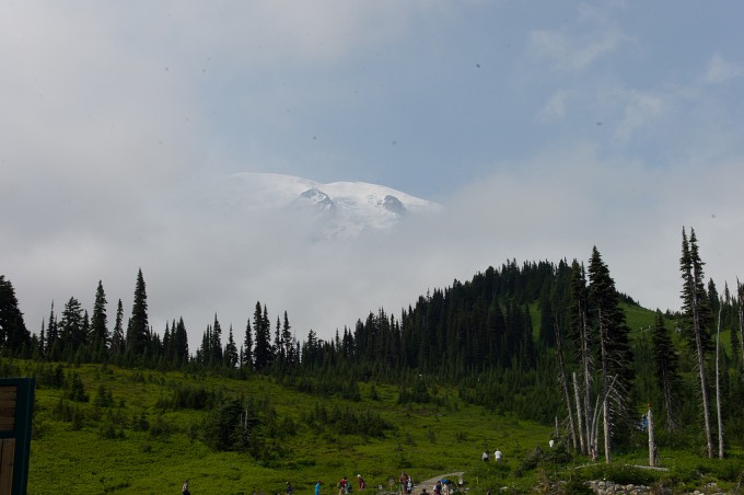
On returning home, I quickly downloaded the images, and here’s a sample of what I got….an image that I’d consider thoroughly uninspiring….
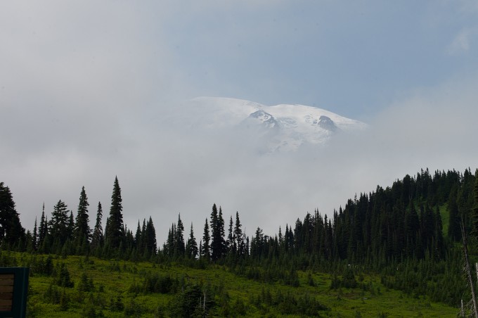
As you can see, the image was fraught by poor composition, dust on the sensor, and a lack of clear cohesive direction. Being an eternal optimist, I did my best to tweak the image. I did a bit of liberal cropping to re-center the image and get ride of some dust, and thought I had done a reasonable job of capturing a somewhat bland summer mountain moment. I have plenty of these in my home photo collection, half-finished images that simply don’t seem worth much more effort:
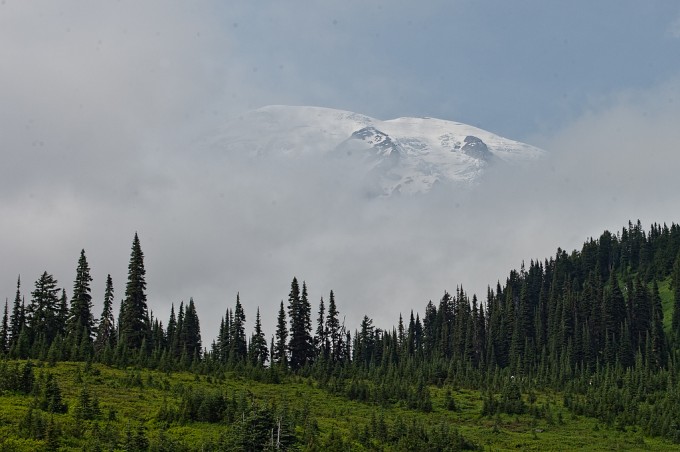
To me, the image continued to seem underexposed in the foreground, and generally dull. I tried to tweak things a bit more by increasing the “green” luminance channel in Adobe Lightroom to bring out the trees (as well as some more dust on my sensor, which came about as a result of my processing)…What I got reminded me of some of the garish HDR images that I stumble across, but at least I gave it a reasonable effort and improved the overall exposure.
I moved on and looked at other shots, but ultimately put the photos away for nearly a year. For some reason, maybe due to the crummy weather that occupied Seattle through much of the spring, I decided to go back to those images from a year ago, and give the image another try….
This time, The approach that I took was to say, for a change, let me try to bring out my “inner Ansel Adams”….Every once in a while I find it fun to mock up images in the style of a famous photographer, and in this case, I decided (with the best humor possible) to put on the hat of the famous Ansel Adams, known across the photographic world for his wondrous black and while work.
To all of you who believe that a photograph should be taken and left as is, please read up on Ansel’s techniques. Adams used extensive photo processing to achieve the look that he desired. He did a ton of dodging and burning, to bring out the intended highlights and sink the intended shadows to create some of history’s most compelling images. Today, in the world of digital imagery and wizardry, processing becomes much easier, and I was able to simply refer back to my Lightroom library and do a quick Black and White conversion. Stepping back to the last edited image in my series, here’s what happened, after a bit of dust removal and contrast adjustment:
To me, suddenly the image in front of me, left for dead a year ago, came to life. I suddenly saw Mt. Rainier as a looming giant in the mist, with the foreground telling its own story….so I I decided to tweak further, pushing the highlights and shadows a bit more to see what would happen….
What I found was that the mountain was becoming even more mysterious…What had originally been intended as a snapshot of Rainier, dashed by the poor weather, was becoming a moody shot, and a “keeper” to my eyes….
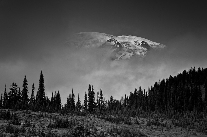
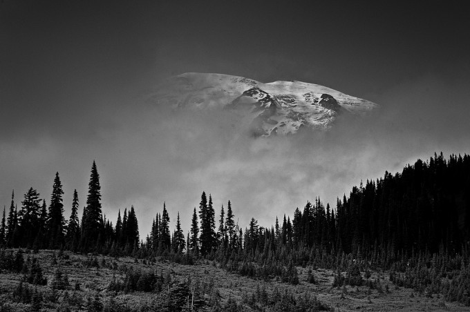
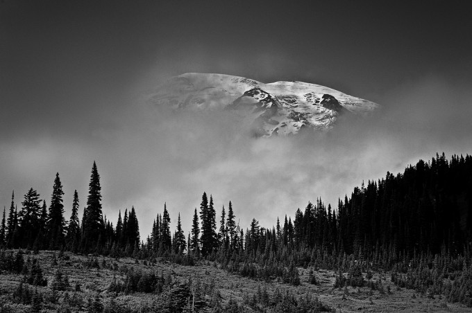
So after a bunch more tweaking, that involved adjusting shadows, doing a bit of selective dodging and burning, and performing a series of little tweaks that involved emphasizing the cloud and fog that I saw in this modified image, all in Lightroom, here’s the final result:
So what do you think? I personally feel that I saved an image….a throwaway image at that….Sure, I manipulated the image extensively. Some might argue that what I performed took the image from the realm of photography to something more like graphic art. To me, the image is still a photograph, albeit one that’s extensively interpreted for effect. But again, I feel that this last image is a “keeper”….
I’d be curious what the traditionalists and digital manipulators among you think. After all, this series of images provides a flow from “Before” to “After”, and you can see how what the end-result of the image represents is a far distance from the reality of the day.
Yet, this is now how I “see” Mt. Rainier, as a mysterious giant, hiding in the Northwest’s dense fog, occasionally peaking out, tempting us. Tempting us in its beautiy, challenging us towards becoming better photographers, and to me, better photographic editors….
Until next time, your thoughts and comments are warmly invited….
[ad#Adsense Blog Sq Embed Image]



I see nothing wrong with what you have done Ashwin. And I do not think this is manipulation. Lets recognize that the camera DOES not really capture what we see with our eyes. Our eyes are just so so technologically advanced than any camera.
I think for all practical purpose what you can do in Lightroom is not manipulation. Dodging and Burning were extensively used by photographers along with filters and so is the case in Digital photography post processing.
I would probably say that if one is doing documentary or photojournalism then changing the photograph but for correcting the camera errors like color, brightness etc would not be justice to the viewers not so much in travel photography. What do you think?
Great collection of tips. Thank you.
Actually, I consider every shot I take a potential ‘throw away.’
Only when I return to my studio and settle into post-processing, do I apply much of a critical eye. After ruthlessly culling out the problematic photos (poor focus, exposure faults, etc), I ask my keepers (if any) “What’s the point of this photo… Is there a story in it somewhere… etc…?” If an image passes the ‘possibly interesting sniff test’, I stop thinking about its subject-ness.
Next, I look at the design of the image (geometry, color play, subject positioning, distractions, possible cropping options that may enhance the composition, etc) then begin to formulate a general processing plan. Once I have my plan in mind, I quickly execute it. It’s really easy to get fussy and over-work an image, so I try not to dawdle, over-think, or piddle around very much. I want the result to appear fresh. As such, I try not to spend more than 5 minutes (total) formulating the plan and executing it. I act decisively and once it’s done, it’s done, then I save it…. I next move along to the next image candidate, or (better, yet) prepare for the next shoot….
Anyway… my 2 cents… again, thanks…
Cheers… M
Great – would not call this “extensive PP”. Noone would have even mentioned it 10 years ago when doing the same in the bathtub at home developing a B&W picture.
Yeah nothing wrong with PP which is a kind of post-visualization and a kind of fine art photographic practice if not documentary. It also helps you to shoot better next time and get it close to what you wanted.
Good work there Ashwin!
Nice job on the crop and conversion. I guess it is a good idea to not delete so quickly.
Hello Ashwin
I was wondering if you had come across George Dewolfe’s Percep Tool plugin. It does magical things with the luminance of a photograph. George trained under Ansel Adams and is recognised as a master of the black and white form. Just a point in passing and thank you for your input on this site.
Regards Peter
Ansel Adams dodged and burned obsessively. He used a Zone System. He used the darkroom to get the prints to what they looked like when he was actually out shooting. That meant a lot of manipulation of the photos. Photoshop is the same way. Great work, Ashwin.
We should use photography to express what our mind’s eye sees …and that’s often different than a literal view of the scene. As you noted about A Adams, photography’s all about interpretation.
Nice work Ashwin!
But one thing about it. I had the last shot in mind when I took the first. That is called visualization and this is what the master said about it:
>In my mind’s eye, I visualize how a particular… sight and feeling will appear on a print. If it excites me, there is a good chance it will make a good photograph. It is an intuitive sense, an ability that comes from a lot of practice.<
And hmmzzzz, why did Ansel cross my mind now…..
Greetings, Ed
Love it, Ashwin. Got to keep those eyes open and give your shots a second and third look.
Yes, I used to do audio recording in my own little studio…..and the going fraze was “fix in the mix”. And you can do a lot these days with digital, see if you like this little concoction on my website:
http://blogger.xs4all.nl/stomoxys/archive/2011/06/09/660873.aspx
Takes only 7 hours to perform……
Greetings, Ed
While I’m not “super” fond of the image (even after), I do LOVE the thinking behind, and as a matter of fact, I consider this a real service to newbies. Way back when, during the BW lab years, I often had to “arrange”, or rather use any trick I could think of to produce a print from super poor negs. To all pixel peepers (a la 1:1), don’t throw away anything unless you’ve explored ALL issues.
.
I think you posted this shot – or a similar one – a month or two ago; I said I liked it then, and I like it now, too! (..The final, processed picture, not the original shot.) I think Ansel said something like “the photograph is the score, but the final print is the performance” ..meaning that the straight photograph is the raw material, and then you can adjust the ‘timbre’, the highlights and the shadows, the densities and contrast, and THEN you get the finished photograph.
No photo “just IS”, as choices will have been made about type of film (or digital camera makers will have made choices about the sensor’s responses), the ISO, the colour balance, etc. It’s all tweaked, whether before or after the photo’s shot. And with film, you make a choice about which developer to use, which grade of paper, etc.
So ‘post-processing’ is all part of the business (..though I often can’t see why Steve chooses to turn so many of his pics to black-&-white). [“I’m not in the business; I AM the business” ..Rachel the robot, ‘Blade Runner’.]
Thanks for showing all the intermediate stages. Now let’s thank all those programmers who make this possible with Nik software, Lightroom, Aperture, iPhoto, etc. They’re the ones whose expertise we’re all piggy-backing on!
Hey David, this is the image that Ashwin posted in his commenst on my article. You did say at the time that is was a great image and that it’s composition was very strong. For me this gets to the heart of the debate about cropping and PP. I’ll nail my colours to the mast and say I don’t like a lot of PP on my images BUT only because I want to spend less time in front of the Mac. That said all of my best images have had a degree of PP, if I showed some of the stages like Ashwin you wouldn’t believe that I don’t like to spend a lot of time in Aperture.
I will say however that I have no hesitation in cropping an image. There are times when you just can’t get to the shot you want any other way. If it helps produce a final image of the standard of Ashwin’s then as far as I’m concerned its a no-brainer.
Thanks for sharing this Ashwin, I’ve learned as much from your thought process as from the work that you carried out.
Very good post Ashwin and lovely work as usual. This does however raise that old debate about Composition vs Croposition. Everywhere I look now it seems every teenager with a DSLR can claim themselves to be a good photographer with a little help from the crop tool in PS/LR. I will have to side with Kay on this one and say the mark of a good photographer is taking a good picture from the get-go. I work hard at improving myself and the bad shots are there to remind me. Yes, Ansel did a lot of post in his day but for a process that took weeks of trial and error and hard work cannot be compared to 5 minutes in Lightroom. There are plenty of folks who will love this tutorial but lets not forget what sets us apart is to take as close to perfect an image with the shutter than PS. Otherwise, why spend so much money on decent equipment if not to enjoy both the shooting and review of your images.
Kz
good job! i actually didnt even see the mountain on the first shot
hi ashwin…i am quite surprised to see from the picture that there are so many many dust particles on the sensor of the m9…is it a permanent issue with the camera? what kind of measures you have to take to avoid the dust on the sensor?
Hi Ashwin,
I really like your work generally speaking and I liked this article a lot. well done on the post-processing side.
Thanks for sharing.
Thanks, everyone, for your comments. They are greatly appreciated. I had forgotten that I sent this article to Steve a week back, and checking back, it was nice to be greated by the positive feedback and the constructive criticism, which I very much appreciate!
I like a bad shot to be as is to remind me why I suck and what I need to improve on. I would rather not fix a bad shot to make myself feel good about it. But if for whatever reason you have no other alternatives available, then I guess you have to make the best of what you already have.
Different strokes for different folks…makes the world go around. I prefer to save an image if I can. I find that I can save plenty of “bad” shots with a bit of cropping, a dash of processing….
I agree though that it’s always lovely to nail the shot the first time aroujnd…
For travel shots, I agree that you can’t always go back and make another shot. So you do what you can to save them. But I remember reading some “advice” a long time ago about always shooting with a wide-angle and crop later, or shoot 10 images first and pick the best one. It’s especially prevalent in the digital world which results in the need for more and more frames per second burst. I still believe in disciplines and every missed shot means more better shots in the future.
I would be interested to see the second color photograph converted to B&W. The foreground might be less noticeable. As they are, I like the first B&W the best.
I am no fan of pp. Would it not be better to spend more time behind the camera and learning how to get it right in the first place rather than turning a bad photograph into a processed mess?
Pp has it’s purposes, but it involves knowing what you want before releasing the shutter, not fidling around afterwards.
The first black and white version is excellent, both beautiful and evocative. The following ones are overcooked in my opinion though.
THanks for the feedback. It was by debate as well, as to where to stop….A good secondary article would be: Knowing when to stop with editing….LOL…thanks!
Very Ansel Adams
I’m with Frosti7 on this one.
The problem with PP is knowing when it’s too much.
In this case, while I believe that the B/W conversion was virtuous, somewhere along the way it got a little over the top.
Ashwin
Great Post !!!
You have created magic with that photo…You have caused me to go back to some of my images and take a relook…I too have found 3 of my photos that I was able to bring back to life..
Your the BEST !!
Dave Berry
Thanks, Dave. I am looking forward to meeting up in Dallas when I head there! I am glad to have inspired a revisit and rediscovery of some of your prior images…
Take care, my friend!
Ashwin
Does color advance the story I want to tell. Many times the answer is no.
Converting made a big difference. You wanted to tell a story of a mountain. The greens and blues added a subplot that distracted from the story of the mountain.
Absolutely. Eloquently stated, Al. Thanks!
Looks awesome.
@Mathias. LOL I always love Bob Ross quotes.
AshwiN! sorry…
Ashwim, fantastic treatment, I think what it proves most of all is the power of black and white. When the colour is gone, you can tweek to your hearts content to get the most out of an image like this, and it still looks real. would love to know more about your approach in lightroom, struggle to get such convincing B&W and have been considering silver FX but this is seriously impressive I wonder if one can do just as well without it. regards John
Brilliant transformation Ashwin! That really went from drab to spectacular!
thanks, Satya!
Thanks for the lesson. You inspired me to go back and take a look
This reminds me of Bob Ross.
‘Happy little clouds…’
The B/W conversion made it another image. It made it an amazingly interesting image rather than a usual snapshot in the album that contains hundreds of images. The B/W conversion made it more mysterious and showed a different mood. It brings out more the details and that it would encourage people to see more about the mountain. This is brilliant!
Another thing this picture has going for it is the pixel count. The crop makes it work and with the M9 sensor at 18 mega pixels you can do a crop like this and still have a large enough image for printing. I liked the result, really nice.
Great processing. The photo went from So-so to ‘hang on your wall’ quality. Thanks for your insight!
I’m thoroughly impressed! I thought there was a lot of cool stuff going on in the original photo, but agreed that it was poorly excecuted.
Love the final result! It’s not often I enjoy black and white landscape, but in this case the result is spectacular!
it does need that B&W conversion, but that dosnt make it a throw away shot.
from the bw’s i liked the first one best, other 2 looked too processed/unreal compared to the first b&w one
Fair criticism, Frosti. I debated this myself…
Thanks, Sarig….Glad that I could break the mold on this image!