A reader of this website, Alexander Franz just sent me this video he made which is a preview of the new Panaosnic G-F2 where he compares it to the G-F1. He was lucky enough to have a pre-production unit sent to him. Check it out and then check out his website at ifranznation.de
Related Articles
Mirrorless
QUICK SHOT: Midnight Flash (Yongnuo 560 IV and YN560-TX)
QUICK SHOT: Midnight Flash (Yongnuo 560 IV and YN560-TX) By Jannik Pietsch This photo was taken with my Lumix G7 with the standard 14-42mm lens and the (relatively) new Yongnuo flash set up which […]

Featured
In the Galápagos with the Leica Vario-Elmar 100-400mm and the Panasonic DMC-GX8 By John DeVore
June 22, 2016
Featured, follow ups, Guest Post, Inspiration, Leica, Mirrorless, Nature, Olympus, Panasonic, Travel, User Reports
20
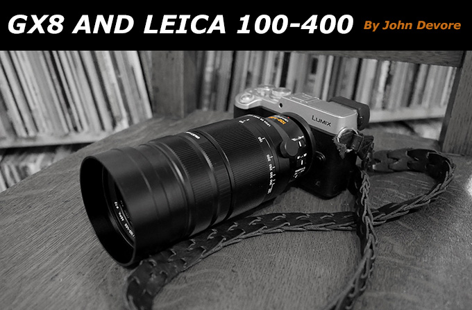
In the Galápagos with the Leica Vario-Elmar 100-400mm and the Panasonic DMC-GX8 By John DeVore I had the incredible good fortune this year (my 50th) to be able to take two photo trips of a […]
Crazy Comparisons
Shooting with the Panasonic GX85. Small with a huge punch!
Shooting with the Panasonic GX85. Small with a huge punch! By Steve Huff Hey guys! I’m back again with a real world look at a little Micro 4/3 camera, the Panasonic GX85. I recently took […]
6 Comments
Comments are closed.
What makes this one interesting, is that you can fit M-lenses on it, using a bayonet adaptor.
Too bad they they couldn’t fit a real APS-C size sensor in there… That would make up for Rabi’s complaints…
It has no 2nd curtain sync option, not even flash exp. correction. No DOF and AE lock button at all.
I think this camera is nothing more but an interchangeable lens compact for beginners.
I understand that some people prefer mechanical buttons over touch-screen buttons.
Personally, given that the GF2 is designed primarily to take photos from the rear screen (the viewfinder is an option, not included), mechanical or touch-screen doesn’t really matter since I’ll be looking at the screen anyway.
However, I would be very happy to know more about the menu tree and the customizable options for the touch-screen buttons before making my mind on these brand-new ergonomics — and incidentally, before concluding that a lot of menu digging is mandatory to change basic settings.
There is still a turn’n’click wheel, so changing aperture in A-mode or shutter speed in S-mode should be as easy as before. And I am very curious to see how the wheel and the touch-screen interact with each other… A lot of new ergonomics possibilities to explore here; wait and see if the engineers did their job right!
Yep, another digital camera that totally misses the point of how damn easy it should be to take a picture.
Well I will have to agree with Jim, I am dissapointed too. I do not know about you guys yet I prefer buttons and knobs when taking pictures instead of digging through tons of Menus. It looks nice and may have improvements yet I still would prefer that Dial to change Aperture or Shutter priority.
I know life is better without expectation, but still, highly disappointing!