Today I welcome Tom Di Maggio who has written a nice little article that asks the questions “Color or Black & White for Concert Photography?” – Tom has provided plenty of real world samples here so I hope you enjoy this one! You can see more of Toms work at his website HERE. Some pretty amazing stuff! He can also be found on Flickr.
Since I’m shooting concerts there’s always been that argument in the pit about black and white concert photography. I’ve always avoided being drawn into that discussion, as I don’t think that one can definitely say it is acceptable or not. To me it often sounds an awful lot like the “to photoshop” or “to not photoshop” discussion. In the end it’s about a personal choice, I for one love black and white concert shots, as long as it’s not overdone and fits the purpose of the shot. I tend to think of concert photography the same way I think of any other kind of photography. You want to make the viewer feel a certain way when they watch the picture. If that means converting a photograph to black and white, well then so be it.
Don’t get me wrong, I am convinced that if a photograph is bad to start with, it is not a conversion to black and white that will save it. I still have to see a badly exposed photograph turned into a keeper by such a conversion. There’s also a limit to what I think should be digitally done to a concert picture as you want to stay as close as possible to the original.
In my experience not every photograph works in black and white, in fact most don’t, especially with concert photography, because the lighting is a key component of the show. Converting a picture to black and white equals to removing what often makes the best concert picture i.e. colors and atmosphere. You should know why you want to convert that specific picture and how it will help to increase the impact on the viewer.
The goal of this article is to demonstrate that a conversion doesn’t necessarily be a means to hide defects of a photograph, whatever they are. But rather to bring the viewer closer to the “feeling” the people in the first row had at the precise moment the picture was taken.
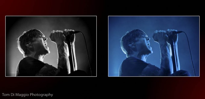
The next four shots are ones that worked better in black and white than in their original color. The reason might vary from frame to frame but as you can see in the original the exposure was right to start with:
This shot from Ben Kowalewicz (Billy Talent’s lead singer) looked a bit dull to me in that blue tone, but the expression is great. The shot worked better for me in black and white as it conveys more passion. The contrast in the picture is increased, and the focus is lead to his face, which is precisely where I want the viewer to look in this picture.
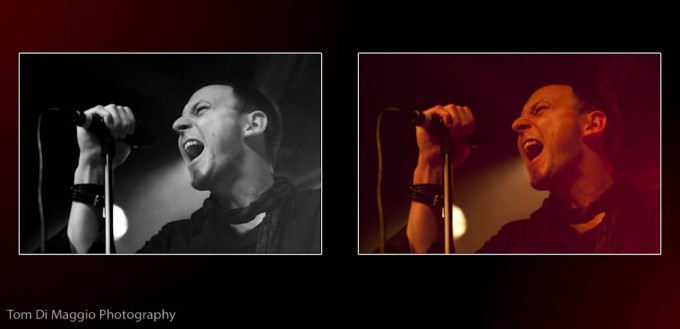
Machine Head’s lead Robb Flynn, is a very intense person on stage. He really lives his music. This one “screamed” for conversion, the subtle change in Hue on the red background provides a great base for a conversion. When you have a background like this you know that the conversion will make it interesting as it will increase the perception of the tonal change. But the conversion only works because of the yellow spotlight on Robb’s face. The spotlight brightens up his face , which leads the view back from the background tho his face. Whithout the spotlight, the background would be the point of interest in this picture and not the artist.
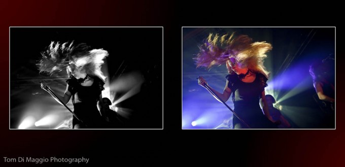
When I was selecting the pictures from Epica I didn’t notice this one straight away. It’s only a day or two later that this photo of their lead singer Simone Simons came to my attention. This is one of my favorite concert pictures. If there is one reference shot for a black and white conversion, this would be it. The intensity of the moment is not increased by the conversion but rather prioritized.
Joe May from Pale Obsession was 100% into it at this point. The red Vari-light on his face brings the intensity of the shot way down. Red light is a common issue for concert photographers, and I think this is where the black and white conversion is used most of the time.
The next four shots are ones that reduce the impact of the viewer once converted to black and white for me:
The colors at the Tori Amos performance were great. Her red hair on the blue background are great. They actually help the photograph to come to life, getting rid of them would be taking away the atmosphere of the picture.
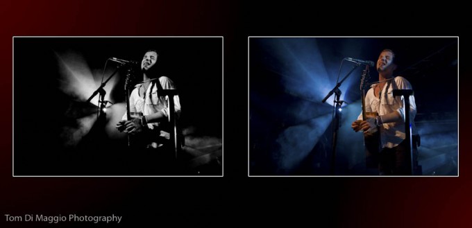
This picture of James Morrison is full of emotion, the bright spot and smoke in the background actually make the atmosphere in this one. The smoke and light beam are heavilhy reduced in the conversion which result in a darker picture altogheter. The shadow on James’ face are harscher as well.
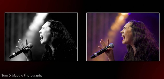
To be honest I like both versions of Jennifer Kae’s picture. But the color version looks a lot more intense to me, the colors really fit well together and the warm tone in the background give a lot to the strength of the picture, which is utlimatively what I wanted to convey here.
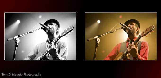
The lighting at Charlie Winston’s concert were very warm, which perfectly fits the music and the artist. This is a good example as to how the lighting is an integral part of the show. Conversion simply doesn’t fit in this case.
As a final word I’d like to say that for me it is important to keep in mind that photography is a very subjective area, and I think that you should present your photographs the way that you like them, post processed or not, black & white, or in color. No matter how, there’s always going to be people who like your pictures and those who don’t.
[ad#Adsense Blog Sq Embed Image]






Great article and great pictures!
I know the problem be myself. Delete the ‘red shot’ or convert it into b/w? That is the question… Almost every good (!) red toned picture can be turned into a great b/w action shot. And the easiest way is over Nik Silver Efex Pro.
bw it is more expressive as me it seems 🙂
Finally.
Again, didn’t use Silver Efex Pro or some other program like that.
and again ….
[img]http://farm5.static.flickr.com/4071/4666973698_69dac37c11_b.jpg[/img]
Argh …
[img]http://farm2.static.flickr.com/1305/4666333731_233c56bfae_b.jpg[/img]
Let’s try this again …
http://farm2.static.flickr.com/1305/4666333731_233c56bfae_b.jpg
@Nick: Thanks
@Eric: I think so too, … 😉
@Harald: Thanks. You’re right when you say that every photograph needs to be treated differently during the conversion. And don’t get me wrong, I am not against B&W at all. In fact I love it and I often use it for concert photography and my other work. What made me write the article was more the fact that I heard too many times from concert photographers that the only purpose of a B&W conversion is to hide defects, which to me is not true. I do convert some concert shots to B&W because I think they work better in B&W than in color, but there are some pictures from which I would take an important part away if I was to convert them to B&W. This is meant for concert photography, … 😉
@Michiel: Thank you.
Great article; enjoyed that read!
Sorry, technical difficulties. Sent the pic to Steve. Hope he can post it for me.
To put my money where my mouth is, here’s what I’m talking about. (To be crystal clear, I did not use Silver Efex Pro nor Exposure from AlienSkin.)
[img]http://squarehead.smugmug.com/Other/smugmugstuff/12114738_CrL8u#887846865_qCaZc[/img]
Don’t really know what to think about this article.
Don’t get me wrong, the photos are all great. Nice job … but otherwise, it makes me rather wonder.
The first thing that makes me scratch my head is the assumption that turning a photo B&W is a way to hide defects.
Yes, I kind of get that you mean to say a conversion doesn’t work for every shot but to put that into the context of people (amateurs?) using it mostly to cover up for bad photography/bad exposures is a little harsh. If not wrong.
The other thing, when looking at your B&W conversions – no matter whether it’s the working or not working examples – I can’t help but notice you are kind of unfair in making your point.
Looking closely at your B&W’s you seem to use for each and every shot the same conversion technique. Meaning, besides adding a colour tone here and there every photo gets treated the same way.
Well, that just doesn’t work. At least not for every photo. Sorry.
With digital photography making great B&W shots is a little more challenging than picking one’s favourite bw-film used to be. Each photo needs to be treated differently to get the best out of it.
Of the top of my head I can think of 5 or 6 different ways to go about it, each one offering a slightly different result. To be frank, I haven’t even included Nik’s Silver Efex Pro or AlienSkin’s Exposure in that list.
Very cool article. I think everyone is guilty of trying to make a bad picture good by hitting the bnw button atleast once in there lives.
Great article and insights. You picked some interesting examples to illustrate your point. Thanks Tom!